Small UI proposal but it tortures my intеrnal perfectionist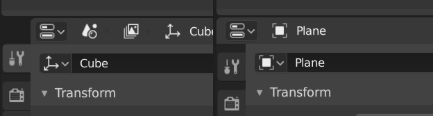
7 Likes
This is incredibly annoying, any overlay menu with a down tick in the viewport also has the issue.
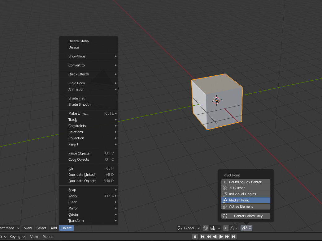
As far as I’m aware there’s no way to assign the pivot point selection to the quick menu (or any shortcut) too.
My eyes are tearing whenever I look at it.
2 Likes
So you have a car with 4 wheels and you want all of the wheels to be brushed aluminum. You want the default behavior when I pick the brushed aluminum material for one of these objects, that it creates a unique copy of that material? I’d rather have the one brushed aluminum material for all of these. I adjust one material…all 4 wheels update.
Expand this out to a project I just completed that had 16,000 individual screws. Why would I want a unique material on each of those screws when they are all made of the same stainless steel? It would have taken hours to adjust 16,000 materials individually.
5 Likes
and also happens (in 2.7x which we know it doesn’t have collections) when you have outliner in “visible layers” mode and child object in some levels and parent in not-all-the-same layers: child object are not nested if parent isn’t visible in outliner, they are nested if parent is up there.
It may be confusing, seeing an object sometime nested, sometime not as if it wasn’t a child object. Or maybe it would be a plus. Anyway right now, seeing an object in a collection and having no way to tell if it is parented to some other object (even if in the same collection) looks rough.
But this is no matter for a paper cut, sorry.
2 Likes
Sorry, I wasn’t clear.
I meant adding a Material slot to an object that already has a material, and being able to assign the already assigner material, as shown in the gif below.
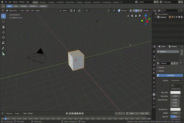
In my opinion, either the material is removed from the list, or the material is branched.
1 Like
Papercut: Not sure if Papercut or bug, or interface design issue, but if you try to tap with a Drawing Table an axis on the viewport widget, you can’t change to the orthographic view of that axis. Blender only assumes you are dragging the widget.
Please MAKE THIS HAPPEN!!!
Permanent delete with ctrl + z support.
10 Likes
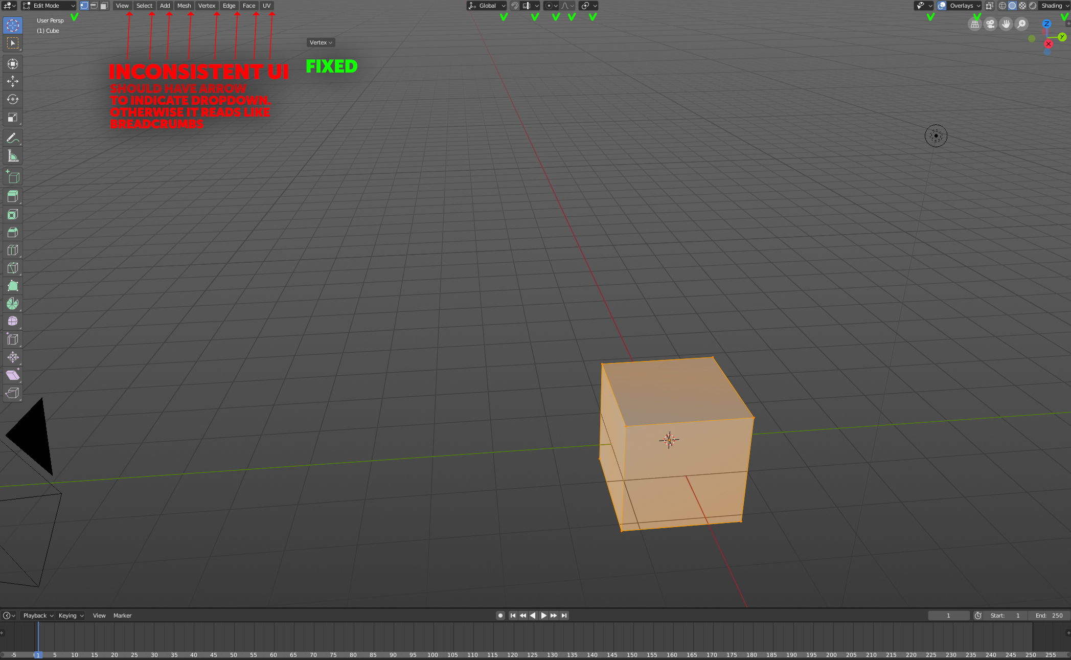
As an ex UI designer with 13 years of experience under my belt what was always a cornerstone is consistency in the UI and adhering to standards, not to confuse users.
Which brings me to my pet peeve in 2.8 so far.
Atm the top left “3D space” menu reads like tags/breadcrumbs/labels and not buttons. Everywhere else in the UI when you have expanding menus its indicated by both color and arrow.
But not for these, they just sit there, not telling the user that they have any deeper function. It would be a quick fix I think and would make sure the UI doesnt deviate on arbitary things like this.
19 Likes
that whole area needs more love to be intuitve,
2 Likes
Negative!
Where did you saw a menu containing an arrow.
In the context of Blender there is no confusion with breadcrumbs because it is not a browser and the user has not navigated through each of those elements. And on the left you have menus and in the center you have radio buttons. So it’s really consistent. They would also occupy a little more space.
You’re looking at it from the wrong angle.
Assume you’re a first time user or a user starting out.
Youre entire digital life you’ve been conditioned on how things work, from your phone to your web browser, to buying tube tickets.
“in the context of blender” is exactly why people have had a problem picking it up. It exists in its own universe.
In this case, “the context of blender” is not correct either. Look at the screen, every single item that functions as an expandable/dropdown menu got an arrow indicating that, it’s good practice.
Except these. They are wholy uniqe in the UI for no apparent reason, indicating to the user that they do not function like the other buttons. And seeing how they are brighter and doesn’t have anything indicating its a button its very easy to read them as plain labels.
1 Like
Every item that got a downarrow is marked with a green little checkbox in the screenshot.
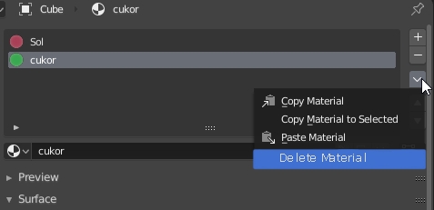
but that does somewhat go against blenders core philosophy. I mean you still have the option to maunally fork the material or remove another material from the list. but that’s nothing blender’d do for you…because in some use cases you might actually want to have the same materials twice on a single object and then you get super annoyed by software trying to be more clever, than you…
2 Likes
Could be a good idea to make two tabs to separate input settings from hotkeys in the settings area (yeah, an area other time!!!). To solve the problem that @Rawalanchetell in this thread
And add some options to make optional pie menus. It’s strange that you need to use pie menus in the old 2.79 hotkey template.