What is treshold here? It goes between 0 and 1… so is that 0 - 100% length? Sadly no, because the results doesn’t match that.
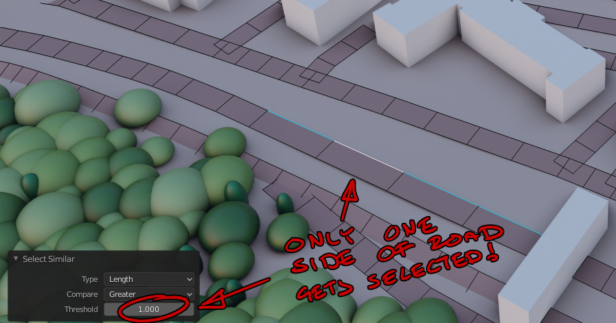
A more natural input would perhaps also be a unit treshold, that accepts cm, mm or meters.
What is treshold here? It goes between 0 and 1… so is that 0 - 100% length? Sadly no, because the results doesn’t match that.
A more natural input would perhaps also be a unit treshold, that accepts cm, mm or meters.
Hello Guys.
I don’t know where this should be mentioned. as a UI/UX issue or change of functionality or a complete loss of it.
In 2.7 there was some settings for the 3d gizmos where i can change their size to be larger but their handles remain small for the scale and translate but in 2.8 the handles become too big.
Here is a video for what i mean.
I would like if this functionality is brought back but with some usability improvements and that’s by adding two operators that do the proper resizing in the viewport without us having to adjust the handles size manually, then you can remove the preference option.
Thank you.
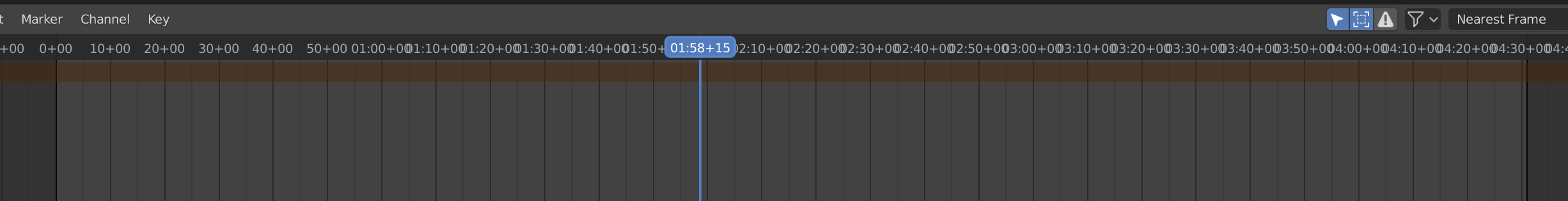
The timeline “show seconds” option is messed up in certain zoom levels:
If I got to decide, I’d drop the “+00” extensions altogether and have more space for even seconds. Maybe add the frame numbers if the individual seconds are so far apart that there’s space for them? It doesn’t make sense to show the frame numbers when there’s not even space for every individual second.
edit: the blue current frame indicator is fine as it is, I was referring to the rest of the top bar.
6 posts were split to a new topic: Emissive materials are black instead of white in the diffuse light render pas
The Ctrl+F* is sometimes reserved by Linux for switching workspaces. The common sense tells me that if user have multiple objects selected and presses F2 this should open batch rename util.
Some feedback regarding the Sculpt Mode UI…
The downside to all the fabulous Sculpt Mode additions is the awkwardly cluttered UI. Heaps of tiny checkboxes and nested rollouts you have to open for much-used tools like Topology Auto-Masking and Projected Falloff. And such functions seem to be hacky, or hardwired to each brush, because they can’t be added to a Quick Favorites or Pie Menu Editor menu.
As lots of tools and brushes have clearly been inspired by ZBrush, I’d suggest also taking a look at the easy shortcuts ZBrush offers for rapid masking, slicing and polygroup / face set management. Also, essential functions like brush size, brush strength and brush hardness should be as easy as RMB / pen button + gestures.
I think the icon used for ‘new’ in Blender looks far too much like commonly and widely accepted ‘copy’ icons. The ‘new’ icon should probably be something with a plus sign.
“New” icon in Blender
“Copy” icon used pretty much everywhere
Yes, that 0.25 multiplier thrown in there seems like a bug. Of course they can’t fix it now without breaking every hair system out there. Hopefully the new hair object type fixes the units, especially the ones that make no sense whatsoever like the physics timing controlling hair size.
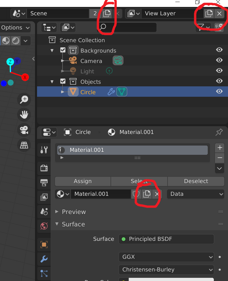
The icon for ‘new’ in Blender is a plus sign. This is the Duplicate icon.
Well all of the tooltips say New. But New in Blender is a crapshoot on new or a copy or whatever. For example, you can’t make a new default material from the view I just posted. It’ll copy, but the tooltip says New. If you hit the x to unlink the material it’ll let you create a new default material but the tooltip is exactly the same as when you copy. The scene ‘new’ button will bring up a menu for new, copy settings, linked copy, or full copy. I think the view layer will copy, again with a tooltip that says New. It’s an absolute mess and you never really know what you’re getting when you click that button. So I guess it’s not really just the icon but the interface has icons that do completely different things all over the place. I guess I can investigate more and document every time that stupid icon shows up.
Another case of “What does the “New” button actually do?”
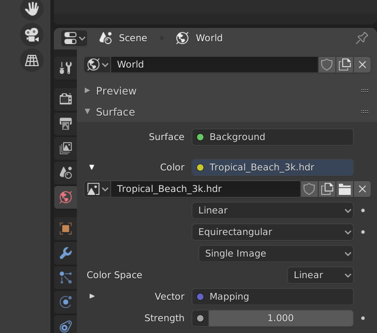
The new button for World will copy the existing World even though the tooltip says new.
The very same button for the texture image creates a new blank texture.
I don’t know how much of this is relevant to UI, but this is just annoing from usability perspective:
In sculpture right mouse button menu appear not centered.
In Weight paint mode we’ve always* had the “X-mirror” feature, that mirrors painted weights, and in addition, knows about .L and .R (etc.) suffixes to vertex group names, and will instead of mirroring a .L group, paint mirrored weights into a .R group, etc.
Recently, the new Symmetry options (X/Y/Z) were added into a bunch of modes (modelling/sculpt/weight paint, etc.)
so now we have the following:
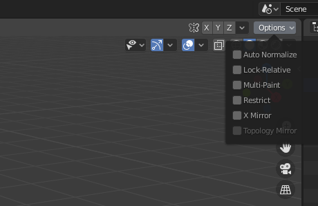
So a user sees immediately the X symmetry option which is not useful for weight painting bone weights and hidden under options there is an X-Mirror option which is
furthermore, the names of the options nor their tooltips indicate how they are different, and the UI is acting with multiple personalities. you can have them both on (in which case, your .L groups and .R groups will be identical).
As a secondary, pre-2.8 paper cut, the left/right suffixes that are special (or indeed that they have to be suffixes and not prefixes) are not shown anywhere in the UI.
The solution isn’t clear to me. Perhaps fixing the names/tooltips to be more clear, or making the X-Mirror more visible in the UI is enough. Or, special strings for left/right, top/down, front/back, should be in prefrences, where they can be found, internationalized, edited, etc. and then we could have further options to make the X/Y/Z options individually ‘smart’ with names… or replace them with enums instead of flags… or?
This is tricky because it feels like a papercut from a user perspective, and it might be easy to code a fix, but it should have some designing work before coding.
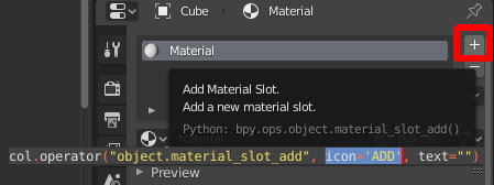
Just so that everyone is on the same page: It appears that the plus sign is called the ‘ADD’ icon.
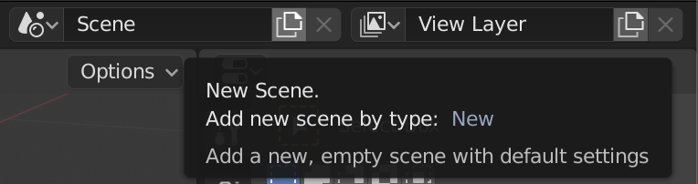
A while ago I committed a change to the view layer add operator that made it behave more like the Scene add op (options to Copy, New with all collections enabled, New with all collections disabled). In that case it was a bit more than a paper cut since adding new viewlayers with everything enabled could seriously lag or crash on larger scenes and there was no alternative.
With other ID’s, like World or Material etc. the “New” button copies most of the time (you pointed out Image as an exception, there are probably others too) but you can always make a brand new one by removing the existing one before pressing new.
Idk if the approach of adding a menu with New, Copy, ... to every instance of the New ID button is a good idea necessarily - it might get in the way too much if that was the behaviour for materials for example, but I’m curious what people’s thoughts are on the matter.
For a start all of the tooltips need to change. If it’s making a copy then it’s a copy, not ‘new’. Personally I think defaulting to copying sucks, especially since in most case you’re not even given the option to create new from a default template of some sort. The interface is so different depending on what component you’re looking at. In modifiers you have a copy button. In Object Data Properties let’s look at UV maps for instance, although I think most of the properties work this way. You get these nice + and - buttons and a list. Of course the default is to copy whatever item you have selected so you can’t even get the default blank UV map until you’ve deleted them all. It’s just all over the place, and on top of that the tooltips are just wrong. In the Blender universe it seems that New really means Copy, most of the time, and Add means new some of the time, and new means new some of the time, and copy can mean so many different things in regards to linking that we never really know what’s going on until we try it a half-dozen or so times. Oh, and then there’s duplicate. Let’s not forget that we’ve got that word thrown in there for good measure just to change things up. I know there are people arguing about the alignment of damn checkboxes meanwhile we’ve got a user interface designed by at least six different competing factions.