I have to disagree here with this one, DanPool’s and BillySmith’s comments too. Origins conceptually pertain to objects, not meshes. Even if it would be possible to expose this option in edit mode, and even if it may seem convenient to save a few clicks, I doubt it’s “right” and I doubt it won’t introduce further confusion (despite active object), specially now that more than one mesh can be edited at the same time. Personally, I believe prioritizing convenience over logic can quickly escalate to havoc.
1 Like
There is Area Options menu (RMB-click on area borders).
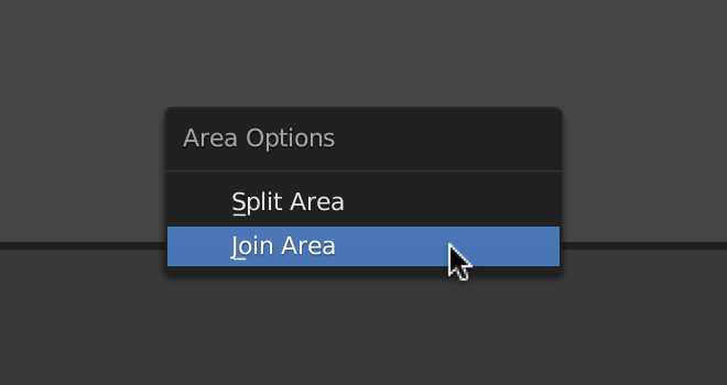
It would be nice to be able to use Shift-LMB-drag border to Split Area, and Alt-LMB-drag to Join Areas. It will be clearer and more intuitive than invisible widgets in the corners.
For swapping areas can be used some modifier-key + dragging the Editor Type icon, for example.
There is also the (View) Area menu with these functions, but the View menu is not present in all editors. Perhaps we should add Area menu to the header right click menu.
1 Like
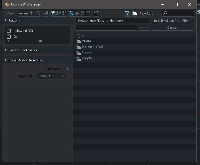
this is boring,
whenever I need to install an addon,
the window of the bookmarks is always covered by the install addon options … and there is no way to make sure that it is fixed at the bottom, even if you create a new startup file.
please fix this.
12 Likes
majority of 3D apps have that and also with easy way to snap except for blender and even in blender just one of them works “geo to origin” while the others don’t work in edit mode…the point here is to provide user a better way for changing and snapping in edit mode without keep going in and out, changing the name,adding 3d gizmos for every origin or active object…etc whatever works because even the current system doesn’t make sense too.
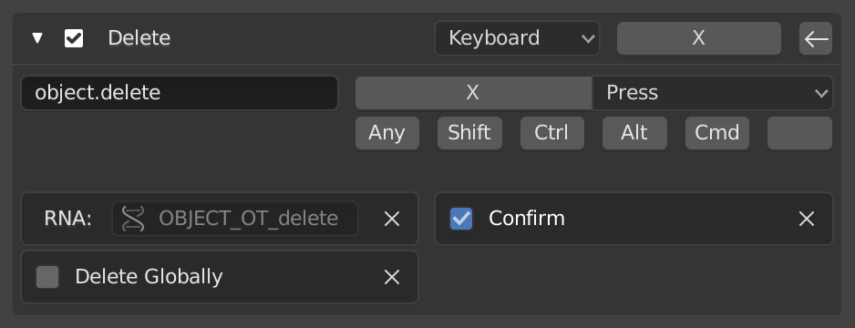
I can’t thank you enough! I feel so stupid for missing the confirmation checkbox 
Well, I would have to restate my comment for the most part, except for this: Personally I believe the current design is solid, despite what other 3D apps may be doing (I have limited experience with any of these). The “exception” of being able to set the geometry onto the origin in edit mode, is (I think) because we’re operating on the mesh against an object property such as the origin, and not trying to move an object property such as the origin while editing its mesh. It makes a lot of sense to me.
EDIT: Just to anticipate in case… The reason “Geometry to Origin” works then out of edit mode would be because an object is higher in a hierarchy than its mesh, thereby still makes sense this can work out of edit mode. I hope my justification doesn’t come off as too convoluted.
I’ve always thought those area options context menus should be smarter, work differently, and not just start the current modal split and join operations.
If you right-click in an area between editors, I don’t think that is a logical place to start a split of either so I’d remove the split options there. Instead there should be a “merge up” and “merge down” (or “right” and “left” if a vertical shared edge) that does the operation immediately rather than start the modal join operation (so doesn’t show the big arrows as you drag). Basically you know exactly what operation you want to do when you brought up the menu, so just select an explicit choice and do it right away.
Similarly, right-clicking on an editor header (and other parts of the editor as well) should give options for “split vertical”, “split horizontal”, “merge up”, “merge right”, etc for any operations that are possible. And again, do them immediately rather than start the modal operations. So if you select “split vertical” it would do so at 50% without further interaction.
Changing the way these operate would give some contrast to the advanced, and more complex, ones at the corners. They also become easily reversible without fiddling or dragging. Right-click on the header and select “split vertical” and it happens instantly. Don’t like it? Right-click on header and select “merge right” and it is fixed instantly.
3 Likes
Exactly. That’s how I always thought it should work, yeah.
if you read better, I have not misunderstand you,
with this I want to highlight that I recognize the progress in blender 2.8, and are among the first to promote the evolution when they are consistent and well done
as well as evidence when they are inconsistent and not very functional, even if on paper they seemed to work …
my comment was a more generic comment addressed to everyone to make some things clear, and not addressed directly to you or your work
Ah, but which editor should it merge over the other?
I’m assuming (maybe wrong?) that your intent would be to keep the area you are clicking in. So you’d select an explicit “merge up”, “merge down”, “merge left”, “merge right”, which ever are applicable. And it would keep the editor you are on and take over the space in the targeted direction.
Of course I might be missing some important detail, that I might have not missed had I had more coffee this morning. LOL
Just realized I was answering for the context menu inside an editor, while you were probably asking about right-clicking on the border between two. That is why I have changed, in these circumstances from “join” to “merge”. Hoping that “merge up” would be imply taking the bottom and subsuming the top, while “merge down” would preserve the top while removing the bottom.
Another way to merge editors (similar to closing the sidebar) you move the border and when the editor reaches some minimum size it is removed.
2 Likes
That does seem like a completely logical suggestion. But many existing users are used to using the current behavior (letting the area get small, but not too small) as a way of minimizing an area, which can really come in handy.
The Collections Visibility, Object Types Visibility, Overlay menu, and Shading in 3D view reacts to mouse scroll in the opposite way from scrolling in other places (Preferences, Properties, Panel, etc). Maybe this wasn’t discovered when user’s monitor has much space that the overlay menu are all revealed.
In the following screenshot, usually you scroll down to reveal the rest of the menu (just like you scroll the Outliner, Properties, etc), but instead I have to scroll up here with the mouse.
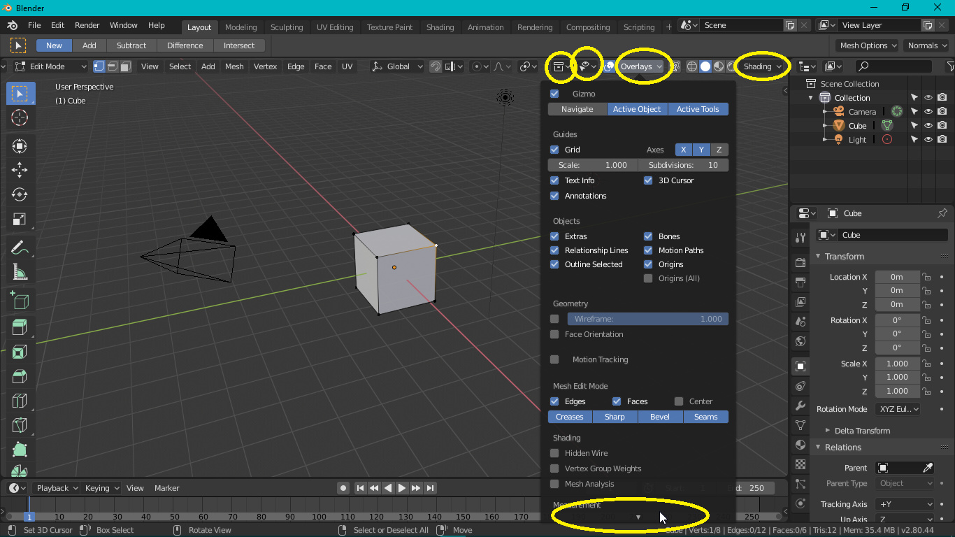
Initially, I discovered this only from Overlay menu in Edit Mode because it contains more options. But then, I experimented with higher Resolution Scale (in Preferences) and turns out it’s also the behavior in Collections Visibility, Object Types Visibility, and Shading, or maybe it is the behavior in all those menu, except that the rest only have few options that they are all revealed without scrolling.
Note: If you can’t replicate this because you have higher pixel density monitor, use the Resolution Scale setting in the Preferences.
I think probably this one, just because the shapes seem clearer without overlapping:
In the end I’ll leave it up to you which one you add to the sheet.
Great work all around.
2 Likes
there is a script for 2.7x that people used for years to quickly edit origins in edit mode and they pointed to me and to others and that’s before the 3d cursor was exposed to 3d space,you don’t know how much useful it is when you actually need it ,the current design doesn’t provide that, sometimes u want to do work as efficient as possible we don’t need technical explanation as long as it works, there are tons of requests on this simple feature…i am not here to debate about what’s what, but rather see what can be improved and add to make it easier for us the end users, and it’s in the hand of the devs to add it as it fits without making huge “sacrifices”…sometimes these little things makes huge differences that only stumbling upon them that makes you truely appreciate it.
2 Likes
Hey i got a BIG FAT PAPERCUT here:
when you use incremental save blender saves “.blend1”, “.blend2”, “.blend3” and so on, and windows and mac at least don’t recognize these as blendfiles so then it becomes rather annoying, not even blender recognizes them as blend files so if you’re using the blender browser you need to un-filter so you can see things that aren’t blend files to actually get to them
I think it would be best if this behaviour would be changed to how blender names objects, and have it do “nameofthefile.001.blend” this would be much more readable, and easy to find
thank you!
6 Likes
Oh God, yes please, this!!!
I’ve been waiting for this feature since 2.5 - it’s sooo frustrating having to click on the thumbnail icon every time I open the file browser. Please remember settings per session.
2 Likes