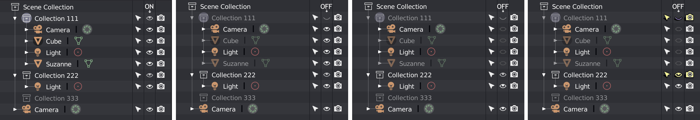
What affects the collections affects all the objects that it contains, for this reason I think that highlight the icons according to the hierarchy, and darken the “children” when the “father” is inactive, it can help to visualize the final result. Currently only the name of the children is darkened, when the parents are deactivated.
1 Like
Filled Key makes the whole icon look blobby. I’d go this route:
![]()
15 Likes
I’ve just done this mockup but i like your route too.
1 Like
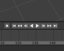
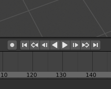
Maybe to make the prev/next keyframe buttons in a separate block nearby, and actually prev/next frame are already exist, where the Current Frame field.
8 Likes
Mind, that the “jump to the key” would be one pixel wider, than the rest of icons, but maybe it’s not a problem, since only two pixels would cross the 14x14 pix boundary. There’re some pictograms that are already designed this way. Another possiblity is to shrink the arrow horizontally by one pixel.
Still my version is the clearest, and most distinct, while the overall style is preserved.

1 Like
I was in the same questioning ![]() That’s why at first I tried not to take too much width. But I think the road you chose works well. A mockup to quick preview it.
That’s why at first I tried not to take too much width. But I think the road you chose works well. A mockup to quick preview it.
10 Likes
Darn… the bottom one looks very good too (the one with horizontally shrinked arrow). @thecavelap - could You make a mockup with it too? Just for the sake of comparison…
1 Like
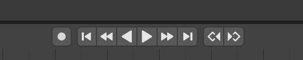
Here it is.

4 Likes
What do You think, guys and gals? Which one?
I think yours is more readable at a glance. It stands out from the crowd of arrows by having this hollowed-out keyframe symbol.
2 Likes
I can’t help feeling that this navigation panel is getting too complicated.
There’s so much room, I wouldn’t worry about it. As an animator… we use shortcuts anyway to jump between frames/keyframes. I never met an animator who would click those buttons.
Same here, I never use the timeline buttons when animating.
Requirement for buttons is needed only for tablet-heavy workflow, but i can’t speak for that or who would animate using a tablet. As far as the icon goes, the open one fits better, and things would be even clearer, if the “keyframe” part of the icon was the same colour as the keyframes themselves.
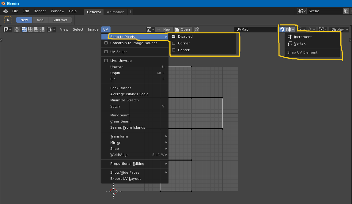
Anyway, for the paper cuts, in UV editor, snapping is divided into two different settings, found at different places. “Regular” snapping overrides pixel snapping when both are enabled.
4 Likes
I prefer the hollow key-frame personally.
9 Likes
Agreed. I also like the idea of having the diamond part of the button colored the same way the indicator on a keyframed property would be. That little touch of color would help differentiate those buttons from the others and make the transport controls a bit less drab.
And I would still like to see the current frame number field inserted into the very middle.
All of that would make it a very specialized button, unlike any of the others. So unless the use for the new button type could be generally useful in other places as well, I don’t see that likely to happen.
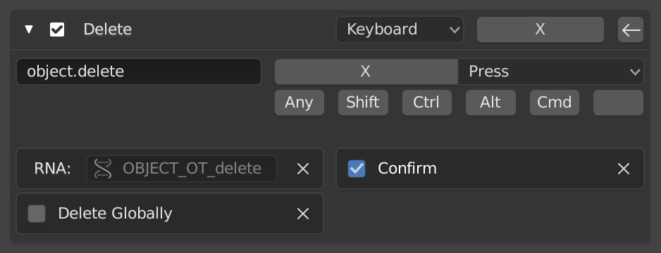
This. And get rid of the Fake user stuff as suggested before, by making everything automatically have a fake user then really deleting something when requested. Although as stated before too, this isn’t really a UI papercut.
1 Like
I have to disagree here with this one, DanPool’s and BillySmith’s comments too. Origins conceptually pertain to objects, not meshes. Even if it would be possible to expose this option in edit mode, and even if it may seem convenient to save a few clicks, I doubt it’s “right” and I doubt it won’t introduce further confusion (despite active object), specially now that more than one mesh can be edited at the same time. Personally, I believe prioritizing convenience over logic can quickly escalate to havoc.
1 Like
There is Area Options menu (RMB-click on area borders).
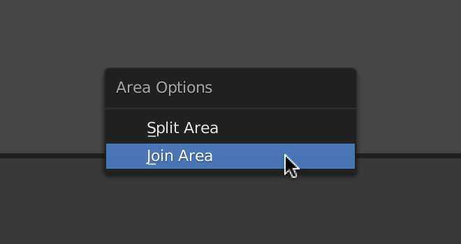
It would be nice to be able to use Shift-LMB-drag border to Split Area, and Alt-LMB-drag to Join Areas. It will be clearer and more intuitive than invisible widgets in the corners.
For swapping areas can be used some modifier-key + dragging the Editor Type icon, for example.
There is also the (View) Area menu with these functions, but the View menu is not present in all editors. Perhaps we should add Area menu to the header right click menu.
1 Like