I vote for this too. As a work-around one could set filter to VISIBLE, hit A to select all in the outliner, then set filter to ALL, then CTRL+I in the outliner. Though I’m not very sure this is exactly selecting just the invisible items, because I haven’t yet quite grasped the difference between visible and enabled in the viewport (not referring to selectable here). At least this won’t mess up the scene like when using H and ALT+H in the 3D view…
@LudvikKoutny I do not know if we are understanding or not …
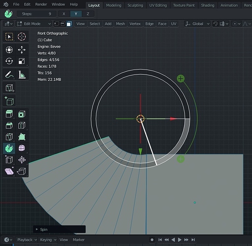
what I know is that at the moment the new active tools are too lame, totally missing the use of shotcuts in the classic way that a blender user knows … I make a practical example so we understand each other better…
@billrey , my problem has never been the use of keymaps if industry standard or classic blender … what bumps me is when it affects the philosophy of interaction …
follow this example, so we understand:
at the actual state, when I select an active tool, the use of shortcuts as “interactive mode” for these is totally ignored and this generates confusion for a classic blender user accustomed to using the keyboard heavily.
what I would expect in this example with the spin tool is:
- 1 I press the spin tool and this is activated.
- 2 I see that the rotation axis is wrong, so from a classic blender user who uses the keyboard I press Y to set the right axis.
- 3 from classic blender user I press R to rotate the spin
- 4 press enter or click, done, work finshed.
- 5 if I finished with the spin tool, if I press esc I expect that any active tool will be deactivated and go back to the “select mode” state.
At present all this does not happen, the interaction is only visual with the mouse, the use of the keyboard is totally ignored and this is really frustrating … and generates confusion, because blender does not work as a classic user expects.
There’s your answer.
Those new tools were not made for “classic blender users”, and you should be happy because the only reason those old obsolete modal tools are still there is because of you (classic blender users), so you guys can keep hammering the keyboard as always. ![]()
and I reply so … why they decided to cut my left hand?
I feel a handicapped without …
… which I do now with my left hand while I use these tools, I’m not even left-handed … so i can not even do pleasant uses in the meantime I use the active tools … 
This should be a togglebox/button, perhaps right beside the “ghost” option!
As an aside… I wonder if you might be willing to write a button that adds a motion-based spring/dampening effect to all selected bones (across all currently-selected keyframes). This would be handy tool to jiggle (or provide a little springback) for particular bone chains across the given keyframes. These are such a pain to animate manually. D:
No. You can scroll with mouse wheel (in case you don’t know) if the cursor is not hovering on top the options. So you need to scroll when hovering on blank space, and the direction is the opposite of how it behaves to mouse wheel in other part.
Actually thanks to the great people of twitter there is no more button. It works by holding down ALT now. You can grab it here free 
The spring effect is possible to construct (https://www.youtube.com/watch?v=yKc6AFvPsUQ), but that’s offtopic therefore this thread is not the place for questions like that.
I want to think that the reason is because those old users were the ones who paid the codequest. Because of the “professionals” who are here all day asking for changes to break workflows, I still haven’t seen a single one that put in a dollar.
Is it Cursor only or 3d Cursor or both?
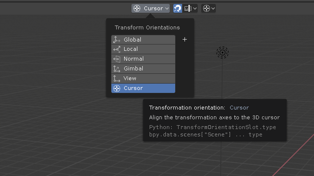
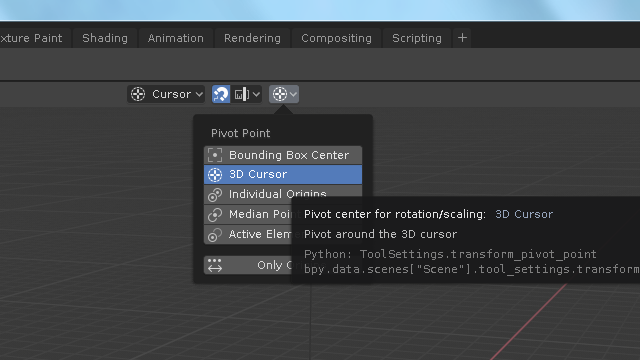
Can we standardize it?
It seems that you are right, but as soon as the starts to scroll the cursor is again over some option. So it is very difficult to scroll popover.
Also, in some cases, the content goes beyond the boundaries of the popover.
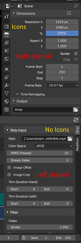
With the 2.80 release closing in I’m surprised to see that the sequencer UI is still not in consistency with the 2.80 UI style(click on image to see the full image):
Ex. the panels are not aligned to the same side and the widgets are not used in the same style ex. descriptions inside/outside buttons and there are no icons on the tabs - and the tabs are on the opposite side of the panel. On top of this the VSE panel is very messy and really needs a general cleanup like the General Properties panel, and maybe also move stuff from the extremely long VSE panel into separate tabs.
NB. an attempt to do some of this and generally improve/clean up the Sequencer UI panel was made here:
But the work was never used:
https://developer.blender.org/D4199
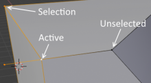
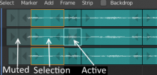
With a white line, the active strip is visible, but darkening the rest of the selection, makes it feel less “active”, than the unselected strips, and it is now confusable with the muted strips.
Current look:
For consistency and clarity, why not use the selection colors of the 3D View:
It would look like this:
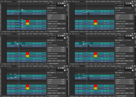
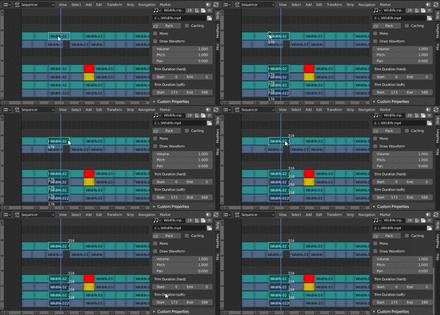
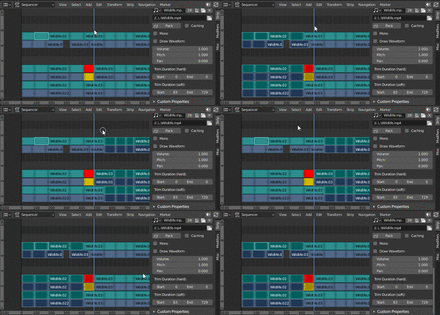
In the VSE the Shift/ctrl/alt + select do have several functions (hidden) functions in the sequencer, and info about these should be added to the status-bar(or else no-one will find them). Click to enlarge the gifs:
Alt:
Ctrl(inside strips):
Ctrl(outside strips):
And Ctrl+drag will snap.
i understand the feeling, i have the same feeling with the annotation tool,
Around 2008/09 when i started testing blender to leave max as my work tool grease pencil help a lot, was a quick way to doodle and guide me in my modeling wokflow without interrupt the process, around 2013 grease pencil add the posibility to select and move grease pencil point that was a espectacular feature for my workflow, with a drag of the mouse(actually stylus, mouse its only for gaming : 3) i could modify what i doodle in 3D with the D or erase with the Alt.
The last week i took it to seriously test modeling workflow in hard surface(https://twitter.com/Nahuel_Belich/status/1097253668301258754/photo/1), and it was extremely frustrating to see that i lost that speed, in a 20 min test its not noticeable but in a ten to twenty hours modeling its a thing.
With anotations i need to go back an forward to draw or erase or keep working(even using the fastest way we have now space>D Space>7 Space>Space) and if i use grease pencil to have the possibility to move doodles(only move not sculpt not stroke radius nothing, just move/rot/esc) i need first to
1-change modes or deactivate mode lock
2-select grease pencil object
3-enter in edit mode
change the select mode because the select tool overrides and works inverted from the ctrl+click to lasso
4-select
5-change
6-and go back. . . .
not mentioning that loosing the posibility to select and move “annotations” points also gets tutorials or notes on other editors like image or node editors really messy and annoying to work with.
Yes there are a lot of optimal little things that blender had (and probably was the best of blender, those little things) that we are kinda loosing for the moment, i have hope that some of those go back once its stable and more widely tested, 2.8 its a huge project and there is a lot of space to polish things, time will tell.
you get the point…
Shhhhh… Things are easier to use when they are left aligned.
This is awesome ! But I dont think this should be a button (or at least not only…)
It should be activate while scrubbing while Alt pressed (exactly like in the 3D viewport where the view snap when you rotate with Alt pressed). This way its consistent, activable quickly. Or use Ctrl, mimicking activation of snapping like in 3D viewport with this same modifier. I propose Alt because currently Ctrl pressed snap on 1 second according to framerate while scrubbing, or lasso select if pressed before . Currently Alt does nothing special !! So lets do it all mighty devs ! 
It’s time for a new papercut.
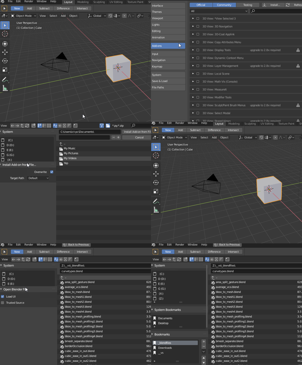
^ The left side operator panel in the file browser is given too much of a default margin in common file select operations.
The file selector during addon installs suffers the most since the initial preferences window size is 650 by 500 px. But that’s a papercut for another time ![]()
Grease pencil snap mode “NONE” means “ALL”:
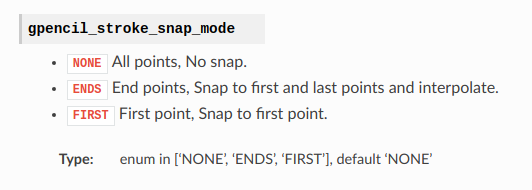
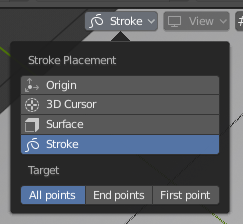
Tooltip “All points” - is “No snap”, but actually it is “snap to all points” . Maybe it is because wrong BPY name?
Read his reply to my post above – it’s already done. ![]()
