I did read your comment above and can’t guess from it how you would deal with this last example.
Are you saying that the left-right panel resize (that allows you to go to two columns or show text label) should not work where I have illustrated?
I did read your comment above and can’t guess from it how you would deal with this last example.
Are you saying that the left-right panel resize (that allows you to go to two columns or show text label) should not work where I have illustrated?
Yes, otherwise it will appear in thin air, as it does currently, which doesn’t make any sense. Again, we could add a heuristic, like it only appearing with some opacity threshold, or not.
Because… if you answer is “yes”, that doesn’t end the complications…
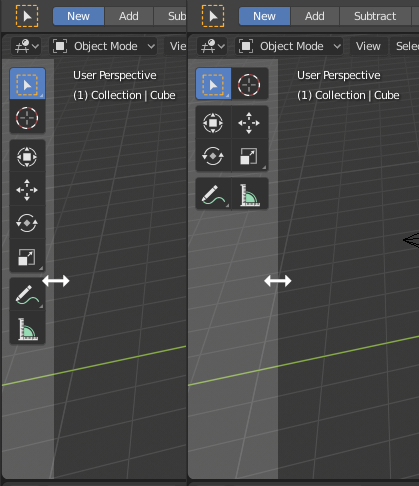
Here are two captures, before and after the region changes from one column to two. If the resize only works where there is content in the region, then what happens as it changes?
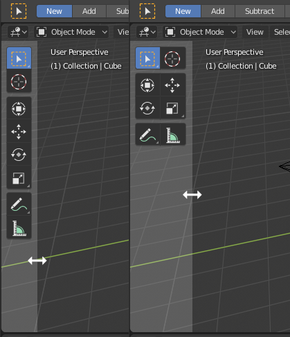
So on the left that drag was too low, so we make it not work and ignore use complaints there. But it does work if you move up slightly, but then after the drag the area that did work suddenly does not?
You can just drag on the part where the actual toolbar is?
So you place your mouse in a position where there is content in the region, as shown on the left below. You drag to the right so the columns increase to two. You change your mind and try to drag it back, but it no longer works from there?
This bit again:

In 2.79 it looks like:

where the active area in the corner for splitting regions is visually indicated. Also in 2.79 it’s just the upper-right and lower-left corners that are active and labeled in this way so there’s no way you can grab the wrong side.
In 2.80 all the corners are active and none of them have any visual indication of the active area other than the + cursor.
So the problem comes when a user is trying to act to split or merge two regions using the mouse. Because there’s no visual indication that what you’re really doing is grabbing a corner of the window, the eye is drawn to the point where the two regions meet (the very top of the vertical separator bar) and indeed if you point at this area the mouse cursor changes to a + but whether it works or not in the way you expect depends entirely on whether you’re clicking to the left or right of the center point, and if you get it wrong it will seem like it’s not working right. I have seen this be quite frustrating to people until you explain that they should instead aim for the corner of the window they want to affect.
There’s only like a single pixel width to the vertical separator bar drag area at the top, so it’s easy to entirely miss that it’s not a single active area for the + icon, and again as you’re drawn toward the center it’s likely that you may click on the “wrong” side about half the time.
So, in addition to the + cursor, could we possibly have the active corner area of the region highlighted when the mouse is over it, thus indicating both the active area and which region it’s associated with?
Or can we replace the single + cursor with four separate little arrow cursors pointing into the region whose corner you’re going to be clicking?
Alternatively if we just move the active areas a bit farther apart so that it’s more obvious that they are separate things that would help somewhat.
I can see how that would help with the placement of your cursor at the corner, but arrows might not make sense. The actions you can do from a single corner could be to split that same area (in one of two different directions) or to join with an neighboring area. So arrows don’t seem to tell the right story about possible future action. Any other ideas for the cursor that might work better?
How about if the cursor changed into a solid triangle shape, so similar to the old visual at the corner? That way it wouldn’t be implying a particular action, but would change as you move between areas at the corner.
Yes. That is preferable overall yes, especially when the toolbar has no alpha.
Yes, it has been pointed out to me that this is a pending potential patch:
https://developer.blender.org/D4264
so hopefully soon!
Viewport visibility icons can’t be keyframed in 2.8. Not sure if this is coming back to 2.8, but I’m hoping it will.
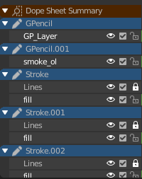
when working in the grease pencil dopesheet you don’t really have a chance to know which keyframe belongs to which object even if you named your stuff in the outliner, because it displays the name of the grease pencil stroke object.
Suggestion: 3 ways to tackle this.
Auto rename “shape object” of grease pencil when object gets renamed
show object names in dope sheet
filter to selected objects in grease pencil dope sheet
Will the industry compatible keymap have shift + select to select every vertex/edge/face in between the first and last click, like both Microsoft and Apple have in their file managers since the last 40 odd years?
At least on Mac, it doesn’t work this way many places. If you are using icon view, shift-selecting does not select all the in-between icons diagonally.
Normally, this behaviour is only applicable if you are using list-view. Selecting distinct objects or vertices are not akin to a list-view. What if you shift select several objects - is Blender supposed to select the objects in-between? Obviously not.
Path selection is more obscure and less commonly useful than simply adding to a selection, so no, I would not promote path selection to replace regular additive selection.
I did not mean replace. I meant switch the shift + select and control + select behavior.
If you control click two icons in any view in any file manager, you only select those two icons. If you control click two vertices/edges/faces in blender, you select everything between those two.
Similarly, 3D Studio Max has control to add to a selection and alt to remove from a selection. Shift can be made to select everything in between in Max, but the behavior there is a little tricky to describe.
That was my point, and my paper cut.
(Also, I wasn’t easily able to reverse this myself in the preferences, which is why I asked.)
I don’t understand. Ctrl-click to do path select already works. What is your point?
Similar as with right-click select in old Blender is left to select everywhere else, shift select behavior in Blender is control select behavior everywhere else, and control select behavior in Blender is shift select behavior everywhere else… sorry, English is not my native language. I think I’ve run out of ways to describe my dilemma now (also edited the last post with another example). 
Why is the 3D View header transparent?
You try make full-height sidebar work like a floating panel, using transparency and other hacks. OK, I understand what the idea is. But why is the top panel (header) transparent? These flying in the air buttons look very strange, it looks like “Overlays”, and different from other editors. To save 20px of the viewport? It wasn’t the right idea.
Are you asking for the reason why other people might prefer something that you do not? In far less time than it takes to ponder such a question you can just change it for yourself, save the preferences, and see it exactly as you like it from then on…
There are many new users who may be confused by this unusual UI, and may not know that it can be changed.