You might be interested in this, too Blender UI paper cuts
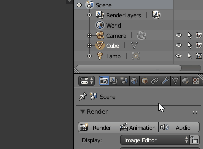
Viewport visibility icons can’t be keyframed in 2.8. Not sure if this is coming back to 2.8, but I’m hoping it will.
2 Likes
when working in the grease pencil dopesheet you don’t really have a chance to know which keyframe belongs to which object even if you named your stuff in the outliner, because it displays the name of the grease pencil stroke object.
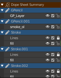
Suggestion: 3 ways to tackle this.
Auto rename “shape object” of grease pencil when object gets renamed
show object names in dope sheet
filter to selected objects in grease pencil dope sheet
Will the industry compatible keymap have shift + select to select every vertex/edge/face in between the first and last click, like both Microsoft and Apple have in their file managers since the last 40 odd years?
At least on Mac, it doesn’t work this way many places. If you are using icon view, shift-selecting does not select all the in-between icons diagonally.
Normally, this behaviour is only applicable if you are using list-view. Selecting distinct objects or vertices are not akin to a list-view. What if you shift select several objects - is Blender supposed to select the objects in-between? Obviously not.
Path selection is more obscure and less commonly useful than simply adding to a selection, so no, I would not promote path selection to replace regular additive selection.
I did not mean replace. I meant switch the shift + select and control + select behavior.
If you control click two icons in any view in any file manager, you only select those two icons. If you control click two vertices/edges/faces in blender, you select everything between those two.
Similarly, 3D Studio Max has control to add to a selection and alt to remove from a selection. Shift can be made to select everything in between in Max, but the behavior there is a little tricky to describe.
That was my point, and my paper cut.
(Also, I wasn’t easily able to reverse this myself in the preferences, which is why I asked.)
I don’t understand. Ctrl-click to do path select already works. What is your point?
Similar as with right-click select in old Blender is left to select everywhere else, shift select behavior in Blender is control select behavior everywhere else, and control select behavior in Blender is shift select behavior everywhere else… sorry, English is not my native language. I think I’ve run out of ways to describe my dilemma now (also edited the last post with another example). 
1 Like
Why is the 3D View header transparent?
You try make full-height sidebar work like a floating panel, using transparency and other hacks. OK, I understand what the idea is. But why is the top panel (header) transparent? These flying in the air buttons look very strange, it looks like “Overlays”, and different from other editors. To save 20px of the viewport? It wasn’t the right idea.
Are you asking for the reason why other people might prefer something that you do not? In far less time than it takes to ponder such a question you can just change it for yourself, save the preferences, and see it exactly as you like it from then on…
1 Like
There are many new users who may be confused by this unusual UI, and may not know that it can be changed.
Yes, but that doesn’t change anything really. Your question was “Why is the 3D View header transparent?” If the header was changed to an opaque green, then someone else could then ask “why is the header green?” That person could similarly argue that the default should be as they prefer it because new users “may not know that it can be changed”
So is your comment really about the header not looking as you like it? Or is it about not knowing about themes and such? Could that be made more obvious in some way? If so, let us know…
1 Like
Lol. I guess he’s just wondering why the header is not “normal” like the header on most softwares.
@jenkm If you want that “professional” look, just turn off region overlap in the preferences.
Why the header is not “normal” like the header on other Blender editor.
And is this better for default values? What is the purpose of this transparency?
The comment was not about my preferences.
In all seriousness, there is probably a good argument for making the default theme, in a few ways less ideal…
What I mean is that the header could be partially transparent by default. And the same for both the N and T panels. So the header being partially transparent would better inform that it could be changed (somehow) to being less so or fully opaque. So seeing it in an in-between state would help inform that the system support a range and therefore can probably be customized.
Having the N and T panels partially transparent would not only serve the same purpose, but would also remove the complaints mentioned above, about the confusion of having an invisible panel edge that can be resized.
So yes, for all of us the default theme would be a compromise that could be considered just a little worse. But then all of us can easily change it, and the newbies would be more led to change it.
Hard to explain this well in writing…
2 Likes
I’m just curious, by shift-clicking two vertices in 3D space the question is: “how would you decide which vertices do lie in-between if vertices aren’t aligned (e.g. diagonally placed)?” I actually really like this idea and hope it’ll work that way in the outliner, but I’m having a trouble imagining a 3D example.
It’s all about the theme. Someone made it, right? Therefore the author likes it that way. And somehow it became the default. So there’s nothing you can do but change it yourself.
In fact, I meant that transparent sidebars make sense because they allow you to see more work space. But the transparent header doesn’t make sense, it’s too small.
It’s not about the fact that like someone, but about the fact if it has some meaning.
So I’m not suggesting a big change, just making the header and side regions have a small amount of opacity rather than zero on the default theme.
So for the header it better shows that there is something there and it isn’t just gone. If the impression is that something does not exist at all then you wouldn’t ask the question “how do I make it look different”.
Similarly, the side tool region clearly shows an edge and therefore would make sense when the mouse pointer changes into one for “resizing”.
Once you know how to change theme preferences it can look how you like, but you’ve already learned two lessons: the header exists but can have a color and transparency. And that the side panel extends to the bottom. If you later make it invisible you still know why the mouse behaves as it does there.
6 Likes
Similarly if we’re going to be new user friendly, I’m surprised the Tool pane is collapsed to icons-only by default. I hate being asked to memorize icon meaning in software and I’d really like to see it expanded to show the tool names by default. This is another case where it only takes a moment to collapse it once you’re familiar and want a little bit more screen space.
Especially in Edit mode where there are a lot of twisty little icons all different.
I definitely like the light opacity on the Tool panel since as you say it makes the dragable edge understandable and noticeable, rather than being weirdly off to the right when the background is 100% transparent.
I am in favor of changing them all to have a low non-zero opacity as suggested.
2 Likes