Looks like long operator menu is not scrollable, at least I didn’t manage to scroll ant landscape menu, tried mouse wheel, pgup/pgdn, arrows, mouse click&drag…

Right now change between sculpt brushes is worst than in blender2.79. Do the devs have any idea to improve the way to select brushes?
The only thing that blender2.79 needed about this was a improved brush selector popup (that resize when it’s necessary) and a hotkey to show over the mouse position (like in Zbrush). Now to select any brush you need to remember the brush type, change to that type of brush and then click in the brush icon to show the classic panel and then select the brush.
will we have a improvement on this? or do we have actually a way to avoid that?
3 Likes
Currently the active tool parameters display that is now an independent “pop-up” in the lower left corner of the 3dview has, as far as I know, no options for affecting its position on the screen. In a BA thread someone asked if there could be an option to get it closer to the mouse working area because on very wide screens it ends up being a long reach.
So something simple would be to have an option to center it in the view rather than being at the lower left, or ideally it might be nice to be able to drag it to any location in the view.
Edit: Ok, never mind, I can re-create the screen.redo_last keybinding to F6 that existed in 2.79 and that pretty much takes care of it. I think this would be a useful re-addition to the standard keymap. Searching shows no conflict with F6 as an available key.
The text of the buttons of the physics section on properties area are not centered
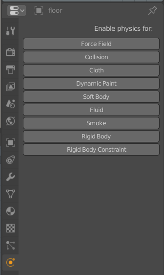
EDIT: and should the text “Enable physics for:” be justified to the right?
3 Likes
i vote for icons! 
4 Likes
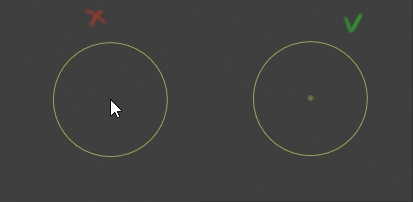
Dont know if it was here but the change of mouse cursor in sculpt mode with a dot would be appreciated.
26 Likes
To keep it clean all you would really need is for the tick marks to be longer to indicate each 90 degree.
1 Like
hell yeah!
This is bugging me since ages.
1 Like
Id like it if the add dialog (bottom left after adding a primitive) would allow for setting up sizes x, y and z when adding primitive. Currently it only allows one size for all axes.
Also I like the proposal in right click select which suggests to have a field called name above all others where the recently added object could be named. I think it’s a great idea.
2 Likes
It was a while before I noticed you can edit the world in the shadier tab. So similar to how the material nodes update depending on what object you have selected. I think it would be great if you deselect or have nothing selected then it would automatically go to the world nodes. It is a simple idea but faster way to work and faster way for beginners to discover.
1 Like
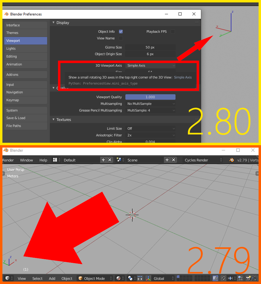
3d Viewport axis widget now disappears during transform operations.
It does not matter if it’s set to Interactive Navigation or Simple Axis in the Preferences. That’s probably one of the worst little things that bother me. It is going to be hard to get used to this since I always check the axis after starting rotation before I constrain it to x, y or z with the following keystroke. It does not seem to me like that’s a good time to hide it. It does remain during transform operations in the bottom left corner in previous versions and seems to be quite useful to me.
5 Likes
‘Now’? This has always been the case, back to at least Blender 2.0 in the late 90’s/early 2000’s. We could change it, but the header contents disappearing while transforming has always been the case.
@billrey , I am not talking about the header that the widget happens to be a part of now. I am talking about the widget itself. You can see it visible at the bottom left corner in the GIF in 2.79 view-port. As far as I know there is no way to replicate the functionality now. Maybe the view-port axis could be outside of the header if that is what causes it to disappear.
I think it would be nice to see the axes all the time, wasn’t that the whole point of it before it was meant for easier navigation with pen tablets and touch screens? It was there to help one know what the directions of the axes are in relation to the view. I find it useful during transform operations as well. Is this something that only makes sense to me?
The grid axis helps with this problem in my opinion…but I don’t see why it could not be kept. If you have grid disabled it may be useful though.
Also, it could be nice if it changes when double-tapping to reflect a local transform axis? I always have trouble remembering the local axes of my objects.
The grid lines are hardly ever visible in anything but most simple scenes. I am surprised I don’t see more people mentioning this, I work with archviz and have to rotate and move stuff precisely all day long viewing it from different angles. It sometimes gets a bit confusing with a lot of technical drawings imported as lines and the widget is really a lot of help to me if it is on screen all the time. I thought other people use it to know what they are looking at a lot as well. If it had other functions like showing local or selected transform orientations when they are active, that would be very cool as well, but that would be new features. To be honest after testing 2.80 on a real project for a few days, I think it would be amazing just to have the old functionality back as well. I think it is a matter of me not being used to it to some degree, but I also think it would make sense to be able to see it all the time no matter my habits and preferences. Just a little thing but it makes a small difference.
Yay, this papercut was fixed! Much love! 
what was the reason to hide UI elements during object transformation in the first place, does it still hold? I don’t know if it is hard to implement, but could we have an option inside of settings (like transform on mouse release) to leave UI as it is?
1 Like
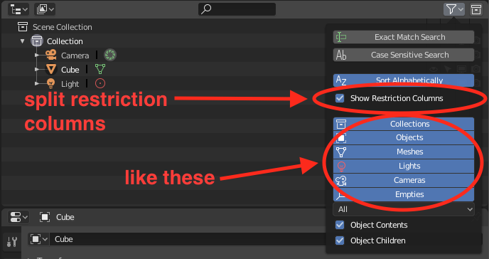
restriction columns take up more visual space in the outliner than actual objects. I personally always end up hiding them completely, it would be nice if we could separately disable at least those we use rarely.
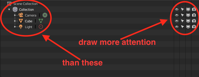
one suggestion would be to separate them in order to be able to activate them one by one
3 Likes
I know that many users have complained about the layout of object transformation properties and that @pablovazquez ended up changing it from a single column layout to a responsive one. I suggest to remove two column layout:
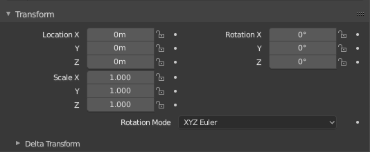
since it is harder to find a transformation label (Rotation or Scale) than in other two:
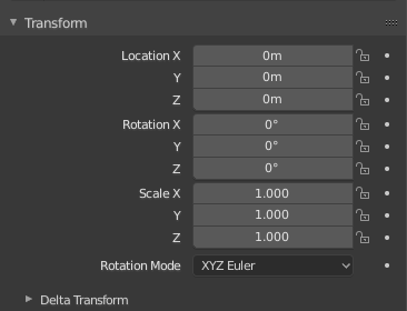
and
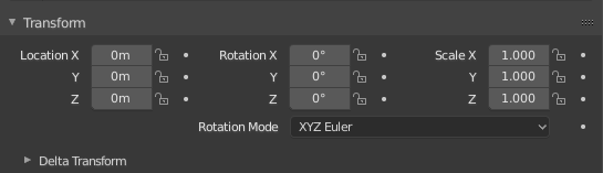
where we can scan either vertically or horizontally aligned labels
1 Like
This would be nicer but I’m not sure if our layout engine supports this. Will investigate.