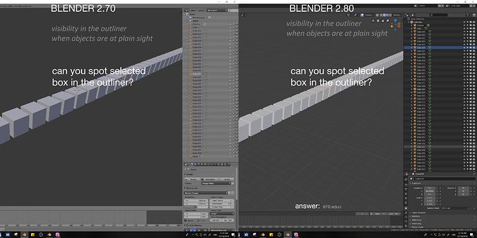
I love the new outliner and Collections. Now it is much more important part of the workflow, and after using 2.80 in a first project, I noticed something which classify as papercut “A small, isolated UI problem that makes using Blender annoying”. Here is a little quiz, I think my point will be clear. Directions: Try to find selected object from the scene in the outliner, preferably in a single glance
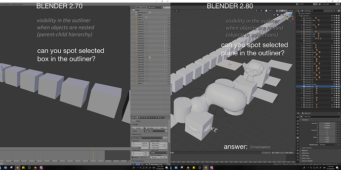
Now, something even harder:
I hope that we can all agree that readability of selected objects from the scene in the outliner is difficult and after short time using it, produces strain in the eyes. I don’t know how much customization can be achieved with the custom themes, but I think that default theme should clearly highlight selected objects. It is true that outliner got some improvements in the selection within it (blue srip) and needs just a little bit of work to be perfect!

