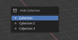
This part have some problem, like that you can unhide all collections pressing alt+h.
As far as i remember it never worked that way. Before 2.8 it was like this :
H - hide objects
Alt-H - unhide all objects in the CURRENT layer. (now alt-h unhide objects in ALL collections, even if some collections are hidden in the viewport)
Q - toggle visibility of all layers (show all of them, or press again to hide all of them, except the current active layers (it didn’t affect them, they remained visible). I couldn’t find any setting in 2.8 to do that.
Insted 2.8 has ctrl H hotkey wich is really confusing menu. Looks like this :
I bet, anyone initial thought would be it HIDES SELECTED collection based on the menu name. But it actually HIDES EVERYTHING EXCEPT selected collection.
1 Like
Yes, for that reason I told that it is a problem. Because the expected behaviour is not “hide collections” is “Disable in viewport”
Disable in viewport don’t interact with hide or unhide parameters of each collection or objects. So we really need that
press 1: enable only collection1
press 2: enable only collection2
press shift+2: add to enable collections the collection3
press shift+2 again: disable collection3
1 Like
just a test of study …
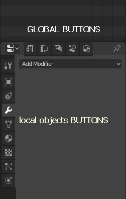
because at the moment, I find that horizontal bar with only the name of the selected object a waste of space and useless.
so since between the buttons there are two categories …
-
global buttons that relate to the scene
-
local buttons that relate to the individual objects
… here is a quick little draft proposal … obviously to be improved …
The buttons have been moved from horizontal to vertical because they were too long compared to the short space, but only the global buttons, in that short space could be more comfortable in a horizontal return … it would help to better distinguish the categories … especially with the mono color icons …
also with a division like this the panel area could be made more compact when needed, keeping all the buttons available
4 Likes
All that problems in the inteface could be solved with two things, editor in tabs and divide properties area in object, render and world. Or object and global properties.
there is a sort of anti-max allergy in the air… 
so my proposal is only visual …
but I agree … my motto is more context selected and more predictive sync pannels
edit:
think of it better, with this subdivision:
-
the context select for local objects buttons … could work better in sync with outliner
-
while the Global buttons, are selected manually only when it is necessary to make changes to the scene, and therefore they are disconnected from the fact of being in sync and from the selected objects

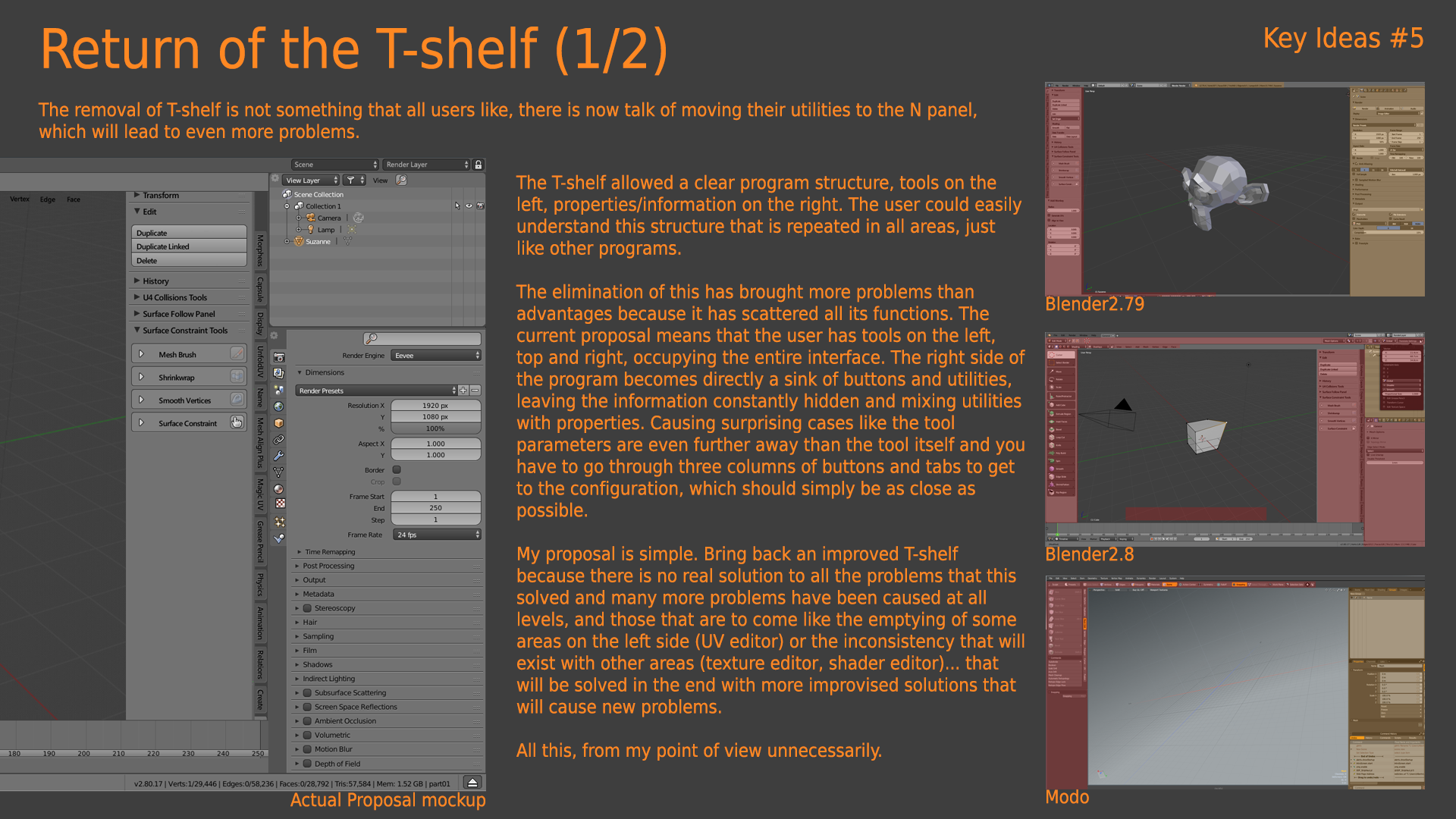
Hey, folks, please take a close look at these screenshots and then vote which one you like more, which one is more readable for you, very interesting to know. Thanks.
- I prefer the old, single-column version.
- The new four-column is better.
- It doesn’t matter, I use hotkeys.
0 voters
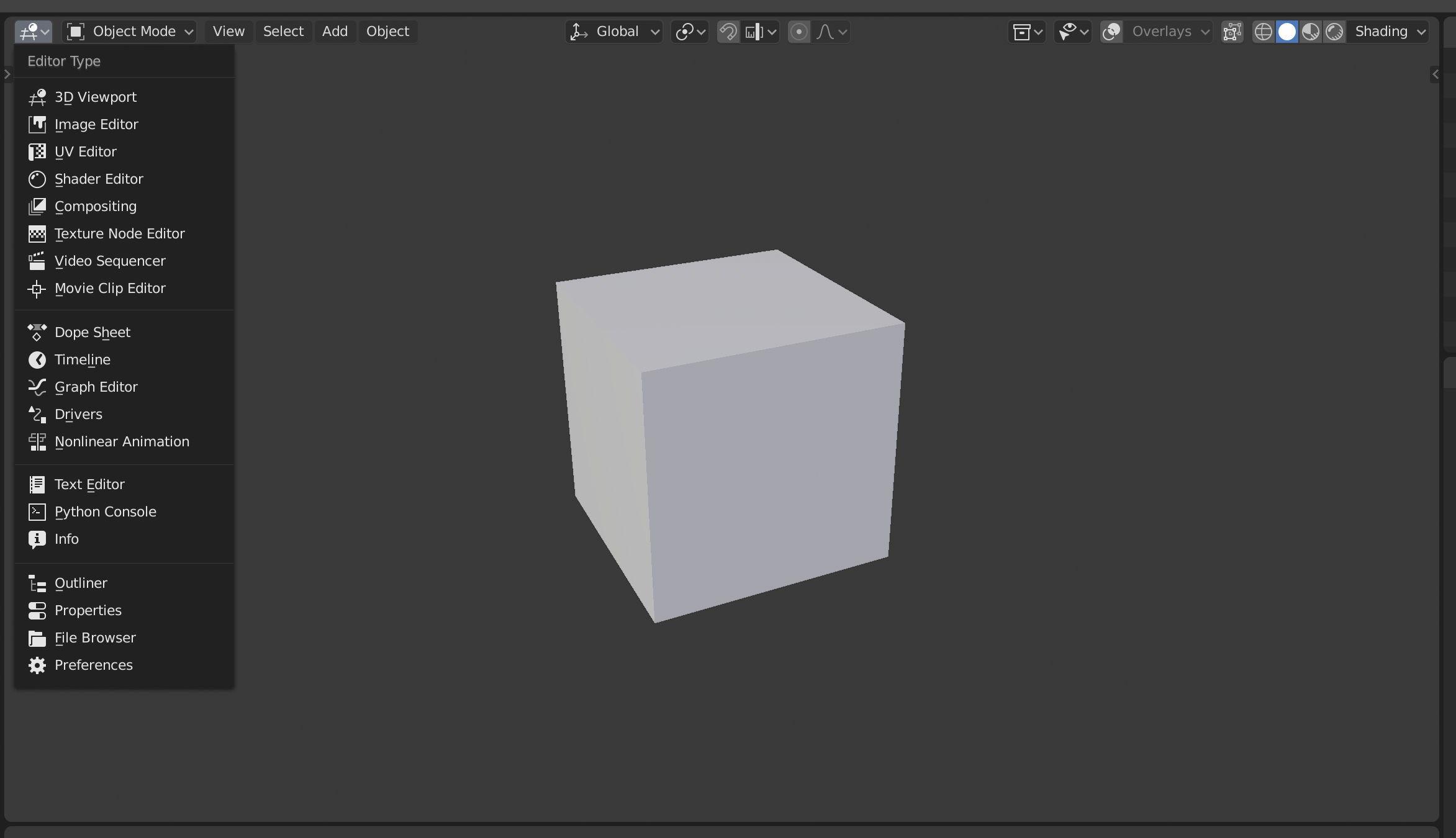
I didn’t notice before… but blender2.8 UI is a copy of the Affinity software, right? or at least have a lot of references…
Topbar, workspaces, info bar,…
look a few tutorials of 3dcoat and you will notice a lot of resemblance in that direction, not only in the UI.
The main difference is that 3dcoat has per “workspace” tools but blender has tools per editor, so the workspace and topbar its a bit more difficult to implement.
I can’t tell if it was inspired or just an accident but 3D coat its the place to look for things that will work or won’t work in the actual path.
No, 2.8 is photoshop + modo. And since affinity photo copies photoshop, then 
Obviously the old is better. Why ask? lol
I know, I know. But I told because I have seen the same problems in same parts. When this parts don’t have that problems in photoshop.
- An useless topbar
- An info bar with hotkeys
- Divide the program in workspace with custom topbar each one.
Currently there is a Number Field and Value Slider, both allow you to click to input a value, and drag to adjust. The Number Field has additional step buttons, I see no reason why the Value Slider can’t have the same buttons with step 0.1, this was very useful.
Also it will solve the alignment problem.
6 Likes
I think it’s completely random …
I am of the opinion that the coincidence stems from the fact that the UI Designer William is a mac user, he is used to his os environment and many applications on the mac tend to resemble each other … and therefore he has consciously or unconsciously transferred much of the philosophy environment on which he is used to working on blender
Hello friends!
I don’t speak English very well, but I hope I’ll get my message across. 2.8 float menus problems:
One column grid - OK
Shortcut column - OK
Sepparators - OK
New monochrome icons - BAD
Horizontal grid - BAD
9 Likes
Hi engine9, that was warned in the beginning of blender2.8 development but ignored.
2 Likes
The brain stuff is nonsense But goddamn do we need to bring back coloured icons. It’s so obvious when seeing those two screenshots. It’s just so much easier to identify elements of the image. White icons are a fad.
3 Likes
Someone wanted to make a multi-column menu, okay, but where are these columns?
Take, for example, the “Add Modifier” menu, here are very clearly separated columns, a lot of empty space between the columns, and icons of a different color serve as a separator.
And more, look at the brush “Blend” modes menu, it looks like it was broken in half. The ugly hack.
2 Likes
i agree “with the brain stuff nonsense”
in fact it doesn’t matter what does what …
but it is important to make it clear “what and how we were trained to work” with respect to “what and what ways we are forced to re-learn” … I also wanted to highlight that now there is a clear imbalance of “stuffs” in right…
this is a synonym that we want to imitate “a standard of other software” … and it is evident that this standard is followed by the most hierarchical people, which is not a totally negative thing, but this attempt to bring the balancing from one side to another … and above all to evaluate if it is a positive thing in the long run …
yes … on icons and lack of color is a problem for many …
but obviously not for everyone, not yet.
edit :
addendum on brain work
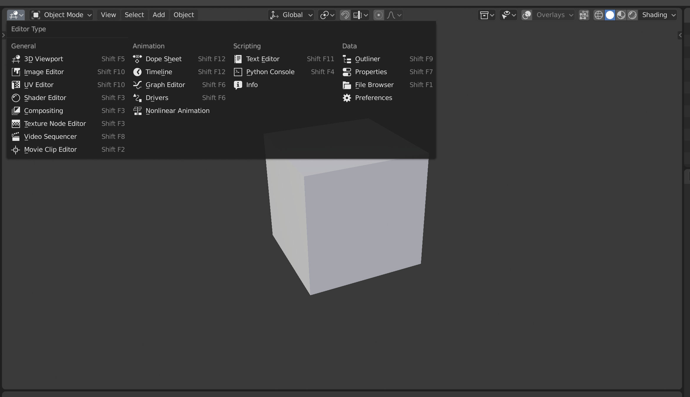
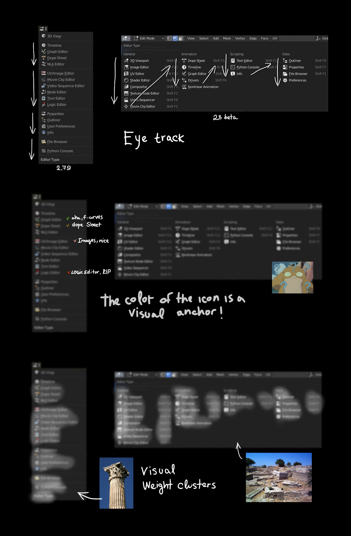
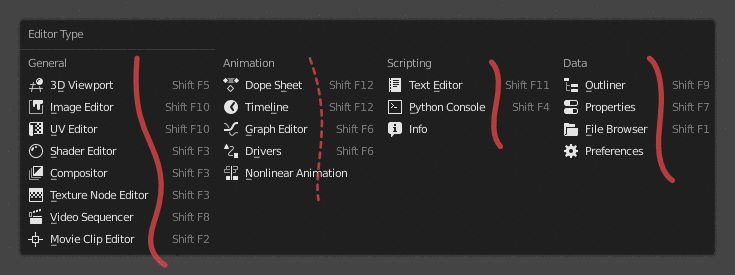
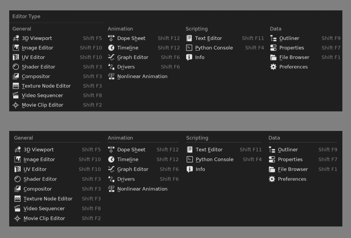
I personally have problems with the Editor Menu that have more to do with balance, padding, alignment, etc. I don’t quickly read it as four columns of options.
So in the following image the top part, how is now, looks a bit of a jumble to me. But the bottom section looks more like four discrete columns that I can more quickly scan individually.
12 Likes