Use the scroll wheel?
Damn, that was so silly. Yes it does work. I was just used to the softwares where dragging an object to the edge of a scroll view would make it scroll automatically in that direction.
Yeah, it’s a feature few ui’s have, but in my opinion is soo much better than edge scrolling.
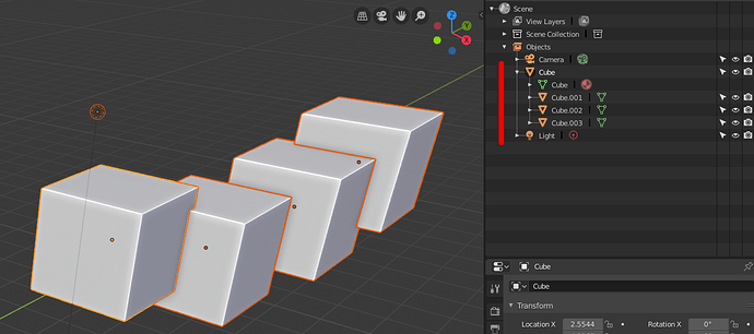
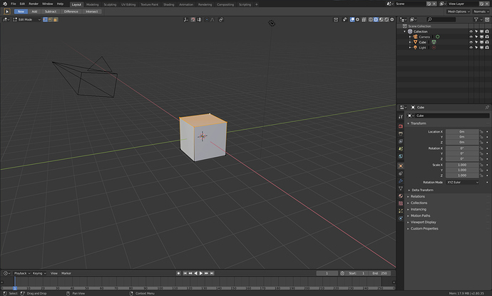
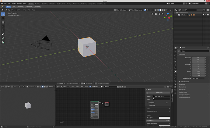
Am I the only one who is missing visual indication of multiple selected objects in Outliner ir Scene mode.
Just select multiple objects in scene - and only the active object gets hilighted in outliner.
In Collections mode (flat hierarchu) at least Icons get hilighted in outliner, but not in scene mode.
Here I have selected whole hierarchy of cubes (see 4 pivots in viewport, meaning all are selected). Nothing shows that in outliner.
No, the outliner is a horror show of ux nightmares currently, but I’m very relieved to say that @billrey mentioned recently that selections between the viewport and outliner will be unified in the future:
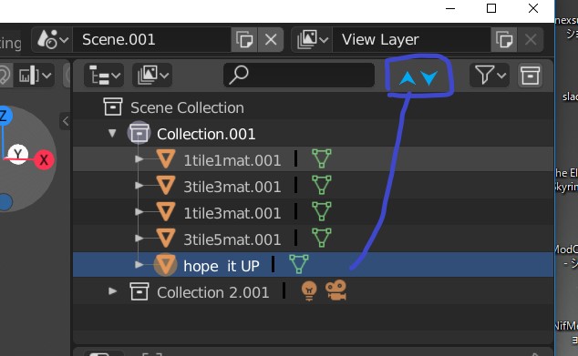
One thing I still not clear aboout 2.8 outliner, Is there way, to just move up and down about each object order in collection ( outliner)? I could find setting, to sort as alphabetically.
And I can move up-down as collection. When I drug obj in collection, I can see
“Move inside collection”. I know it work for parent and link, but to just change order,
it seems not work.
I like the way, we up down shape key by arrow icon. Even though there is no arrow, hope it will be offered , as modifier key (or as option menu) , we can change position (order) .
Move up down asset free in same hieralchy (collection or group), is usuall about most of outliner app.
I think it may need hard change code, but if it is arelady on timetable, really apreciate.
if not I think, if we can not move it manually, it is not outliner.
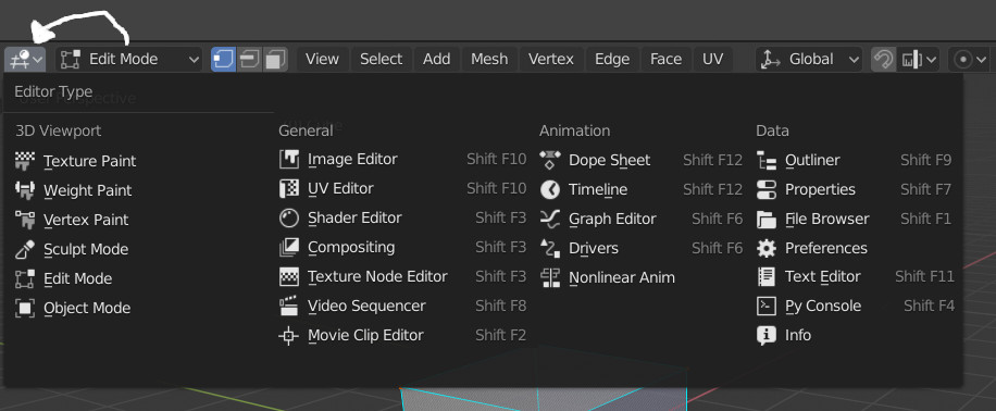
HUD is a bit crowded, lots of things could be combined into a single button. Area Type + Interaction Mode, Snap Toggle + Mode, Proportional Editing + Falloff, Collection Visibility + Object Visibility.
Right now I’m just disabling the stuff I don’t need up there like component types and collection visibility.
Couldn’t figure out how to do this myself so I made a mockup for Area + Interaction. Throw the interaction types into their own section called 3dviewport, keep general minus 3dviewport, keep animation, throw scripting into data.
Would be same width and one line shorter, plus one huge button out of the HUD
Also I think that the default “View Layer” mode is very confusing for new users - people don’t understand why parenting is not working and how to build scene hierarchies. This should not be a default mode!
To be honest, also for me (with multiple years experience in Blender) constantly switching between View Layer mode and Scene mode is very confusing. I need to organize my assets in collections, but I also want to see the object hierarchies of individual assets at the same time. I don’t have solution for this, but current state for Outliner seems super confusing and not practical. Are there any ideas out there on how to improve it?
Another thing that I really miss from 2.7 days is Single scene view mode in outliner. I tend to have multiple scenes in my blend files and It is just a visual clutter to see all of them all the time. Also there is no automatic folding/unfolding when switching scenes. It would be nice just to have option to display just the active scene.
It has a big problem. That newbies couldn’t figure how to change the edit mode because it’s a little control.
Also that it could create a lot of problem for new users, changing edit mode when they interact with a random editor, like properties.
Why don’t you also expose the world editor? Right now you have to go to the shader editor and switch to world, I think it would be nice if you go directly to an option to go to the world panel as well.
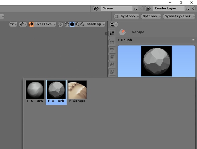
What is the idea with sculpt brushes? It’s sorting them in categories, making it impossible to show all brushes, consequently I have a lots of custom (fake user) sculpting brushes I can’t find.
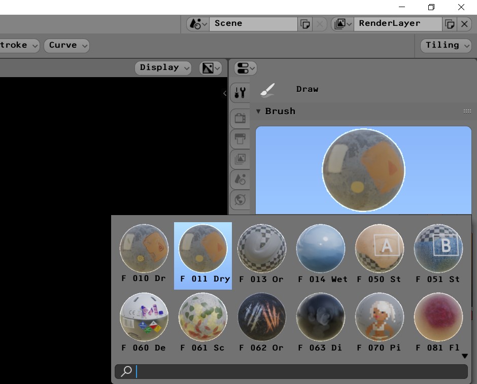
This is not the case with texture paint brushes, clicking on the icon reveals all available brushes and I can use my custom ones.
Is this a feature or a bug? Should I report it?
You can’t design ui around the totally lost, not to the detriment of actual users. There’s a cutoff that is crossed, and this would fall into that.
The first one doesn’t tell you much about what it does by looking at its icon. You have to click it and see what it does. That is the way new people are going to figure anything out. You make it where people who have spent a little while with it have something less crowded, because noobs are always going to be lost at first.
At the very least you could combine the two where it says whatever mode you are in, like the second one. Or just make the icon a little more descriptive. Or just make the whole thing a menu, called mode.
Removing HUD bloat and making it dumbdumb friendly aren’t mutually exclusive.
These things don’t need to be separate, they just happen to be that way right now. They basically do the same thing, change modes. The way I was going to do it was have the interaction modes switch to 3dviewport if the current area wasn’t already there, and change mode to whatever it is. There’s no confusion there because it changes whatever panel you are on.
I might have another go at it but I barely know what I’m doing
I understand what you’re saying, but that button is the most important of the program, I already think it’s even small and hard to find.
And if, the interface is now full of buttons, it was something that was seen to come (and it will be worse when the program begins to have plugins, that the right part will give absolute disgust). But I think you can order the interface and improve without touching that particular button.
This is a old mockup that I made
That is a lot nicer and I like the colors for properties tabs. Personally I am just going to get rid of both the editor type and interaction mode buttons once I make a handful of workspaces. Can easily uncomment them to bring back, don’t even need to rebuild blender since it’s python script
Thanks
In other mockup I made a version of editor that had not a button for editor type, it was changed by a little gear, near to invisible. And the edit mode menu was part of a different “topbar”
More text here and there.
I know some people would scream “Give me those 25 pixels back!” referring to the lower header, but take it easy: it’s not gonna happen anyway ![]()
are you referring to this?
Proposal: Remove bottom headers
https://developer.blender.org/T61244
I understand for technical reasons they are right, but I admit that removing a function that I have been used to using for 20 years, makes me angry like a hyena. and not for rational reasons ![]()
![]()
![]()
The ability of some people to limit blender is amazing. “First I put the header up, now I force to not be able to put it down because I feel like it although there is no reason to do so.”
-Can you leave it optional that it doesn’t hurt anyone?
-Yeah, right. What’s so funny about that?
Every day is clearer that “With 2.8 we will make a more customizable interface” does not mean the same in my country.
-Do we make the blender interface more customizable?
-Okay, how?
-I had thought of removing all customization options
-Brilliant, magnificent.
Wow, I can’t believe that was even conceived, it’s basically just a giant middle finger idea.
Part of the problem with the 2.8 interface is that commonly used areas are all over the damn window, and top headers are in a big part to blame for that (aswell as the top-bar). Flipping them back is one of the few things that can help fix the issue.
And leaving them at the top doesn’t even fix the issues with the popovers, that’s got more to do with them being near an edge of the window than anything else, which will happen anyway, just have any kind of editor down where the timeline is.
Thread is too long to read, so i don’t know if it was aksed before. But shift+ numbers (1,2,3 etc) behave differently from the layers before. They don’t toggle visibility, they can only extend it but you can’t hide collections like that. For example before 2.8 you could switch between layers by pressing 1,2,3 ; you could press shift +2 to extend and it would add layer to the current veiw layers AND you could press shift+2 again to hide it (so it was like a toggle for one layer) was really simple and useful.
In 2.8 you can’t do that. You can only add by pressing shift+2 and it will extend but you can’t toggle it. Is it intentional or just a bug?
Here is 2 screenshots.
- 2.79

Toggle is on by default and does exactly that. - 2.8
Toggle is of by default and when you turn it on it doesn’t work. Seems like it adds “extend” behavior instead
