Like that!
9 Likes
Hi!
Probably it’s too late, but i would like to tell how i wish Blender 3D Viewport interface would be perfectly new&classic ( have to say that i like it a lot, but i feel a kind of lost of logical placement [in my thoughts i have the students i teach last year ] and with a pair of things the change could be hardless and good 4 the future too [i think])
1.-Select- cursor- Basic transformations-etc in the bottom (just direct opposite of transf. orientation snap etc…)
2.- [“T”] Tools of each (selct-cursr-B.Transf.etc) in the left. ( more vertical space free)
3.- The new info mouse line to rest the eye down of the menus bar info( if it’s gonna be immovable)
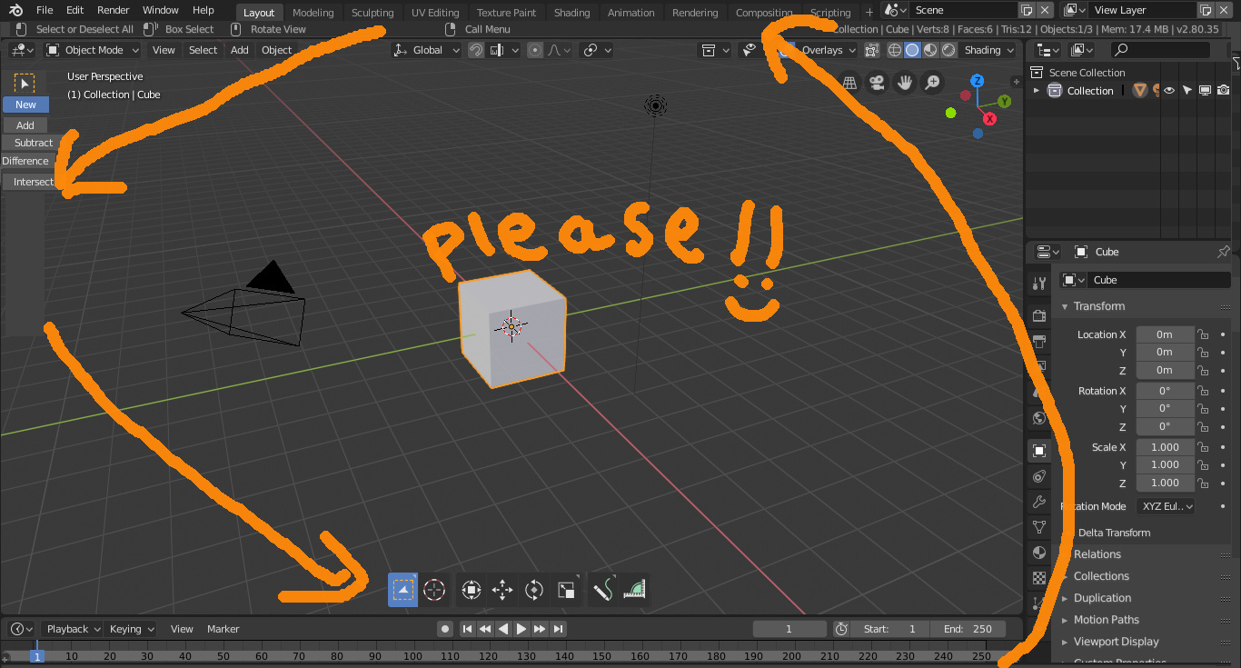
(1 thing beautiful of the last interface were his modular editor windows, it is just one funny unique game that’s a pitty to lost it; Now the new info mouse line and the new menu/ex-info editor are obligatory :~( i wouldn mind if were in the proposal distribution ;~)
Thanks a lot for being free in a crazy world and excuse my english.
6 Likes
Yeah, gread idea, I like this design too.
…don’t know if the place to post this would be better in PAPER CUTS?
1 Like
Ah, silo style. Yeah, would be pretty sweet to dock the tool pallet there at the bottom with horizontal layout.
I like it. Active tool buttons are set on bottom center area, It much as main tool. and it seems logical.
from monitor ratio, we can use short path to click these buttons.
My favor is each sub options eg (“add” “subtract” with border selection tool) are set near active tool.
then we can clear see, which option is used with curent active tool. maybe left side of bottom.
Current Active tool “option menu” location is good when 3d view window on left side. but it is not good place, when 3d view set on right side with monitor. these option menu seems better locate in each 3d window I think.
@bretcht, @ideasman42, sorry tagging you guys again, but is it viable? would be hard to implement?
this interface makes quite a lot of sence, the tools right in the center are easier to reach from anywhere in the viewport and this design is quite more appealing. looks like a toy box.
1 Like
Status bar on the top? Never. 
Tool settings on the left? Makes no sense.
1 Like
could you elaborate why it makes no sense? what issues do you see with it?
Just see the number of settings that appear in the topbar when in other modes/tools. That would require a large panel which would be pretty much a duplicate of the tool settings in the properties editor. So, pointless.
That would mean we could get rid of duplicated settings as they currently exist which would be a good thing in my opinion.
The thing about the side bar is probably debatable but if its already existing in the properties panel we can also get rid of it completely and users can pull out their own tool properties panel if they like to have one^^
I don’t like the topbar either. If it was up to me I’d change it completely, but it seems like there are some few fans of it
And i’m one of them, me likee the top bar
Doesn’t this just shuffle around a larger problem with the header, topbar and tools?
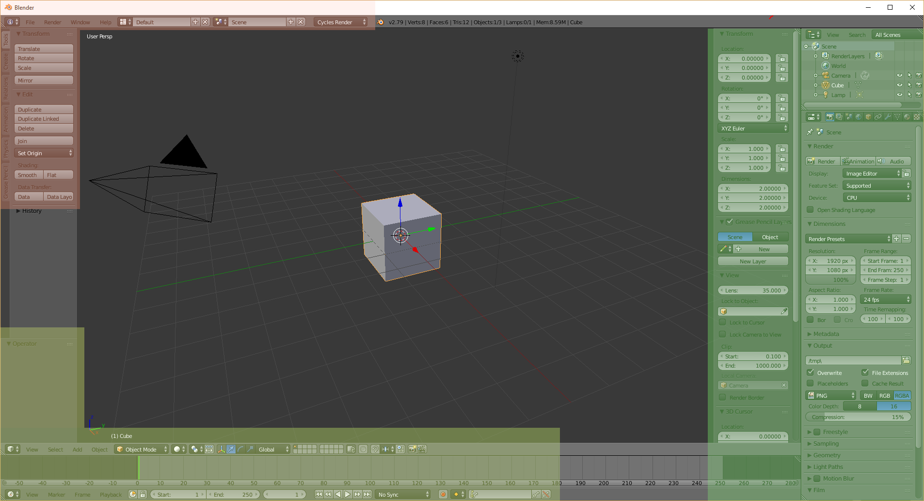
2.79, general use map
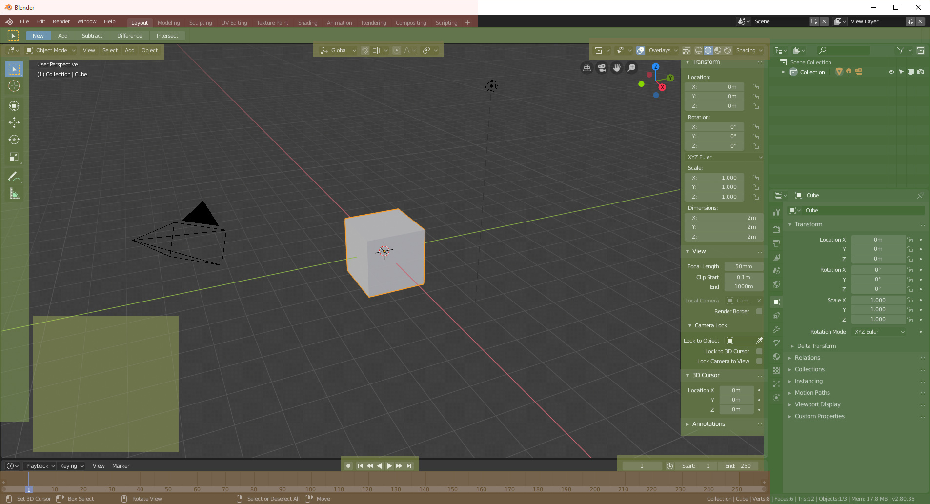
2.80 general use map
Why you dont like it? this is a great idea!, we could get rid of the tool settings panel and the topbar and throw it all to the T-panel (No duplicates!), the tools themselves are better in the middle, at least they are easier to reach!
1 Like
I’m against everything related to the T and N panels. Those are the worst things in Blender imo.
Oh, and the redo panel in the viewport is about to join that list.
if you dont like the T and N panel, where would you put the tools and settings? there must be a place and I dont think outside the 3dView is a good bet.
2 Likes
The tools should have their own customizable panel/palette so we could put it whatever we want in the interface. And the settings of course they belong in the tool settings.
1 Like
there is flaw in that design what about other modes like edit mode? the list gets bigger and addons can also add tools to the list making visually annoying to work with, we all like the viepwort to be clean, personally i like to use hotkeys to call the tools, or even hide the T panel and call it with it’s shortcut…with this design u can’t and status in the top-bar doesn’t make any sene it’s one of the weird things that blender should avoid as much as possible like many things it already has.
I like the design as it is right now, sorry. Hopefully the panels wont be moved again.
2 Likes