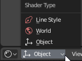
If bound is activated, I don’t want to see the wireframe, if I want to see the wireframe I choose Wire
instead of bound.
The bound option is now useless and it’s bad.
4 Likes
@Wazou
We’re not saying that wireframe-activated bound is a good thing. We say that activating the bound leaves the wireframe clean for life that we really need the modelers without being bothered by the XRay. In other words, what they must implement is the same option in wireframe mode.
1 Like
There could be an option saying: Keep Bound View in the overlays below wireframe checkbox (if checked).
1 Like
How about removing annoying popups in edit mode when every time you hover a cursor near any manipulator and it says: “bla bla bla this is a move too you can move items with it”? I wan’t to see popups with python tooltips, but i don’t want to see captain obvious tooltips on stuff like manipulators. This thing wasn’t there in 2.79 and it was fine as it was.
Speaking of widgets and gizmos stuff - why there is no option for for making manipulators handles thicker, where is the Hotspot option btw? It was in 2.79 but now it’s gone for some strange reason. If you added planar handles for move/scale manipulators where is the option for tweaking their offset and sizes? it’s a straight forward thing to implement.
Why Preferences in 2.8 exists in form of a separate window? there were so many talks on forums about blender’s “superior” windowless layout so that now it actually uses separate windows - that’s awesome! why not to make it’s ui like any other modern applications with dockable panels, shelves, and toolbars which can be easily filled with desirable tools via drag-n-drop, like in photoshop, maya, zbrush, 3ds, max, cinema etc? Why are you messing with those clunky hardcoded side pannels with colorful icons which only python nerds will be able to customize, why not to make it normal and more universal from the start?
1 Like
Yeah, please get attention on this
1 Like
Hi Everyone,
In Blender 2.8 there are many shortcuts have changed, some removed. So, I’m here to propose a keyboard shortcut reference popover in the help menu. That would be helpful for the existing users to know which shortcuts have changed. and also for new users will learn the shortcuts from the popover. If the shortcut reference UI has a “shortcut key” that would be really helpful to every blender users.
Here is my Idea in a visual format:
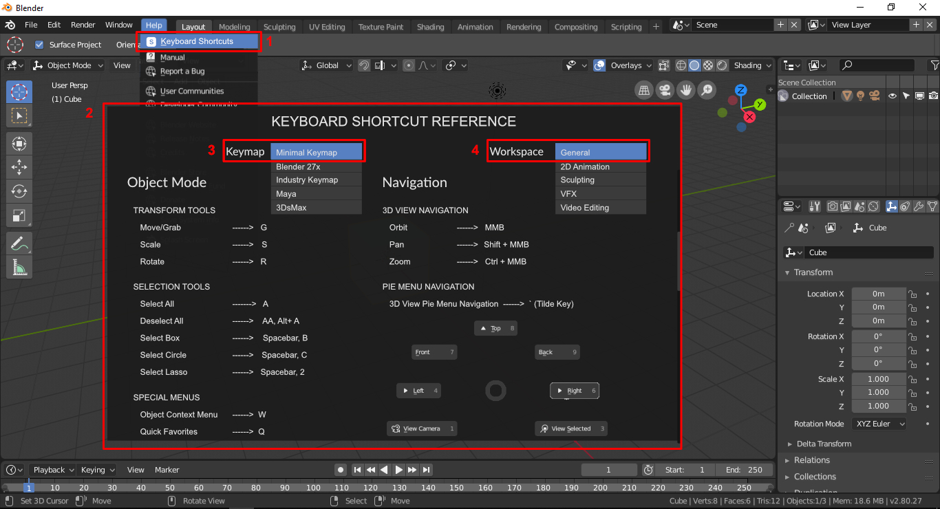
Thank You 
13 Likes
Vertical Properties Editor Tabs in recent blender build is nice.
little problem when not enough room. scrollbar is blocking tab
1 Like
I just realized, trying the new layout of the buttons that between changed icons, no more colors and the vertical arrangement, I do not understand anything anymore 
my mind is telling myself: “nice, you’re fucked, you have to reset everything and start all over again”
I think the vertical alignment is interesting, but it deviates from the rest of the UI quite heavily.
Useful, but it feels like it clashes with the rest of the UI’s design language.
Similar issues with the right-align of the single column layout. Every time I stumble using it because the readability is incredibly confusing. Everything in the UI is left-aligned, except for that panel.
Would it be an option to have a setting in the User prefs to right, left and justify align that text?
I understand some people thought the double and triple layout was confusing, but now we’re left with a panel that takes up ~2/3 of the vertical height of a widescreen monitor and has a lot of scrolling up and down.
All the other UI improvements are great, but I keep stumblimg on the properties panel over and over because it feels disjointed from the rest of the UI. It’s also one of the most active parts of the UI in many workflows so it might be good to have flexibility.
8 Likes
I like the vertical properties tab a lot and personally would like it to stay like this only thing am messing there are the render buttons from the scene tab. I feel that they were very handy there.

 A little glitch in the current build.
I had the same issue, but it was only when I opened one of my file, so I loaded it without “load UI” activated, don’t know if that will help for you.
In Blender currently we have to click “x” and choose from a menu to delete in edit mode. This could be simplified easily I think. Just pressing “x” after selecting an edge/s or vertex/vertices would just delete it away with any faces linked with it If it’s a face you selected than it would delete that faces or faces. Pressing “SHIFT + x” would dissolve edges, vertices, or faces. And “CTRL + x” would bring up the traditional Blender “delete menu”. Comment any suggestions you might have to perfect this idea. And if any developer decides to implement this in Blender please let me know in the comment section, cause otherwise I’ll be on tender hooks xD. Thanks.
6 Likes
Yes. This would speed things up nicely.
1 Like
Yeah, overall I like the new direction, but it definitely doesn’t feel consistent. We have:
- Vertical icon tabs
- Horizontal text buttons
- Dropdown lists with text and icons
- Dropdown lists with just an icon
What if all editors had tabs that could be collapsed into a menu responsively when space is small? As you shrink the window it would go:
Tabs with icon and text -> Tabs with just the icon -> Menu with text and icon, -> Menu with just the icon.
That way we could quickly switch between object and world shaders in the shader editor like before, we could avoid the cramped feeling in the 2d animation workspace, and it would all happen automatically.
By default in 2.79 ctrl+x do dissolve for selected elements. Would be cool to remain this. For instant deleting may best double tab to X key?
1 Like
About 2.8 UV editing work space, there seems no “tool icons” in left side tool section of 3d view edutir and UV /image editer windows. (clear seam, mark seam, and UV unrwap options)
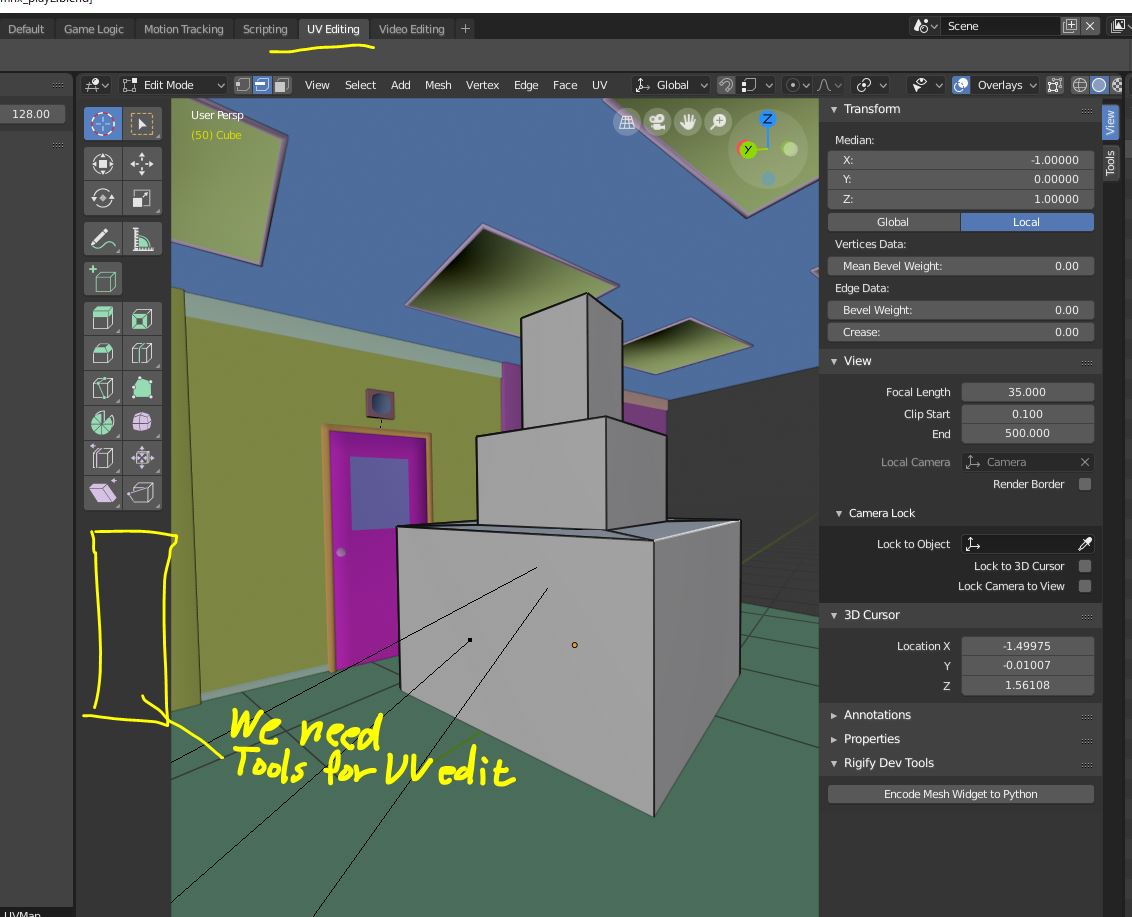
Though I found those commands in header (or bottom) menu of 3d view or i can use short cut. but I believe, work space is desigend to find and use tools which correspond to current work type. Most of new user may serch those UV tools in tool sections.
We need, uv tool buttons, when we choose “edit mode” with “UV editing” layout.
I do not against we keep UV menus in header of 3d view editor, but I can not approve
remove button to set seam , or unwrap button from 3d view.
Please compare 2.79UI
we only need one-click those tool button, to set seam and unwrap after we select " shading tab." in tool shelf. though there is no uv command in header.
About current 2.8 UI, with UV edit layout, we need to go header>UV>mark or clear seam.
it need at least 2 step. for each uv command.
4 Likes
Hi!
Don’t know if it was discussed before, and maybe I just dont understand something, but I’m totally confused with selections in outliner. For example here is my screen and I have selected mesh Cube.002, but why there is also bright line on Cube.061, also Collection 2 is brighter, than current in which I work right now and there is also another Cube selected. Maybe I don’t understand some logic yet, coz I’m learning blender not long, but it’s really can’t help you to understand with which object you working right now. Maybe it can be improved somehow? or just help me please to figure it out whats going on here, coz I always spend a lot of time to finding my active object in the outliner =)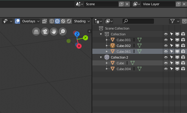
10 Likes
@AlexanderKolyasa
It is not clear enough what there is and what there is not selected, as I have said before. I made some proposals Outliner, Better visualization of the selection, proposal I think it’s still important to be very clear which things are selected and which are not. And here is the other link where you can see the conversation of the colored icons: Colour coded icons
3 Likes