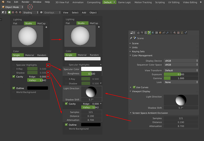
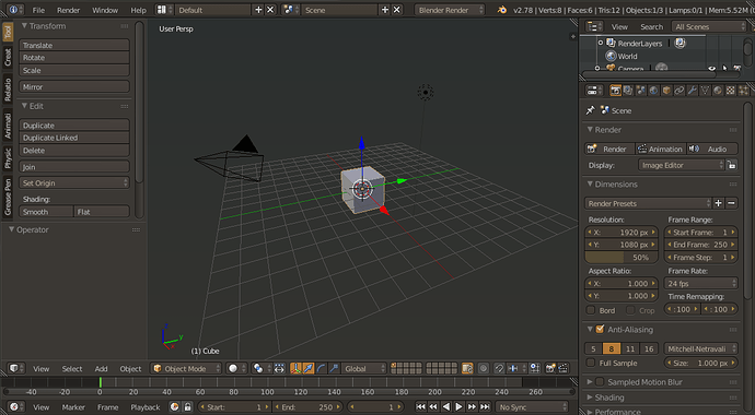
What is the point of having such fat margins/borders around of the screen elements (the red arrows) if everything else is so tiny. These fat borders just eat up space especially on smaller/lower res displays and also look inconsistent with the rest of the design. Windows got rid of the fat borders long time ago if you remember.
I see that the proposal is that what used to occupy only the T panel, now occupies the T panel, the topbar, the N panel and the properties area. I mean, the whole interface.
I can’t quite see the improvement. It goes from having a program with a clear structure (tools left, info/properties right), to having a program where you only see tools in all the sites (to have the same information that formerly had a single column).
But it also involves strange things like…
- The tool properties will be even further away than the tool itself.
- Force the user to go to the property area and change the panel from time to time.
- The properties of the active tools will be on the opposite side of the tool itself.
- The entire left side of the program is empty.
- The entire right side of the program will contain 100% of the utilities.
- Consistency with other areas will be broken (UV editor)
- The consistency of the program itself is broken, now the N panel will contain tools, addons, properties, configuration of the viewport…
I see very good ideas, like tabs for properties, popovers, returning things to the viewport… but I don’t understand this mania of distributing the T-panel all over the program interface. You can take those same vertical tabs with icons from the properties area and leave them in the T pane and let the user decide if they are in the active tools, in the commands, in a plugin,…
Today I’m really tired, so, maybe I must think mor about, but I don’t see it.
Utilizing more of Properties window sounds great. You could argue that there could be scenario in which you have object but don’t know where and how to edit but that scenario could have been reproduced in earlies version of Blender. You could have had in 2.79 3D window with both panels hidden and therefore reproduce that newcomer confusion. Utilizing more of Properties panes just makes stuff clearer. Now that World settings actually can be shown in 3D having Background Image somewhere in that area might be ok? BTW lol I missed experimental tool/properties window but checked it now. Did not rendered correctly for me.
Why not do this for the options of the workbench?
Right now we have to go to 2 different places to edit the settings.
I have made a proposal about blender2.8, but it’s really long proposal with a lot of images and mockups. If somebody want to see it I have created a thread about it.
Some of the interface problems for Blender 2.8
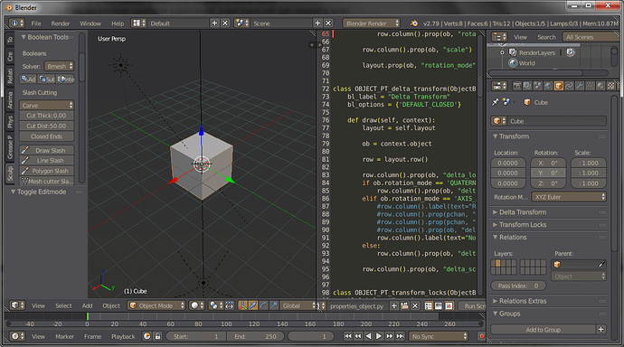
@pistoltoto is right, those problems, specially how hard it is to tweak the interface now, I miss the triangle, the drag feature instead of “toggle header”, the viewport is tiny because of the topbar taking up space, the new toolbar is distracting and useless.
And the accent/grave problem that arrived here show how devs dont think at the consequences of the changes enough:
https://developer.blender.org/T55162
A small test of the tool panel to open with a mouse click or space key. with anchor like S.painter to avoid scroll https://i.imgur.com/hr3bLrM.gifv
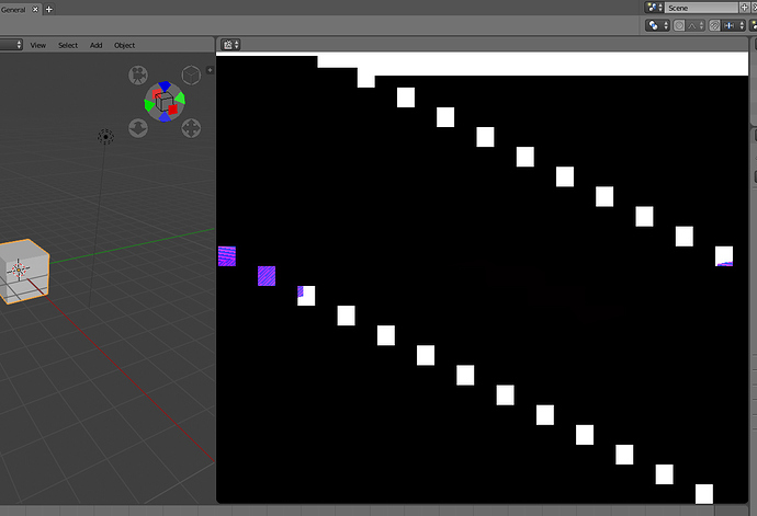
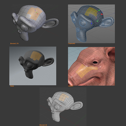
The new edit mode drawing is hard to see. Having black edges makes it very difficult to work with, and it doesn’t help those tones at all, especially if you work with random colors or textures.
This is a theme issue. We should adjust the default theme to have stronger selection color in face select mode.
What about a comunity made theme?
Theme colors can be easily changed as part of changes to the code (some of the colors were already changed).
We should keep Blender’s default theme clear & usable.
I will be honest, I never like the default theme, its gray, boring, too bright, probably the first thing users do is change the theme to a scyfy style flat dark.
But to be honest again, I dont like most themes because I work hours on the screen and the eyes get tired fast, its not how dark is the theme, its how much color contrast there is, most themes are either too light and boring or look like a las vegas neon.
IMO We should make a Call For Content: Themes
There’s a good reason for themes to be grey and “boring”. Having a bright or dark theme affects your perception of brightness, making your finished artwork appear either too dark or too bright.
I know but the current blender theme for me is too bright.
My hobby on blender is create themes and addons, so I know what I’m talking about, it’s not the color that matter its how balanced the pallete is.
You can make a rainbow theme and still not affect the neutrality of the theme, its just a matter of adding the right amount of saturation to each hue.
- If you have a black interface, you will do a light/contrast artwork.
- If you have a white interface, you will do a shadow/contrast artwork
- If you have a blue interface, you will do a greenartwork
- If you have a yellow interface, you will do blue artwork
- If you have a rainbow, then you will do colored and saturated artworks
Interfaces only can be grey and neutral for that reasons, the eye and brain use a lot the context to know the colors. Maybe three or four templates of default blender with different intensity could help to some users. And maybe really strange color themes for some user are good. But in general is a bad election other thing than grey.
Following your supposition, there is nothing we can do to have full control over the artwork pallete, nothing even a gray theme since the very ambient color of the room you work on will affect the same way your pallete.
But think to the side of what you do:
- If you work a lot on modeling, you will prefer a comfortable theme,
- If you do a lot of lookdev, texpaint, you will prefer a neutral theme.
- If you are a modeler seeking for a good shape, a dark theme with light viewport is better.
- If you are seeking for a good silhouette, a dark viewport with a light theme is better.
And it’s true. Even your state of mind affects how the mind interprets the environment. A person with anxiety makes a different art than a person with good emotional state.
This is why a grey interface is always the right thing to do, because it creates a common frame of reference between all the programs. The office lighting must be provided by each person.
There may be somewhat better themes for some people in particular situations. But a program should always try to offer a solution for all cases. For example, a problem with substance painter is its black interface, it is very difficult to see the correct illumination of the models because in substance everything is cool because by default it has a very dark black background.
Gray?
I will leave here a screen shot my favourite themes, I made these two to fit in different situations.
Judge at will.
Ardosia 01:
I use this one when rigging and coding.I made the letters and buttons slightly brown-yelow because my eyes have tendency to see hot colors more sharply but everything else is blue-ish gray to act as hue counter so, the theme is overall neutral, so it works for lookdev too.
Dark coffe:
This theme I use when my eyes are tired or I work too long at modeling, Its the most confortable theme I ever made, I sicrified the neutrality in order to work longer when modeling, I went into a munsell test so I know brown/red are the colors my eyes can differentiate better also.
