2020-07-28 - Property Search Status

Present: Dalai Felinto, Hans Goudey

A quick conversation to discuss the current state of the property search implementation

Desin task: T71185
Implementation task: T77824

Current State

Use Case

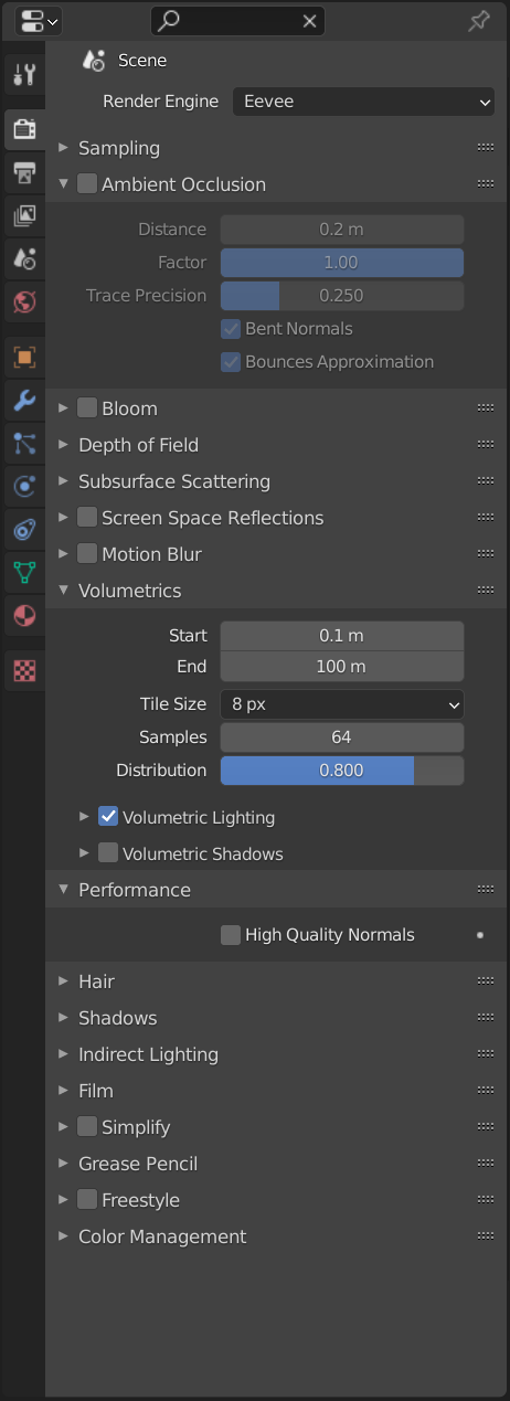
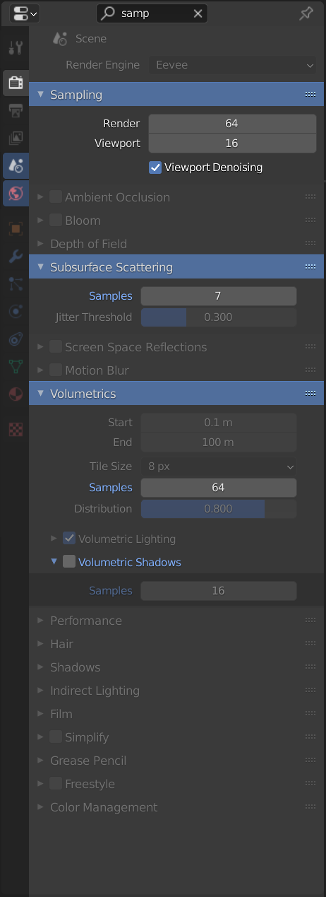
Panels help to organize the properties UI, but they also makes it more overwhelming to dig through the settings. Property search does the digging for you. Even for experienced users, pressing Ctrl-F and typing the name of the property could be faster than navigating to it directly. Using the existing tabs and panels labels helps users remember where the properties are in the future so they don’t necessarily need to use search to find them again.

Search Layout Issues

The approach the design and implementation take is to change the layouts after the buttons are added. This works well in many situations, but is fundamentally a more difficult problem than just drawing a highlight for matching buttons or fading out buttons that don’t match the filter.

Dalai wondered it the shortcomings of the current implementation should be solved at the design level or as implementation details. For example, expanded enum buttons don’t show all buttons with the same property

image image
image

Even though there are more issues to solve with this approach, Hans feels confident that the current goal is the better solution and that the problems are solve-able within a couple weeks. The issues mentioned above should be solved by keeping buttons aligned (stitched) to buttons that match the filter.

Searching Multiple Tabs

Although a possible simplification to the project would be only searching the current tab, mutli-tab search is one of the core principles of the project. Without it the search is almost useless, as a user would need to know where a property is before searching for it.

Performance

Building the layout to search every tab of the property editor may cause performance problems in the future. Although Hans has done some initial investigation which exposed some bottlenecks, Dalai suggested addressing performance improvements after the basic design works as expected.

21 Likes

I don’t think changing the layout of panels at all is a good idea. It’s not just difficult, it’s impossible in general to do this correctly unless UI layouts are designed to be searchable. Text labels can be important context, and you can’t detect automatically when that is the case.

Please do the highlighting instead of changing the layout, otherwise I think this will be a continuing issue that drags on even after the first implementation gets the majority of cases right.

6 Likes

Changing the layout always seemed troubling to me. It seemed worth an experiment. Unfortunately I realized too late that this was growing into far more than an experiment. And then it also felt too late to ask for the highlighting approach instead.

I assumed there was enough communication with Dalai and Campbell and I didn’t see anyone objecting the return-on-investment balance. So I didn’t really bother with the project and didn’t sit down to discuss possible issues and the amount of work needed. In future I’ll try to do that more strictly.

So yeah, +1 on changing to the highlight based approach instead. Should be far simpler to implement, more reliable, possibly achieves the “help users learn where things are” goal better and should leave the code much more manageable.

4 Likes

Tested the branch and agreed it’s probably not worth the effort the amount of work needed to get it right. It’s a pity that so much work has been done already.

However, besides the “easier” implementation there are also good points to using the highlighting approach:

  • Better for people to learn where the elements can be found the next time without searching.
  • Allows to highlight tabs from other contexts as well (or User Preferences tab when implemented there).
  • In the future, we could use this concept to open/highlight items inside menus using universal search.

Mockup

Here is a quick mockup I made simply tweaking the theme colors. Having nicer outlines, icons, tooltips indicators (when the search matches a tooltip maybe?) are a separate topic. I tried to use what’s already there and as relatively easy to implement as possible.

On match, perform the following actions:

  • Close all panels and sub-panels and dim their content (50% opaque?)
  • Open the panels that contain a matching property or their panel title.
  • Change the color of the labels matching the search.
  • Change the color the panel header background.
  • Sub-panels don’t have header background color, we could color the title label instead.

Edit: added dimmed version and notes.

Edit 2: This is a follow-up to the meeting, not a design task per-se.

10 Likes

Okay, thanks for the responses. I’m glad I posted these meeting notes.

Communication

I have a few things to say, the first is about communication. I would like to make it clear that I was asked to work on this based on the original design I linked. I have also been writing about this project in my weekly reports for a while now.

Given the consensus I see now to not use the original design, I think it represents a fairly large failure of communication that it was assumed there was an agreed-upon design document that I could implement. That’s the purpose of a design document, right? To get buy-in from stakeholders before the hard work begins?

So this doesn’t happen again, I would suggest there be a more clear distinction between an agreed design document and a design that hasn’t been verified by module owners and technical owners of the area.

Next Steps

So, although it’s discouraging to throw away some work, thankfully most of what I’ve done will still be useful! I didn’t spend very much time building the “layout-changing” part of the code anyway. If I added it up that part would probably be just a few days.

I really like your mockup @pablovazquez. And the use of the blue highlight makes it really cohesive. I’ll pose some specific questions so we can solve the design before I touch the code again.

Would you imagine this would use the “inactive” button state, or would it add to that (so that inactive and search filtered buttons would be double gray)? Probably an inconsequential question…

When the search is cleared, should the panels return to their original expansion state? I imagine it would be annoying if panels the user manually expanded were collapsed. One idea is to reset the panel expansion but keep the expansion changes from panels the user actually used during the search.

Also, this the animation is going to be jarring when you start your search by typing the letter “A” and every single panel opens, then they start to close as you type more. But that interactive animation is very nice. I wonder if there is a good way to address this. Maybe delaying animation a bit after the search box opens?

This is one of those things that’s harder than you would think, but I do think it’s important, and I’ve already done many of the hard parts for the current implementation. The label and the button itself are to separate buttons, and in master they have no idea about each other. But in the branch I’ve added a label_button reference, so a button’s label can be highlighted too. (If it has one)

Works for me. I’d imagine adding another flag for buttons and text for the blue “searched” indicator color.

9 Likes

if my opinion can be of some use, I worked with other packages with this type of search function, and I have to say that I incline myself for the highlight variant more than the variable layout variant.

And the reason is that having working with the variable layout variant you end up not knowing where the setting is, and you don’t develop muscle memory about it, so you end up depending on the search completely, and at the same time it may be hiding some important settings that don’t fall under the search but may be important for the setting you are chaning, while the highlight variant helps you to know the software and to develop such muscle memory, and you don’t loose sight of any setting.

Just wanted to give my 2 cents based on experience :slight_smile:

1 Like

A slight modification to Pablo’s mockup:


What do you think?

The stronger highlight is interesting, but that doesn’t really work in situations where there are many buttons in a row and only one matches the search. That highlight box also opens a more technical can of worms; where it would start and end for more complicated layouts, etc…

1 Like

Maybe something like this?
image
The text highlighting is kinda ugly, but it would be easy to see, maybe.

1 Like

I prefer the section highlight, or setting a veil over the non-important settings, and leave the important setting clear and visible, like your previous example :slight_smile:

1 Like

Why not do both? A hybrid approach. Highlight found items and hide(not collapse) whole sections that do not contain any search items.
That way it would reduce the amount of noise in the search results. Plus it would reduce(not eliminate completely) the biggest issue i have with the highlight approach - scrolling.
The hierarchy would be sustained making it easier to memories the item location.
Plus theoretically related(under the same section) items would still be visible.

4 Likes

This! 100%!
I get the idea to not dissect everything for the search and agree with the points made but please hide the the unrelevant sections! With Pablos mock up i have search two times, first with typing of what i want to find and then visually of where the highlighted results are. Honestly, from the user perspective the former solution was better than that. I think the point of the search functionality is also about speed. Type in a few letters and have it there. Please hide the stuff not relevant.

If i search for files on my hard drive i wouldnt like to visually search again for highlighted files because my explorer decided to keep hundreds of files there but dimmed. No, i’d want to see only the relevant files and the rest hidden.

2 Likes

+1 for NOT changing the layout but hiding unnecessary items.

Much easier to change settings and values if the search result is in a more compact view as shown in the current state video.

2 Likes

Hi Hans,

Temporary expand/collapse status:

We do something similar in the outliner. I think it is fine to totally trash the temporary (manually) expanded panels once the search is cleared.

Open the panels that contain a matching property or their panel title.

If it becomes a real issue we can also start matching after the 2nd letter is entered.

Communication

The fact that most of what you don’t is not going to waste is good to hear.

I agree that we should have identified the shortcomes of the approach early on. If not in the design phase, at least after a quick prototype, or the initial iterations of implementations.

1 Like

For the people providing feedback here, please be aware that we are mostly discussing a follow up from the meetings we had on Tuesday and some plan of action. If said feedback starts to get on the way of the discussion we will need to move them elsewhere. For instance, their own thread in devtalk, or the original design proposal in developer.blender.org.

Now more reasoning behind the change of direction.

As per the original design, the property search functionality is less a way to quickly tweak a value, but more a way to help users find where a property is. In that sense, more context to where a property is highly beneficial.

That aside, even if the “hide” approach was proved to be vastly superior, from the beginning the project was struggling to get it to work in a satisfactory manner for most corner cases. On the engineering level this is a complex problem that, as it seems, would make future maintenance of said cases always a complication and something easy to break.

3 Likes

So, just to clarify: is posting the mockups helpful? Or should I do that in another thread?

In order to not spam this thread i posted a mock up and some thoughts on the design here: https://developer.blender.org/T71185 (original design proposal)

2 Likes

Could not be keeped the layout of the part with the text?

For example, if you have 3-4 text fields joined and one of them have the term, keep the layout of that part. Same for buttons like the “Z” example.

1 Like

Thats because of reducing User Memory Consumption value effect, but it depends on a goal - you want to find it with scrolling to work with, or just change its value faster without scrolling.

A highlighted list takes longer to navigate but requires less user memory consumption to recognize than a filtered list.

1 Like

Another variation off Pablo proposal. Slightly more obvious by giving more transparency to what are not matches and highlighting in orange the words that do match. I also desature color what are not matches.

2 Likes