If the label is overridden in Python, matches with the original label may look like an incorrect search result. I’m sure users will report this as bugs.
Perhaps by default, the search should only be for visible labels and some option for advanced search. This may not be a checkbox, but a specific search operator.
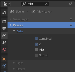
“distance” – regular search
“~distance” – include synonyms (overrides)
“#distance” – search includes property IDs
“distance, factor” – simultaneous search for multiple properties
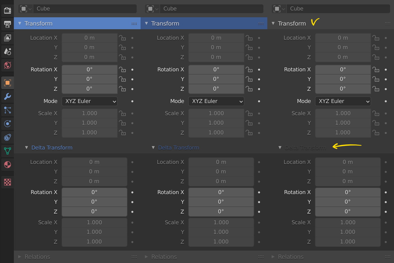
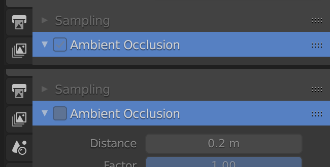
Yes, good point. Although the example furthest to the right in your image is a bit artificial, this doesn’t allow much flexibility for theming. It would probably be better to only use the blue highlight for the headers and keep the regular subpanel header text color when the panel matches the search.
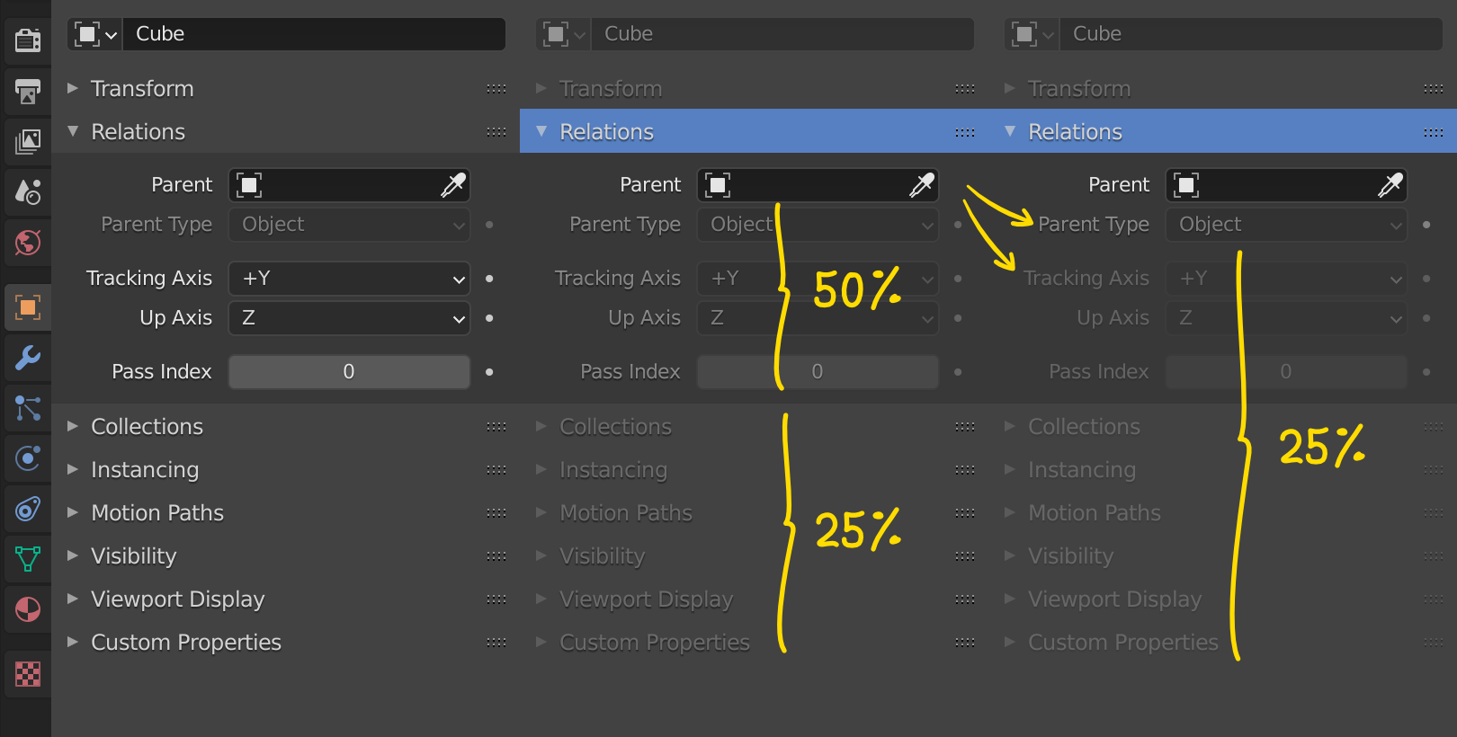
A few people have said this, so it must be worth looking into. I would like to keep it easy to interact with buttons surrounding search matches though, and dimming them to 25% might make that quite hard. That’s my only hesitance.
We’ll have to decide which state is more important to convey during a search. If a button is inactive, the user searches for it, interacts with it, and it doesn’t do anything, that would be a failure of the UI. Maybe this is where the 25% state could be useful. Something like this: 25%: Inactive and no search match 50%: Inactive and search match 100%: Active and search match
What you suggest sounds much more complicated than I would hope for. In my opinion we should not be designing around situations where the label doesn’t match the property at all like in your example. While testing I have found a few situations where the property UI name doesn’t match at what it’s being used for in the interface. We should fix those first before changing the search.
Also, searching both the label name and the property UI name is sort of the point. It allows for a highly specific search (“I remember the label for this property, where was it?”), but also a more general “How do I accomplish this?” search, where the UI names might provide more of the necessary context than the labels.
I like the idea of simultaneous search for multiple properties though, that could be cool.
I love it! This is a huge improvement and will make most people’s life easier – thanks for that!
Buuut … I would really much prefer non-relevant panels to be hidden.
During typing you cant scroll down to see if the setting you are searching for is maybe further down, you’ll have to click outside and therefore confirm the search (and confirms the panel closing/opening).
The (main) point of the search is to save time, no? Shouldn’t we try to reduce scrolling and unnecessary mouse traveling distances to bring the searched settings as near as possible?
The dimming/highlighting makes it easier to scan through the results for sure, but it still takes a bit more effort than necessary for the eyes/brain to scan past all the non-relevant panels. Why not make this process a few ms more efficient per search?
Also, the search field has a weird horizontal placement, looks really wonky.
Why not center it properly?
But again, really excited about this feature, definitely one of the UX highlights of this year.
Thank you very much!
I’m really liking this feature so far! It feels very responsive and will surely save me a lot of time
Some first impressions:
It would be cool, if switching through the Property Tabs with Ctrl +Tab to look for the result in the other tabs would also expand the panels with matching items in the other tabs you’re switching to.
Currently the results in the other taps are highlighted, but the panels aren’t expanded. Is that something the multiple tab search might change?
Basically echoing ManuelGrad’s comment: navigating the properties panel (switching tabs, scrolling through the results) without having to ‘click out of’ the search, would feel very nice. Especially, when the properties panel is rather small ans some of the search results inevitably end up off screen.
So it might be worth looking into, if it’s not too much of a hassle to implement.
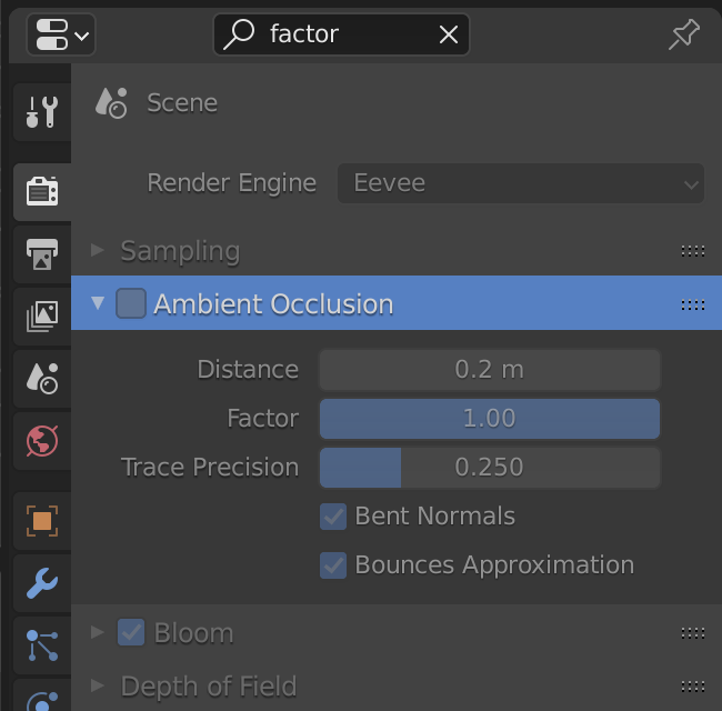
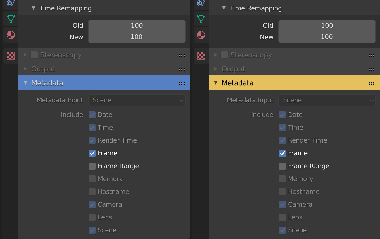
Also, I’m not too sure about the default highlight color for the search.
Currently the panel headers are the most striking part of the search result - even if the panel title itself doesn’t actually match my search.
I think the actual search match should be the most visually prominent element to make scanning the results easier.
That’s just a first impression though. Maybe that’s just a matter of getting used to it and, since the color can be changed with the theme it’s not too critical anyway.
We went back and forth about this in the design process. We ended up with the highlighting, mostly because it’s a bit less disruptive, and it helps provide context to the results. It also allows you to leave the search active while editing properties from other panels, which can provide similar speed benefits because you don’t need to clear the search after every interaction. The flow can be something like:
Search for property, adjust it, don’t clear search
Adjust nearby property in another panel
Ctrl F to start a new search
Repeat
I don’t think anyone on the UI team felt too strongly about the decision though. I could make a test version with the panel hiding, the changes are not too big. I would like to avoid ending up with an option though.
Yes, agreed. I’m working on this, but right now there’s some weirdness where panels end up on top of each other when you switch tabs. Hopefully in the next few days.
This one would be cool, but might cause some problems. Currently having the text button captures all input events into Blender (try pressing ctrl Q when editing any text field). This is probably done for a good reason, so making an exception or changing this would have to be done with care. Ideally scroll wheel events should pass through at the very least.
My idea is to have an automatic (smooth) scroll to the first panel with results in that case. I think it would be so cool! I just have to find some time to figure that out.
Yeah, I’m not sure about this one. At first I thought the blue was nice because it’s very cohesive. It looks good. But it is very bright…
Obviously context is important, filtering out too much will result in confusing results.
Showing only relevant panels/modifiers/constraints, but all of their content, gives enough context in my opinion. The rest (all the other non-matching panels) just waste space.
I also think what search highlight should be different from blue, right now blue is already used a lot in ui and this makes search highlights visually blend in. This is somewhat countered by dimming of other parts but that also has counter effect of context and location of search results being harder to see and learn.
I completely agree.
Marking the search result with the same blue accent color the buttons/boxes/sliders usually have is confusing.
What about making it consistent, defining one global search highlight color, and using the same color for the outliner as well (change that ugly green to the yellow from jenkm’s mock-up)?