I think search highlight just should be a separate color, just like we have yellow for keyframes / green for animated properties, etc.
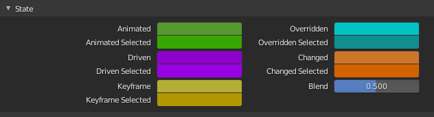
Blue is already used a lot in ui and search highlights should be different.
I think search highlight just should be a separate color, just like we have yellow for keyframes / green for animated properties, etc.
Blue is already used a lot in ui and search highlights should be different.
Search highlight is green in the outliner, personally I think that looks out of place though, at least the shade of green that’s used there. The way it’s implemented in the branch right now it’s a theme color, so it will be easily adjustable. It will also allow for easy experimentation to find the beat color for the default theme.
Personally though, I’m becoming less certain that using a highlight is even the best solution. As I implement this and test it, I’m actually thinking that removing panels with no results and using just the graying out of unmatched buttons is better. It’s simpler from the code perspective too, which is an important consideration.
Looks like maybe I need to finish implementing both the highlight and hide-panels options and get some testing.
I don’t think there could possibly be the best solution from two above, because they are mutually exclusive and are focused on different goals, so, technically, they can co-exist together.
Highlighting list is focused on better visual search with no recognition efforts, and Filtering list is focused on speed of access.
Previously, during 2.8 design, the entire panel layout was redesigned for Filtering demands (longer lists but every option take one string), which tilts the balance in their favor.
Right, I meant as two separate options so people can better decide between the two. Although there is some interplay between the two ideas, for example, the panels can be filtered and the properties within the panels can be highlighted (or the reverse grayed out).