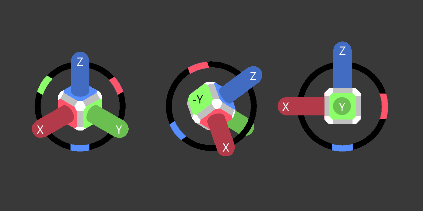
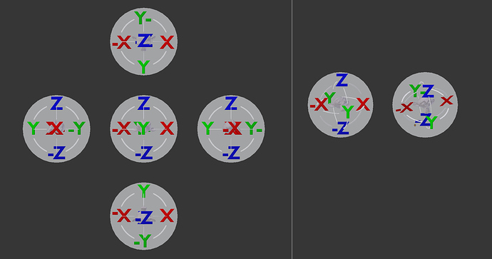
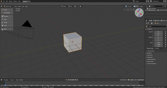
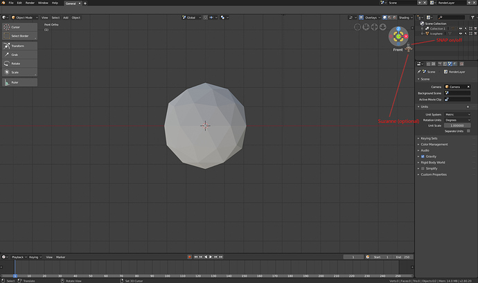
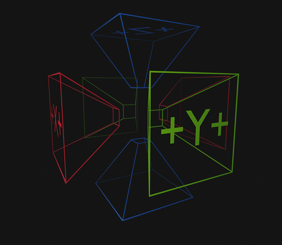
As it seems that the thread of BlenderArtist is not official, I upload my proposals here at once. They are a mixture and interpretation of several ideas that have come out in this forum, it would be good to take a look, as there are interesting ideas.
Personally I like the first image, it looks harmonious, delicate and although you have to see its functionality, it is good to see how ideas are enriched.
Like the new interactive Scene Navigator that appeared a couple of days ago. I think it’s simple, and easy to use as is. Some of these other ideas are kind of scary, if you ask me. I would prefer it as is. It’s much better than the previous version, and simple to use and see what is going on.
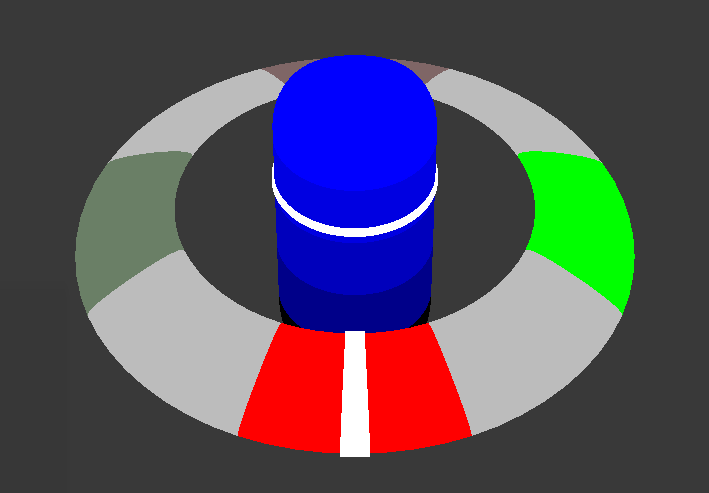
Hello Community, I am speaking from a translator, so forgive my little coherence when speaking. Here is my gizmo 3D Viewport Axis
It seems that your work lacks a bit of contrast in its objects to better appreciate the idea.
Thank you very much uno_mas, I will try to update, making a better contrast and illuminating the active axis.
Maybe it’s not the right thread, but I would like to add a comment:
I work a lot with my laptop (without numkeys) and since the keymaps are changed in 2.8 so that 1,2 and 3 are for vertex/edge/face selection (which is nice) I can’t use “emulate numeric keyboard” anymore… losing my direct access to all the views.
Since rotating through the screen with trackpad/mouse are simple enough, I would not need the gizmo at all, only for selecting my front/back/etc ortho views.
Well… I added this:
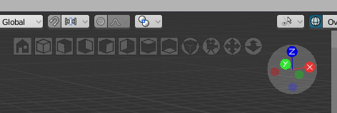
Can’t get any faster than this I would think.
If anyone is interested I’ve attached two diffs… One to add ISOMETRIC as a view alongside Top/Bottom/Left…etc.
One to add the gizmo’s to the top… (made the size a bit smaller but that’s all up for debate)
Hello, i appreciate a lot the works done by the community for the proposals about the viewport axis visual.
I want to try to contribute to the global effort with what i’ve in mind. A sort of mix of some proposals already done by others.
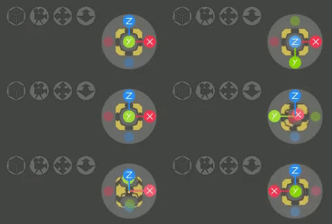
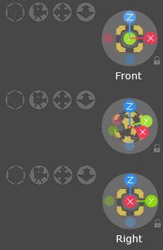
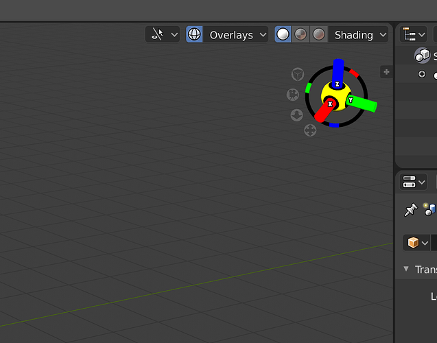
I think the actual design have good points. For those who works with stylus, it is convenient.
Another good point is for me that we can visualize the three axis with thin lines.
But i think it lack the accessibility to the presets of views.
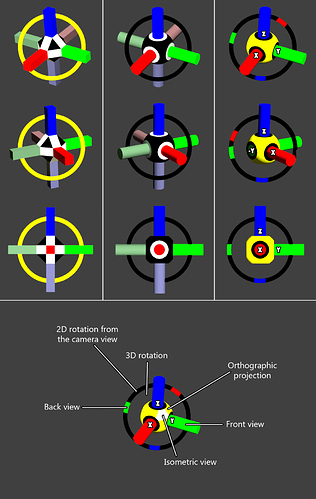
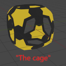
So i add to the actual design something that is not a cube but is not sor far either. A sort of “cage of presets”.
26 presets of views can be accessible:
-
Bottom, Top, Back, Front, Right, Left: are in the octogonal holes zones. These views can be accessible by drag and snap or can still be accessible by clicking the labels X red, Y green , Z blue and the faded red, green and blue.
-
Back Bottom, Back Top, Front Bottom, Front Top, Bottom Left, Top Left, Bottom Right,Top Right : are in the dark grey zones and accessible by drag and snap ,
-
Back Right Bottom, Back Left Bottom, Back Right Top, Back Left Top, Front Right Bottom, Front Left Bottom, Front Right Top, Front Left Top: are in the yellow corners zones and accessible by drag and snap.
Just below the gizmo, i suggest to add a text zone with the name label of the actual view.
While gizmo is dragged and rotated, the name change accordingly when the central dot overlap another zone.
The snapping is done when the central dot enter in a zone by dragging it.
For freeform orientation, i think a small button like for example the padlock can lock or unlock the snapping.
I’ve used for the cage yellow and dark grey so the color of the axis can still be visible when there is overlapping.
I’ve also seen the proposals with the good old Suzanne, and i think that even if it sounds like a joke for the pro, it is not a bad idea to a have a straightforward representation of the orientation by something that is not abstract. But i think this could be an option to add in the user preferences to place a small Suzanne beside the name label of the actual view. And it could be cool to let the user to choose a custom object other than Suzanne (house, car,… or custom user creation.)
Sorry, if i am not clear with my explanations, english is not my native language.
I’ve tried to make some mockups to show the ideas.
I hope it could feed the reflexions of somes of you. I encourage and congratulate all of the developers, teams and community that are making blender 2.8 will be looking so amazing.
when I enter the view of the camera the gizmo disappears … is it possible to navigate with the buttons inside the camera view? I think it’s escensial, I do not want to see a complete course to know how to navigate in the view of the camera, click on the button icon would be enough to move in the view of the camera.
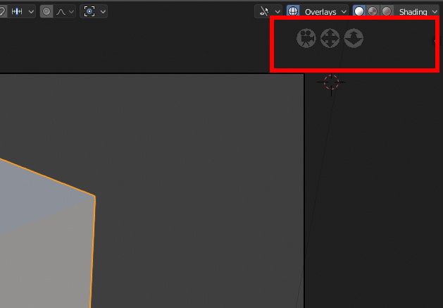
Yes, we plan to introduce a way to manipulate the camera itself from within the camera view in a easy way. It’s on Campbell’s long todo list.
You can already use the gizmo to switch to specific viewpoints by clicking the corresponding axis. No need for loads of buttons to do the same thing.
I know that… I don’t LIKE it because it’s too difficult to use (orthogonal switching needs attention to get it right and therefore breaks my flow)
So that’s why I propose this method (Solidworks thinks it’s a good idea too  )
)
All those buttons take up a lot of screen space. You have several ways to switch the viewport direction:
- Using your laptop number keys (if you enable Emulate Numpad in Preferences)
- Using the visual gizmo and clicking on the desired direction
- Using the View menu
- Using viewpoint snapping (hold Alt while orbiting in the 3D View)
- Using the new Viewpoint radial menu
I don’t think we need a 6th way to do it via those buttons. One of the reasons we even have the viewpoint gizmo, is to provide a direct, visual way to switch viewpoints. If we were to include those buttons, the gizmo itself would be partially pointless.
You are absolutely right! How stupid of me… Please disregard my proposal.
I have my buttons all for myself now… if there are people out there who do like to have those buttons… let me know… you can have the .diff…
Resurrects ancient thread…
for what it’s worth, I really feel like the current manipulator still feels like a WIP. I had some arrogant notions of being able to quickly come up with something better and, after several hours of messing around with it, I now appreciate how frigging complicated of a challenge it actually is.
the current design feels imperfect yet, I can’t really come to a solid sense of how to improve it. Kudos @billrey for achieving so much with such a simple approach. I’m guessing it’s been driving you mad for years now.
I’m attaching my rough attempts mostly as flame-bait. Enjoy.
AndrewC If you click the visible axis that is facing towards the user it should flip to the opposite side right?
probably worth a different thread: The viewport axis gizmos should have a separate toggle off button from the other stuff bunched up under the NAVIGATE gizmo like mvoe the view, zoom the view, camera view. I barely used those and I wan to turn them off , it will hidden the viewport axis gizmo as well.
I’ve just started using Fusion360 for it’s CAM capabilities but found their navigation gizmo very intuitive and easy to use. Your attempt is in the right direction. The current gizmo has a simple operation and graphic but I think making it look like a cube with 'front’s and ‘sides’ make orientation of your object much easier. I tend to think of ‘sides’ rather than ‘axes’ when manipulating an object, especially if the object is all spun around.
(of course, the target user differs. F360 is strictly objects. 2.8 is for objects AND landscapes. Landscapes don’t have ‘sides’.)
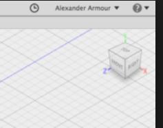
@Shadowphile : it is not possible to use a cube. It’s an Autodesk patented feature:
Hmm. I didn’t patents were awarded for software; copyright yes. Bummer. So…how close can we get without infringement? How much do we want to risk a lawsuit from Autodesk? That is sort of a Ton judgement methinks.
