Blender user interface design

The plane has no thickness, it can’t be above or below the grid.

C4D example:

2018-07-17_20-53-00

It’s the same on all 3d apps…

Just as some people consider that the alt + a (deselect) keys can be useful to prevent accidents in scenes with a lot of heavy geometry, I also propose to put a stop and pause button especially when doing fluid simulations or heavy dynamics, have independent stop and pause buttons can also avoid heavy processing accidents.

suggestion_stop_pause

I wouldn’t do toogle but if it’s essential for some animators you can also put then.
It is also possible to keep the toogle with the play fordward and pause do the same effect that it does now of replacing two icons by a single icon of pause. When you press stop it will automatically stop the animation and go to the first frame.

12 Likes

This concept is a different perspective for an alternative to the cube. Maybe it does not work, but it can give new ideas to other people
A cube does not have different faces to understand that it is forward, backward, up, down, and although in this video it is the head of suzanne, it can be any shape that allows to identify with a quick glance any view.
2 Likes

While that’s a fun idea, feels more gimmicky than useful. =/
Though I wouldn’t be against something like that existing as like an Easter Egg option, haha.

I agree it feels a little gimmicky, but more so, incredibly useful. You instantly see whether you’re looking at the front or back of an object for instance. I think it’s hilarious and useful at the same time, which is great! I want this option.

1 Like

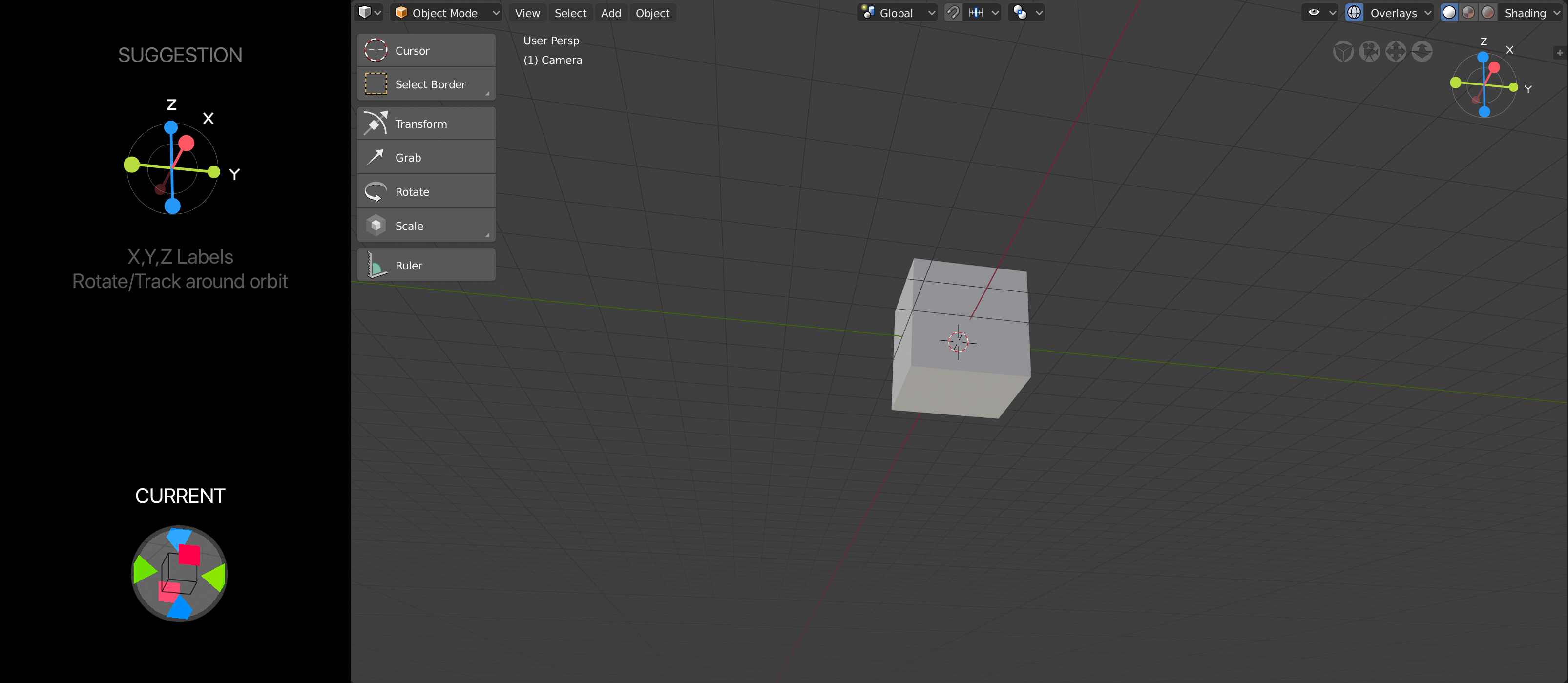
Not sure if there is where I should post this, but I have created some visuals for the viewpoint component. I created a post yesterday that has other visuals, here is just my latest one:

6 Likes

^ even more I prefer how it was in 2.79 without all this thick lines between editors from UE4

Negative axes should be darker to differentiate them better. The letters of the axes should be next to the axes, otherwise it is difficult to interpret. The rest it looks good. Maybe the letters could be inside the balls.

1 Like

Could it be possible to remove the gradient?

Captura%20de%20pantalla%20de%202018-07-19%2002-12-14
I just want to thank for this new way of navigating, it was very useful and the main reason why I did not use blender before, as a traditional artist I usually have a lot of things on my desk and I do not take the time to learn keyboard shortcuts, It turned out to be very uncomfortable for me. for that reason I choose buttons in the interface before a keyboard shortcut. Now if I want to know more about this project they call blender! good job guys !!!

2 Likes

I think this is the fresnel effect that helps to see the shape, it’s useful when it comes in editing denser meshes, is it really bothering you having a gradient on the cube ? Or maybe it could be activated on a certain amount of polygons per pixel ?

1 Like

I’ts a personnal preference in this case, in edit mode I don’t like having this kind of shading, it misslead me thinging something is selected.

That would be great. Overall a little more control over these would be nice. I would like it to close them permanently. Or I to nest it some where or minimize it out of the main 3D view area. When animating, even minimized this window is just screen clutter.

That should really be an option in settings, sometimes you want to stop on the frame you’re on.

“That should really be an option in settings, sometimes you want to stop on the frame you’re on”

That’s why you have the pause.

2 Likes

@zebus3d I think you are correct, negative axis darker; letters next to axes. I struggle with the letters within the axes because of readability. But that is just my opinion. Appreciate your feedback, its very helpful!

1 Like

So I’ve tried doing the XYZ labels inside the ball/axes/handles but there is always legibility/readability issues.
(Think about how this will look when it is super tiny; when you do the above execution, labels cannot be read)

This is where I’ve netted out. V4 and V5, only difference is color of labels.

Oh, and the label text would always lock to the axes (not orbit around like I said before)

2 Likes

Here more alternatives, double click for negativesPresentaci%C3%B3nHsv_01

2 Likes

Looks good, doesn’t work.
You need to be able to click on every direction from every view angle.

2 Likes

Double click for negatives

TBF contextually the play button should turn into pause and there should be a stop button that would stop playback and return to beginning.