I see you changed the default Theme to Flatty Dark Blueberry.
https://developer.blender.org/rBeda770f88406c22ad91ee2d5f576477f5e3c8f13
While it is undoubtedly a really well done Theme by Pablo, in my opinion tinted interfaces may look pretty but are a bad choice for production software. Your eyes adapt to the blueish color of the interface and you end up grading your whole scene slightly more blueish without even noticing it. So interface colors should be as neutral as possible.
As I said the Theme still is very nice so why not make the Flatty Dark Grey variant of it the new default?
8 Likes
This decision gives the impression that blender is no longer a software for professionals and production…
Flatty Dark without Blue and gradients, and with gray text color instead white.
3 Likes
Yeah that looks promising! Maybe there could be a “Call for Content: Themes” to determine the new default and also the packed Themes for 2.8 (for example i feel like the Default++ Theme is not really needed anymore)
1 Like
I’ve modified the flatty dark blueberry to desaturate it, in case anyone’s interested:
https://gitlab.com/zebus3d/varios_blender/raw/master/FlattyDarkGrey.xml
1 Like
Who want to cooperatively design a new professional theme via this thread?
We could ask the approval for devs or anoy them until they accept.
I’d love to but I don’t really have time (also I don’t think I’m an expert on interface themes - actually I trust Pablo and the rest of the developers on this): All I can do is provide this Theme I did for my self as default, which kind of resembles the 2.7 Theme in color choices but darker and flat.
I don’t think Flatty Dark Blueberry is going to be the default.
https://developer.blender.org/T54943
“Default Theme:”
“Flat”
(I believe) Flatty Dark Blueberry is the placeholder default, willst Pablo works on his, not yet released, Flatty Dark theme. As more and more theme parameters are added, it makes more sense to show the thematic variety to the UX & BF Devs (to find issues with new UI elements added, modified and removed) as well as the Blender Animation Studio (the first test users) in the alpha stage (and get tons of feedback) on a non flat theme that is more likely to have issues.
4 Likes
I hate this darker themes, the default semi dark theme was decent, this one just looks bad for me 
Dont take it personally I hate most themes anyway, but the default was decent, even if I dont actually use it, I did like it, hope this is not final and we do get a decent not too dark theme…
1 Like
I’m doing a flatty dark middle grey to be similar to 2.5 theme.
2 Likes
There are a lot of themes to choose from in the user preferences if you don’t like this one, including the 2.7 theme (which I will probably use too).
I understand, and for my use I made a theme for myself, but I work with other people that are not full 3d artists but sometimes need small 3d tasks, and I always try to make them work a bit on blender, without having to spend a bunch of time installing and configuring stuff, and if it looks bad from the start, it is already a turn of.
And more importantly, I believe in design, there should be an accessible default theme, not one too extreme/colored/contrasty, even if some people like that style.
The blender default has a bunch of weird flaws that make it bad to work with in the long run (I don’t understand why dont they fix it since it is so easy with the theme editor but that is another story), but at least it looks pleasant.
I agree.
The default theme should give a good first impression, we never like default themes though, because they are “default” and experienced users always valorize the “CUSTOM”.
Just commenting, I find default theme too dark, and blue-ish, I hate blue…
Sorry I haven’t been online since Thursday,
(I believe) Flatty Dark Blueberry is the placeholder default, willst Pablo works on his, not yet released, Flatty Dark theme.
Yes! I thought I mentioned it repeatedly in the live streams Thanks!
1 Like
The interface, like the software itself, should never draw attention to itself. Art is an immersive undertaking and anything that takes attention away from the creative process is a distraction, even if it’s something seemingly small like a beautiful color scheme.
The same goes for a non-standard UI. Software should build on a user’s knowledge of computers, operating systems, and other software, not force him or her to start over from scratch.
Blender is cross-platform, There is no a easy way to fit the standards, also blender isn’t that hard to learn, the thing you most find hard is just the right vs left click but again, a few days using blender and you get used with.
Blender is the way it is because it was build on performance and not on nonsense standards, once we get the hang, we can work lightning fast.
From my personal experience.
At first when I saw blender, I thought: – what the heck?
Then after a week: – meh, I can learn!
After a month: – teck tick click keyboard sounds, mouse drag, model, model, – I’m so fast!
After finishing the 3D character model: – Huh? I am mistaking something. its ugly, well I’ll try again!
I got adicted in modeling and now I feel like the software is a extension of my brain, I dont need to think about the interface anymore, its obvious to me why its made that way: Someone didn’t care about standards and only care about if its efficient or not.
Thanks a lot! Appreciate this kind of feedback and screenshot.
I’ve done a few fixes today for contrast using accessibility tools to check the levels are right.
If you compile you can try it now, otherwise tomorrow after the buildbot updates tonight.
3 Likes
It’s really coming along nicely. Some small things I noticed:
-
The Graph Editor → Source List Text is not readable
-
Selected Sidebar Tabs are hard to distinguish from unselected.
Maybe a slightly darker variant of the accent color could be used for that?
I recently did a proposal for the selected Tabs design but thats off-topic.
-
The Script-Node / Vertex group selector behaves weird - it seems to use the Box: Inner Alpha value when hovered.
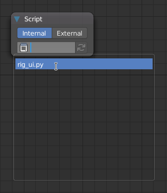
Not sure if this is a blender bug or not - making Box: Inner a solid dark-grey (in a way that the Modifier-Background-color etc. stays the same) helps though.
-
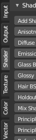
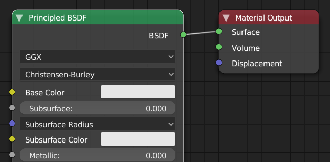
Shader Node Labels could be easier to read with a darker green backround color. Same goes for Texture Nodes
cheers 
2 Likes
Thanks for the feedback Simon!
- The Graph Editor → Source List Text is not readable
This is a tricky one, I made the text dark now so it’s a bit more readable. Still, for example the channels without children was using the editor header background (???), I fixed it to use the dopesheet channel one. While I was looking at the code I found other problems and assumptions (using a darker/lighter version of the channels color some times) that need a bit more time but will be tackled. Thanks for bringing light into this!
- Selected Sidebar Tabs are hard to distinguish from unselected.
Fixed! Although the actual issue is that the tabs are not sharing the same code as the topbar tabs. To be tackled in the future.
- The Script-Node / Vertex group selector behaves weird - it seems to use the Box: Inner Alpha value when hovered.
This is super weird. I will mention it to the devs.
- Shader Node Labels could be easier to read with a darker green backround color. Same goes for Texture Nodes
Fixed!
Thanks again!
1 Like