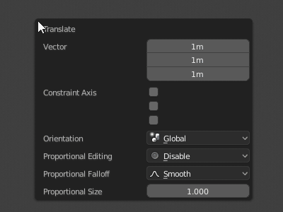
I think the purple color should be the same blue you put on the rest of the theme for the python console text, or light gray.
Two small things I noticed for consistency:
-
maybe the current frame colour could be the same blue of the highlights
-
I think that pie menus should have less roundness
1 Like
The panels get darker the deeper we go (sub-panels, sub-sub-panels, etc).
Having the header the same color as the editor background indicates it’s top level. Then darker background means it belongs to the panel title above.
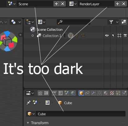
First of all, thank you for this great theme. I don’t know if this has been posted but in the Outliner is difficult to see how many objects are inside the selected Collection.
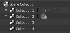
Maybe we should just draw the circle always black? The circle above in light gray to denote it’s active, but the circle with the number of objects always black for readability, like when the object is not active.
3 Likes
Either that or change the number to a darker color, I don’t know if that would be more consistent with the rest of the UI.
Blender really feels fresh with this Theme!
Some more nitpicking (build from 2018-07-07):
-
imo since we also have the icons next to keyframed stuff now, the state colors don’t need to be so prominent anymore and the keyframed values are hard to read like this. Maybe the State: Blend value could be decreased to something like 0.4 and the colors could be darkened a bit.
(here I used E4BA2B for Keyframe, 5CAC34 for Animated and B400FF for Driven)
-
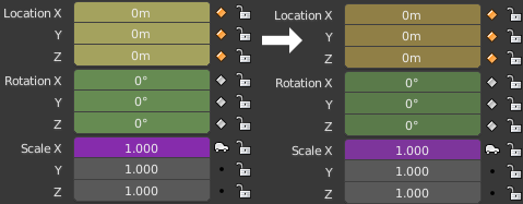
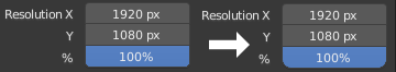
The Value Sliders Roundness could be decreased to .4 to match the rest of the theme. (and it it looks more modern in my opinion). Same for Toggles - wasn’t the original Idea to have a global Roundness value?
-
I’d probably increase the N Panel Opacity a bit - it looks kinda weird when in front of a mesh.
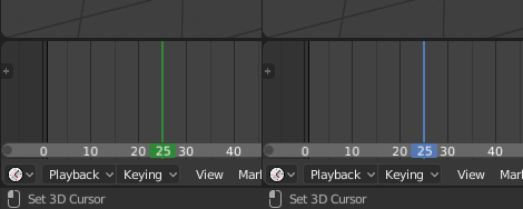
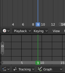
- The Movie Clip Editor still uses green for current frame.
2 Likes
Good points! Thanks for the feedback and screenshots. Just pushed the changes.
Also removed that 1 pixel gap between the panel headers and background.
1 Like
A little suggestion
Hi again! This is not directly related to Flatty dark, but there are a couple of things in the theme configuration that seems hard-coded for no particular reason:
-
There is a dark value applied with alpha over the node backdrop’s colour, this is how it looks with backdrop’s alpha set to 0 and backdrop’s colour set to pure white, respectively :
.
.
(also the way colours interact with the grid is quite strange) -
It seems like the “generic” text cursor’s colour can’t be changed anywhere:
.
Can we somehow have different theme color options for the active object and the wireframe of selected objects?
Same color for those two makes things a little dificult.
Absolutely hate gradient in view port as default…
What do you mean? Gradient is off in the default theme. You might be using another theme. Load Factory Settings to be sure.
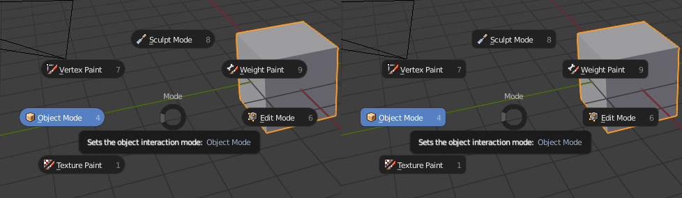
It seems that when you click and drag multiple value boxes inside the “Adjust Last Operator…” popover. The highlighting feedback is barely noticeable, looks fine for the rest of the UI though.
1 Like
My bad, cleaned preferences folder no gradient in default :3
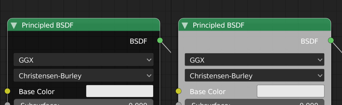
Currently, the types of buttons are differentiated by color, text alligement, icons (for drop down menus), and radius size. I think this much differentiation is unnecessary and makes the interface look cluttered. What about uniting the color and radius size? I think the icons and text alligement is enough for effective differentiation.
(current state of button differentiation [value slider is missing])
@pablovazquez Might it be possible to get a theme setting for the spline resolution of the node editor connections?
Currently we have one for Noodle Curving But I’d like to also see Noodle Resolution. Also I think it would make more sense for Noodle to be renamed to Spline if practical/easy.
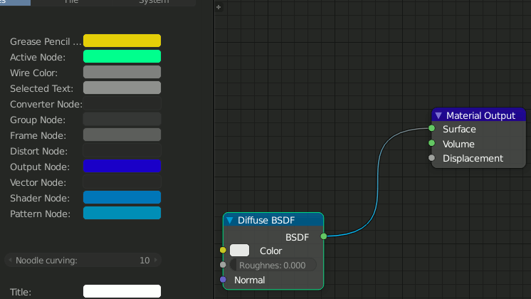
I’d personally dial it down to 3 segments per spline.
2 Likes
I think you are not using the default theme, make sure you go to File > Load Factory Settings. Most roundness and color variations have been unified.
In 2.8 we are trying to avoid adding new theme settings just for the sake of it. Especially in cases where the added value/functionality is minimal like in the case of resolution for wires.