In my opinion I think the icon should have a dark background. To me a white background bland. Plus it sort of matches the blender itself with the default dark theme.
Funny enough, the Blender Studio website already uses an Apple-style favicon. Just white on black.
An interesting article about new changes to the Chrome icon, and how it differs between platforms. https://www.xda-developers.com/google-chrome-new-icon/
@fsiddi How about now?
I personally really like this design with either dark or light background. Should there be a public vote somewhere or how does this get decided? Edit: with vote I meant between the designs, not between light or dark.
i dont see the harm in it, votes are cool
- dark icon
- light icon
0 voters
also a while ago I came across this big sur icon which. I don’t know if it will work well with guidelines but its pretty cool.
1 Like
Sometimes a dark icon gives the idea that the application is “Pro” which is the case for Blender. Anyway, I think that the icon should be super simple, both to respect the coherence with every platform and to fast-track the change. I think that the final version by johjakob is nice, but it should have a dark background and the coloured shadow like in the icon made by JingSong-Zhou.
Edit: sorry, I didn’t see the icon in one of the first posts by johjakob, the one with the title Dark (No bevel)… that’s perfect!
This icon dosent work with the blender logo guidlines. It has a 3D effect and the colors are incorrect.
Blender 3.1 released and no advancement…
2 Likes
This person made an icon in Blender I’m personally going to use regardless of what’s decided here. I think it’s awesome.

2 Likes
sure, anyone can use a custom icon, I also use ccustom icons for current, legacy and dev blender versions, the point of this dicussion is what should be the default icon that fits both blender logo guidlines and OS standarts
I’ve read through this discussion and I’d like to add that a native macOS icon is very important to most macOS users. Proper suggestions that match guidelines (due to their simplicity) were mentioned many months ago. I don’t see any reason for this issue to have been dragged out so long.
I’d also like to add that perhaps the logo guidelines should be relaxed a bit for the macOS version of Blender. I think the icon should look nice on macOS. Part of the appeal of macOS icons is their whimsical and finely crafted nature. Surely there can be some liberation to make this icon somewhat unique to macOS. After all, it’s not a logo in the strict sense. It’s an app icon.
5 Likes
It would be great if the Blender icon fitted in with the default macOS design. I know this chat is about what the default logo should be… but to throw my hat in the ring, I have created two icons for Blender which I use on my Mac - Orange for LTS releases and Blue for Beta, Alpha releases.

If you fancy using them, you can download them from this DropBox folder:
https://www.dropbox.com/sh/is7yd2vleo1j36a/AABT6gPbHHXDg1PSOTrOyYR_a?dl=0
Really simple to swap. ‘Get Info’ on the Blender.app, then drag the .icns file onto the icon at the top of the ‘Get Info’ window.
Enjoy ![]()
3 Likes
Still no progress on something quite simple even on latest 3.4 beta. Can we just… have it?
2 Likes
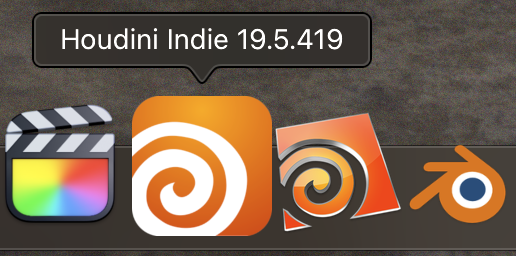
In related news, SideFX just updated the official Icon for the Apple Silicon version of Houdini.
This is included with the Apple Silicon Alpha version of Houdini being worked on by SideFX.
Newest one on the left and the old one on the right.
Disclaimer: I have magnify turned on for my dock, so that’s why the highlight Icon and the ones next to it look larger.
1 Like
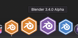
‘My’ Blender icon set
4 Likes
Even though it’s easy to use your own icons for apps on macOS, it’s strange that there’s still no proper icon given native Apple Silicon support as well as well implemented Metal renderer, especially since it’s been two years since Big Sur release. Really hope that new official icon will be implemented as soon as possible.
1 Like
Agreed. Is there any actual objection to this proposal?
So as there seems to finaly be the consense to have the squircle Blender icon, unaltered on a flat white or gray background, following the macOS design standards and Blender Logo Guidelines as close as possible.
So that has to be done for the 4.0 release. There was a commit made by Jenkm 1,5 years ago that never got accepted or reviewed and is now archived. So can we get someone to review this / Jenkem or me create a new pull request and someone from the UI team to aprove it?
4 Likes
I created a new pull request:
The icon is more or less what Jenkm did earlier. I haven’t added a Document Icon yet, so it stays auto generated for now. The white App icon on white background dosen’t look super nice though, so i’d like to change that in the future. But thats a little more difficult do crete outside a native swift UI application so I have to look deeper into that
3 Likes