I much prefer the white background. The orange tends to merge with the dark, especially in smaller sizes. As for the dark-themed OSX, most of the icons in my dock right now have fairly light backgrounds, even just counting the Apple apps. (I run in light mode anyway, but the icons don’t change for dark mode.)
1 Like
So it’s going to be the contained logo then.
As the UI module owner, what is your opinion on the light vs dark background case?
Just to clarify the ones we are giving feedback on and the ones you are designing differ from the current/original logo.
The one on the right in my image is the current official logo.
I actually love the no background Blender logo that is currently used, and think it should probably remain that way. I just like that we can switch to whatever logo we want to, and that there are designers like yourself making other options. ![]()
I hope you post some of your design changes to the site I posted above!
1 Like
Yes, I mean the Blender logo, not the app icon. The Blender logo as part of the app icon should not be altered (should be less ambiguous, sorry!).
Sure, I’m going to provide every variant I posted as ICNS files!
1 Like
If this is done, I’d definitely prefer it be optional — if that’s possible; I don’t know. The current trend toward uniformity in app icons is something that I pretty strongly dislike from an aesthetic perspective.
This can’t be done to be optional, but you could still replace the default icon with one you prefer.
Here’s my version. Almost flat background, no changes to the logo.
I think the dark one looks better (for example in the dock) and is more suitable for the default Blender interface.
Download here: https://developer.blender.org/T63623#1238760

10 Likes
The white one is looking thinner.
By the way, a long-standing idea, maybe we could have different icons for the release version and for beta? Maybe something like how Chrome does it. Or these, one with a black and the other with a white background. I would like that.
1 Like
Yes, a dark icon would match Blender’s interface better (which was my motivation to propose a dark icon in the first place), but this would not conform to Blender’s logo guidelines.
Also, I would use a colour gradient to match the appearance of macOS system apps like Safari.
This version uses a gradient close to the one used in Safari’s app icon.

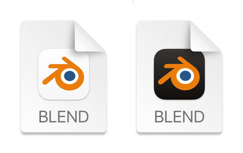
App Icon + document icon for Blender files

I think this is a good way to conform to the logo guidelines and be a good macOS citizen. I have submitted a patch for review here: https://developer.blender.org/D12978
(I am going to make this version and all other explorations I posted in this topic publicly available later.)
1 Like
I don’t see any explicit restrictions regarding the use of the logo on a dark background. While adding a shadow to the logo is usually considered as a modification and is not allowed. Also, such shadow effects look cheap.
As for the gradient on the background, half of the system icons are quite flat, so a flatter background will also match. But the problem here is that the gradient creates a volume (3d effect) and the logo turns out to be floating over. I mean, the logo itself should also have some shading, otherwise it looks unnatural.
On dark backgrounds, the logo is usually white. @brecht recommended to use the logo with a subtle drop shadow on a light background (here). The current icon also uses a drop shadow.
I don’t see a problem with that.
I think @fsiddi should also look into this topic.
Or maybe compensate thickness with tiny orange outline for the white one.
A little off topic, but about these “rules” of using the logo, which we refer to a lot here.
Look at www.blender.org/about/logo, right on the same page you will find a logo with the wrong colors, in the header of the site. An old-fashioned favicon with these “fancy improvements”.
Below you can see the Community Badge on which the logo is broken into pieces. In the store you can find a black T-shirt with a colored logo and a white text “Blender”.
And even inside the “blender_logo_kit.zip” you will find a couple of logos with colors not according to the guide. (Although I reported this several times in the chat and even uploaded a corrected archive.)
And that’s all on the official website. The Blender Developers twitter account has a blue logo at all.
2 Likes
Personally I do not see a benefit into updating Blender’s icon at this time. The guideline is still not very strong and I see a few apps with well-designed and distinct icons not adapting to this yet. The icon on white could be acceptable after a few tweaks, perhaps. The document icon does not require any change in my opinion.
4 Likes
Please, it’s time for Blender to adopt the new icon shape, for a number of reasons: 1-Blender is one of the few 3D applications already ported to Apple Silicon and the icon would convey that, 2-Blender is going to support the Metal technology with 3.1, and, 3-Apple has become one of the financial supporters of the project.
I think that making Blender more OS-friendly and open to new platforms and users would be a step in the right direction. I would even like for Blender to have a place in the Mac App Store but I’m just ignorant about Blender development and the general mentality behind open-source software. Then I would like for Blender to adopt a number of technologies consistent with modern macOS UI design, but I understand that the libraries involved are mostly open-source to make the development easier across platforms. Again, sorry for the ignorance.
There is a proposal above (D12978) with a simple blender logo enclosed in a “squircle” which is perfect and not disruptive in any way to the blender ecosystem.
Of course there are more artistic and thought-out versions of the icon, such as this one by Gavin Nelson https://gnelson.gumroad.com/l/blender-icon?recommended_by=library which is beautiful, but of course it’s not the Blender logo.
3 Likes
I agree jenkm. Looking at BigSur’s current color palette, there aren’t many options left for background colors. But there is an icon that is from Apple and is also based on the theme of graphics and that is the icon of the photo app. Since Blender is also a program that has to do with graphics, a white background would fit in this conformity.
But what about grey ? Could this be a compromise between black or white ?

In my opinion the new icon is definitely necessary. Apples guidelines for the new macOS icons are 1,5 years old already and the blender icon looks out of place right now. And especially with the new changes to the macOS version in Blender 3.1 its time now.
1 Like