Hi there !
This post aims to help design and gather feedback from the community on how the Transform informations of Tools in Edit and Object Mode are displayed. It targets modelers, specially those who rely on precision modeling, such as designers, engineers and architects.
At the moment, these are the issues :
- inconsistency between Tools
- user experience with precise dimensions or modifier parameters of Tools
- visual feedback of transform informations of the active Tool and the previous Tool (redo)
- blinking user interface hiding editor header and useful navigate gizmos
The idea here is to analyze the current situation, see what should be improved, propose a few design variants and then implement the agreed one ![]()
Please write below your thoughts and proposals to help this task going ! ![]()
Present situation :
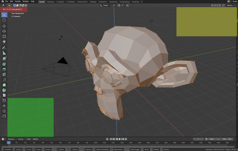
Most Tools regarding transform information usability work as follow: on activation of the operator (Shortcut or via the Toolbar) the amount of transformation is displayed in the header of the 3D View, replacing the Object Interaction Mode list, the menus, the viewport options (shading, overlays, etc) and the orientation/viewpoint gizmos on the top right. The Redo panel is displayed after the transformation is performed and does not update live during the transformation.
This applies in Object Mode to Set the 3D Cursor, Move, Rotate, Scale, Scale Cage and Transform (move, rotate and scale together).
This applies in Edit Mode to Set the 3D Cursor, Mode, Rotate, Scale, Scale Cage, Transform, all 4 Extrude Tools, Inset Faces, 2 Loop Cut Tools, Poly Build, Smooth, Randomize, Edge and Vertex Slide, Shrink Fatten, Pull Push, Shear, To Sphere, Rip Region and Edge.
This also applies in the UV Editor.
There are a few exceptions:
The Bevel Tool uses the Status Bar and hides the Viewport gizmos when the transformation is performed. The Redo panel is also not updated live.
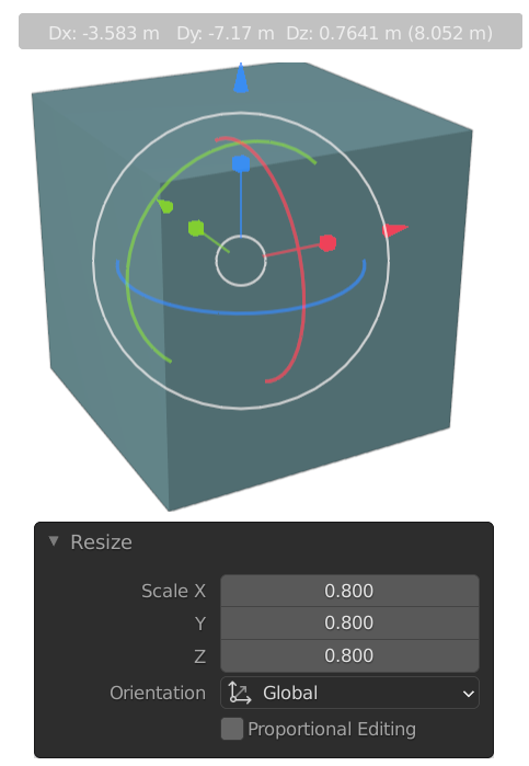
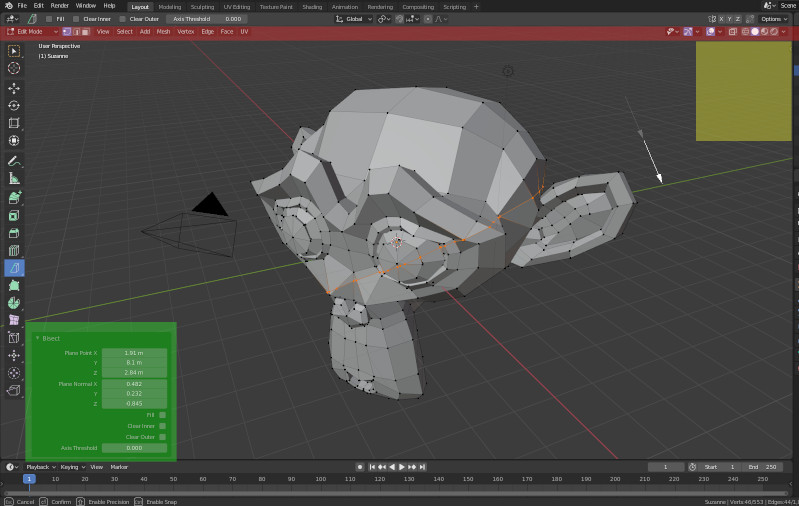
The Bisect and the 2 Spin Tools use the Redo Panel to display the Transform informations directly during action and update live. They also do not hide the header, except for the orientation/viewpoint gizmos on the top right.
To be improved:
The header of the 3D view editor must stay readable and display its icons, options and menus at all time. The orientation/navigation/viewpoint gizmos must stay readable at all time.
The transform infos of Tools must move into the viewport. When using Toogle Maximize Area (Ctrl Alt Spacebar with Hide Panels as default) the transform infos are useful to have. It is impossible when using the header as now, using the viewport space will allow it. The panel must be interactive, opened at the operator call and updated live during transformation (see the Bisect and Spin Tools for that) at all time.
To be completed
Variants for displaying the transform infos into the viewport:
Redo panel overhaul: like the Bisect and the 2 Spin Tools we have now, applied to all other tools, while keeping the Orientation and viewport gizmos of the header of the 3d View displayed. The Redo panel shows live the Transform infos as soon as the Transformation begins after calling the operator. Some more fancy stuff (colored axes, using TAB to access other transformations settings, etc.) could be added later on. This way, the redo panel becomes more of a transformation info panel that is used to display and modify transformation “amounts” during and after the operation of transformation. Its position in the 3d view editor is to be discussed: like now in the bottom left of the viewport or somewhere else maybe ?
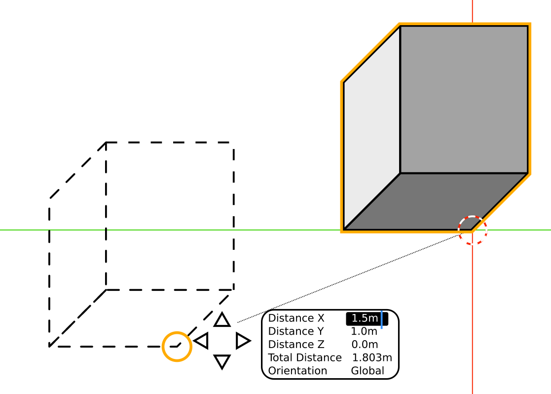
Popup following the cursor: the transformation information could be displayed next to the cursor when doing the transformation. Allowing for direct input of the chosen transformation options like now using TAB should be conserved and made more accessible. Using a relative or absolute transformation amount when it makes sense could also be included.
An example for reference:
- To be completed
Tasks for implementation:
- To be completed
See also discussions related:
See also tasks related in the developer.blender.org tracker:
Move the transform info away from the header, into the viewport.
Make the “redo” panel also appear in the tool settings tab
Make the “redo” panel use the horizontal strip-design
Show gizmo while transforming
Thanks all ! Have a great day ! ![]()
