Thoughts on making Cycles into a spectral renderer

I have modified the setup a bit to this:


Each of those cylinders has a material like this:
image
So it’s just a single material for each side now, using a group like this:

I kinda preferred keeping it in a single material so you can tweak it on a single slot instead of having to switch slots.

It’s still one slot per cylinder, and the current setup is silly in that I’m double testing almost half of the cylinders (to be exact, 30 out of the 36 are essentially duplicated. There are only 21 actually unique cylinders) so you could repurpose a lot of them for different tests.

RGB:

Spectral:

Diff:

The updated file:

It took too long to get spectral to 65k samples like RGB so I stopped at 1024. Therefore the results aren’t actually perfectly comparable. But even so, both look rather clean, and spectral apparently ends up noticeably darker but also more varied in color.

The extra colors are expected. The darkening, I feel, not so much. Also something odd is going on with the double yellow one? (See diff) - at first the diff is rather green. The other diffs also have hue changes but not this drastic ones.
Cyan is also interesting in that the diff ends up being some purple.

Additionally, note all the exteriors: Pretty much the only consistently noticeable diff there is red. And this is under neutral white lighting.

EDIT: ok wow I didn’t even notice all this time that I had some misassigned materials there. One of the top row cylinders is magenta in place of red, and one has red and magenta swapped.
I guess it’s good, then, that the two-colored ones are all duplicated and so you get the information thus missed anyways.

1 Like

“Great minds think alike” :stuck_out_tongue: , I have also continued along the idea of the node group, but didn’t get around creating a full grid of test-tubes. Please go wild on the volumetric things :slight_smile:, while I will focus on an overview-scene. I’ll include your modifications in my design if that is okay with you (albeit not an entire grid). I have some other tricks up my sleeve for various shader types, so I’ll provide a series of updates these coming days.

Don’t you think it is eerie that the diff image shows so many tubes in the same hue? I mean the RR, RY, RM, YM all showing the same reddish discoloration? Same for the pairs YG, YC, GG, GC, (YY)? Same for the pairs BC, MC, BB, MB but not MM an CC? Odd…

1 Like

I made it to be used so go right ahead!

Most of the diff is that the spectral renderer’s windows are literally darker. You can see that quite clearly by flicking back and forth. I’m not sure why that is though. It’s actually kinda the opposite of what I’d expect. But I guess maybe on average each individual wavelength comes back darker than the three lights do, so it ends up going darker overall. It’s hard to judge hue difference if the luminosity is that much different. So I suspect the more varied differences you expect basically “get lost” in the brightness differences. Maybe if you measure the exact differences with a color picker, it becomes clearer. Though obviously, even at 65k samples, there still is noise, in particular in the noisy region.

That said, there are some real color differences besides that. As said:

  • blue is a bit more purple (or really, highly saturated blue goes purple. Regular blue is about the same)
  • green is a bit more yellowish (it contains a little bit of red)
  • red is a bit darker

You can see those differences on the outsides of the cylinders. If you look, for instance, at the double-green cylinder and the one below it, that gets pretty much the same red change in the diff that the red cylinder and the one below it get.
Interestingly, yellow (just like blue) basically have no diff on the outside - that part appears almost black. Looks like there is a tiny greenish tinge in the yellow diff and a tiny bluish tinge for blue, suggesting that blue (the direct color at least) is pretty much spot on, and that red is darker than it should be by about as much as green is lighter.

So I suspect, if there is a problem in either the RGB upsampling or the spectral to RGB conversion somewhere right now, it lies in the transition from red to green. Slightly too much of the spectrum is taken from red and attributed to green right now.

1 Like

I feel like I should have done this a long time ago. - And in a sense, I did. But I never actually checked out the diffs.
The simplest and most direct possible test of color consistency:

I did two spectral versions. One is backward compatible, rendering materials precisely the same. The other mixes colors either additively or subtractivley in the spectrum which amounts to the same when done additively but changes things in subtractive workflow (so differences there are entirely expected):

Combining the spectra in a subtractive workflow yields overall brightness to match with that of the additive workflow, so the right triangle of Spectral (full) ends up being relatively darker, causing large diffs.

And their diffs:

As you can see, there is a rather large discrepancy between RGB and Spectral rendering in the direct colors, in particular in the red channel. Above 0.5 it’s too dark, below 0.5 it’s too bright.
There also seems to be a minor discrepancy in the blue channel for values very close to 1 or, to even less an extent, 1 but it’s far smaller an effect. It’s barely noticeable in most scenarios. The red difference is actually rather clearly apparent.

Finally, here are the two different versions of this scene:

Since these are just emitters, they render extremely quickly, so a high sample rate is entirely possible.

1 Like

I haven’t searched very long yet, but I’m trying to find the actual spectral responses of the MacBeth Color Checker chart. For something so standard, you’d think it has well known, publicly available spectra.
But nope, apparently not only aren’t they publicly available; the formulation, and therefore the spectra, even changed a lot over time!
How is that useful? There ought to be a standard chart with known reflectance values.

Thus far I found a couple papers that depicted some of the spectra that occurred as a diagram, and one dead link to an xml that once promised to actually contain the raw data.
It would be quite easy to build this chart spectrally correct if only I get access to the spectra.

EDIT: the wayback machine had it and I restored it here: https://docs.google.com/spreadsheets/d/1MeR3NXk47c9p0tcO8FzJouqd5eQRlCY-ZHraUgTp1HE
Alongside the RGB version:
https://poynton.ca/notes/color/GretagMacbeth-ColorChecker.html

EDIT:

A quick and dirty spectrally rendered MacBeth Chart from 1997:

It’s lit straight on (sun lamp) with a 6500K (spectral blackbody) lightsource. I lit it such, that the white swatch is as close to white (before color management) as possible, erring on going below. Thus there should be no clipping.

Also there seems to be a bug in the csv import script for when there are wavelengths from beyond the permitted range. It appears to only overwrite 730nm with whatever the final wavelength’s value is. Not ideal. I didn’t fix it though. It’s only the very far red that’s affected, which has miniscule impact on the result.

And the file:

Didn’t yet to an RGB comparison but that should be easy enough to do.

1 Like

Something just came to mind - I believe I updated the CMFs to a newer data set but we might not have replaced the sRGB to spectrum lookups. If there’s a mismatch there it might mean a slight colour shift. I’ll have to take a proper look once I have some time again.

That’s a really helpful file, thanks

The good old MacBeth color chart. Although fine for not too pixel-perfect use in photography, it is not spectrally standardized at all. If you want to have science-quality physical reference material, you’ll need certified calibration tiles. Way too expensive for this project, I expect. Your best option is to have some MacBeth chart, and designate that as your reference material and keep it safely stored and locked-up.

But, what you really need is a digital reference that you, me, everybody agrees upon and uses for their digital tests. Again, any reference dataset works fine, as long as you pick one and share it with your peers (which MacBeth unfortunately didn’t like to do). Only when you want to compare your renderings to the physical world, you’ll need to go through the pain of producing a physical sample, measure it, and link it to your digital reference.

So name it, tag it, brand it, and stick to it.

Yeah based on the short amount of research I did to find that spectral data, I concluded the same. Thought I might as well though.
If nothing else, I now have a neat library of 24 spectrally plausible colors

I mean any number suffices to approximate this, though is always just an approximation.
The spectral branch doesn’t work with more color channels at all. It statistically approximates the result on a continuum which is guaranteed to converge to the right result.

That said, we don’t have dispersive BSDFs as yet. No wavelength-dependent IOR for now. That’s gonna come later.

We’re also not sampling invisible light right now. Nor do we have a way to get materials to take in a spectrum and transform it into another spectrum of equal energy (fluorescence/phosphorescence)

Extending the spectrum into UV and IR is interesting an I’d love to try making a flourescent BSDF but I’m not sure whether it breaks some Cycles rules, since it is direction-dependent.

@kram1032 said it better than I could regarding how to create dispersion. The plan is to not split the ray but to evaluate all wavelengths while using the path of the first ray. This will mean noisy dispersion if 0 roughness is used, but if there’s overlap in the paths of each wavelength then you’ll progressively get more and more benefit from the multiple-wavelength sampling.

Instead of being split, think of it as just taking one of those possible paths per sample. As you get more samples you get closer to the same result. You still end up with wavelength-dependent paths. As you say, even currently caustics are incredibly noisy so adding yet another dimension to the rendering equation is only going to make this worse.

The benefit of the approach I’ve described is that if a path has a non-zero probability for more than one wavelength, that ray will be less noisy than it would be if it was just 1 of 8 split rays, saving on intersection calculations.

Yes, each ray will take a different path to one another. The only difference is whether or not a single ray becomes 8 when it hits a wavelength-dependent material or not. We haven’t implemented this yet so it isn’t final, but it doesn’t seem practical to split the rays when hitting a wavelength-dependent interface.

I tried rendering the MacBeth Chart again with RGB and spectrally defined colors side by side. Three problems with this:

  1. I’m pretty sure these are not the same charts. Apparently the RGB data is from a 2005 chart whereas the spectral data is from at the latest 1997.
  2. in sRGB, the Cyan swatch (right-most column, third row from top) is actually out of gamut so the R component is clipped to 0 (I think this is kinda visible somehow, in that the hues of that swatch between spectral and RGB don’t quite match up, but maybe that’s just me convincing myself that that’s the case)
  3. most importantly, very obviously the luminosities don’t match up at all (the hues are pretty darn similar though) - I think what’s happening is, that the table I found is using gamma corrected sRGB whereas I actually put in linear colors? Not sure. I’m a bit surprised that the hues are that close then. I thought the gamma correction would also mess with that.

Here is the outcome: (top left spectral / bottom right RGB-defined)

and for convenience, here is the modified file. It’s almost identical to the one above, except every swatch is split in two

2 Likes

Interesting how similar they are, hey. I think we just need to define what we’re going to use spectrally and stick with that. We can always manually integrate the spectra to get the exact XYZ value of each patch in a spectrally-defined chart, then convert them to whatever space we need.

Indeed:

… and sRGB is in fact well-defined if you know what you’re doing. From the neutral colors in @kram1032’s comparison, I’d also guess that it is a simple gamma issue.

Would it be useful if I go and calculate the correct sRGB from the spectral data @kram1032 uncovered? In theory, we expect spectral-Cycles should to give no systematic deviation from RGB-Cycles, right?

that would be useful to me (though note that the cyan patch, I just tested, is indeed out of gamut. The red channel there goes to about -0.018 negative, which you can’t tell from the finalized png)
I have now added a perfectly white diffuse material to callibrate the scene with what Cycles would consider white as best I could:

exr result: https://www.dropbox.com/s/yh8sfn9nixvneyq/Spectral%20and%20RGB%20Colors%20white%20stripes.exr?dl=0

Note the light source isn’t E but 6500K so presumably that should come out at exactly white, right?

Blend File: https://www.dropbox.com/s/ob5q04t9bb2kuz2/split%20MacBeth%20Chart%20alternating%20background.blend?dl=0

I remember having seen discussions about that a while ago in this thread. It all depends on the colormanagement display-device configuration. I think it is best to export the renders to EXR floating-point format with the box for “Save as render” checked to bypass the display-device entirely (please verify this).

In our case, If we calculate sRGB values from the spectra using D65 (mandatory for sRGB) and put linear sRGB emitters side-by-side to the spectral reflective patches and light the reflective patches with D65 and render everything using Spectral-Cycles, then the emitters and reflective patches should yield the same RGB values in the EXR file (you might need to tune the light intensity). If we replace the spectral reflective patches by RGB-reflective patches (using the same linear sRGB as the respective emitter) and render everything using Spectral-Cycles again, then the same resulting image is expected. If we then render everything using RGB-Cycles, again the same resulting image is expected.

The above method avoids the uncertainty we have with Blender’s colormanagement.

(EXR also saves negative RGB values, which is nice)

that’s precisely why I linked the exr above

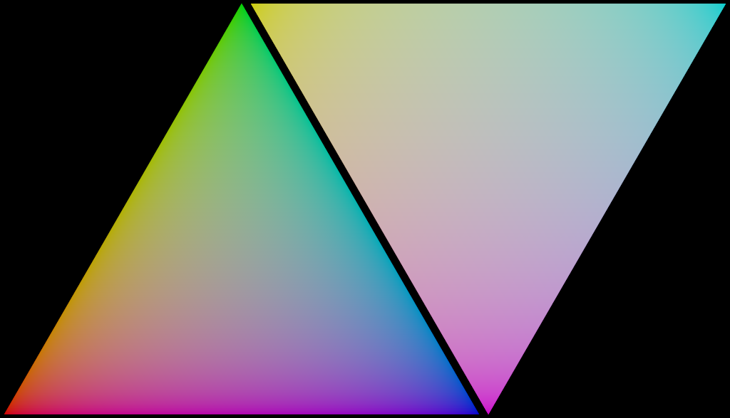
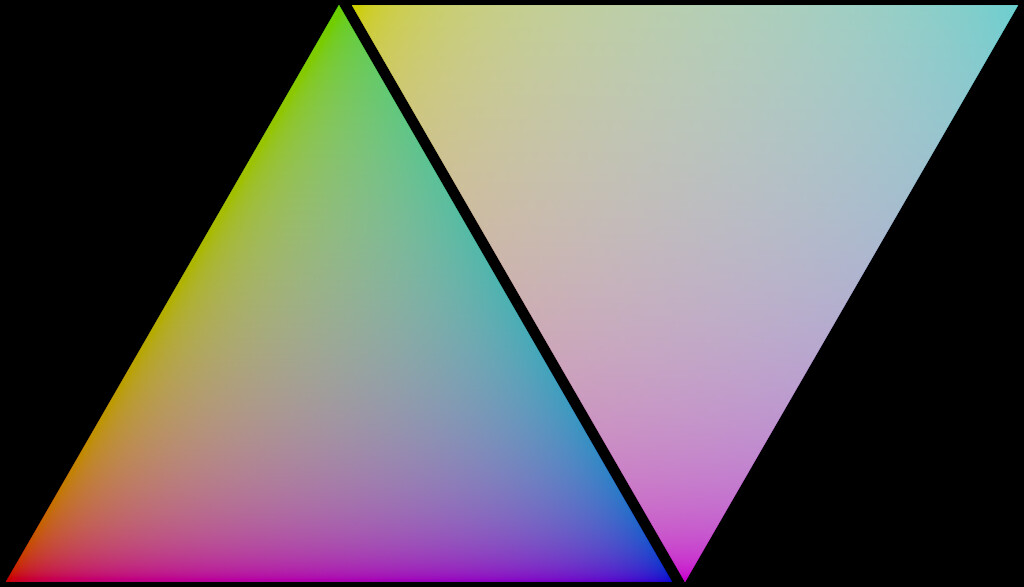
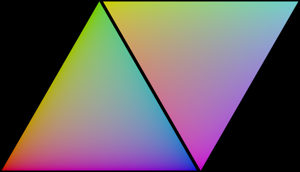
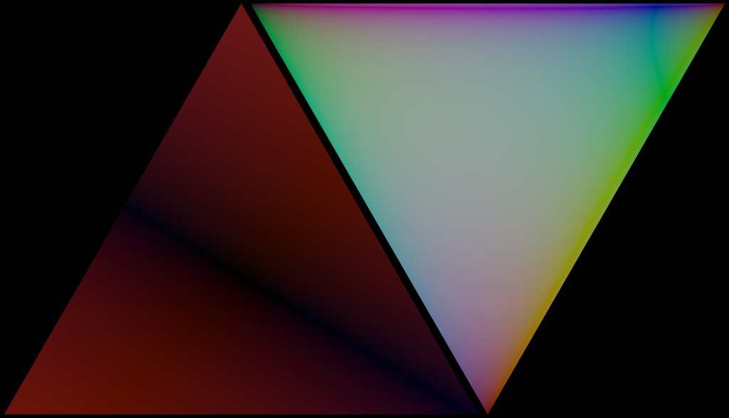
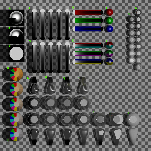
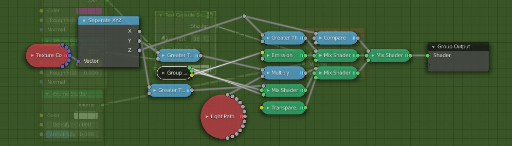
Finally, I got some time to work on this overview-scene. I incorporated some of @kram1032’s ideas too:

There is a lot to see in this image. Every block has special meanings and there is lots of room to extend this. The complete rendering took over 4 hours, but I exaggerated a bit on the sample count and resolution, I think :stuck_out_tongue: . The blend and exr-render from regular Blender 2.91.0 are here: https://we.tl/t-mJfZM2IYqv. Here are some explanations:

A) Refractive sphere with point light at its center in a holdout see-through box. The sphere has a glossy BSDF of type GGX with a roughness gradient from 0.0 through 1.0 in counter-clock-wise direction. I wonder what the dark band is through…
B) Refractive sphere with point light at its center in a holdout see-through box. The sphere has a glossy BSDF of type Beckmann with a roughness gradient from 0.0 through 1.0 in counter-clock-wise direction. Same dark band…
C) Refractive sphere with point light at its center in a holdout see-through box. The sphere has a translucent BSDF.
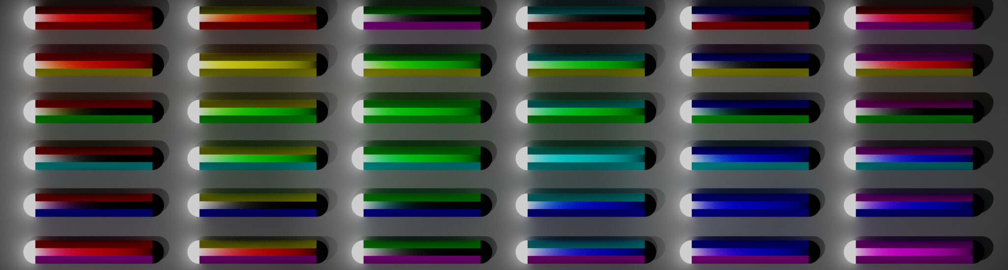
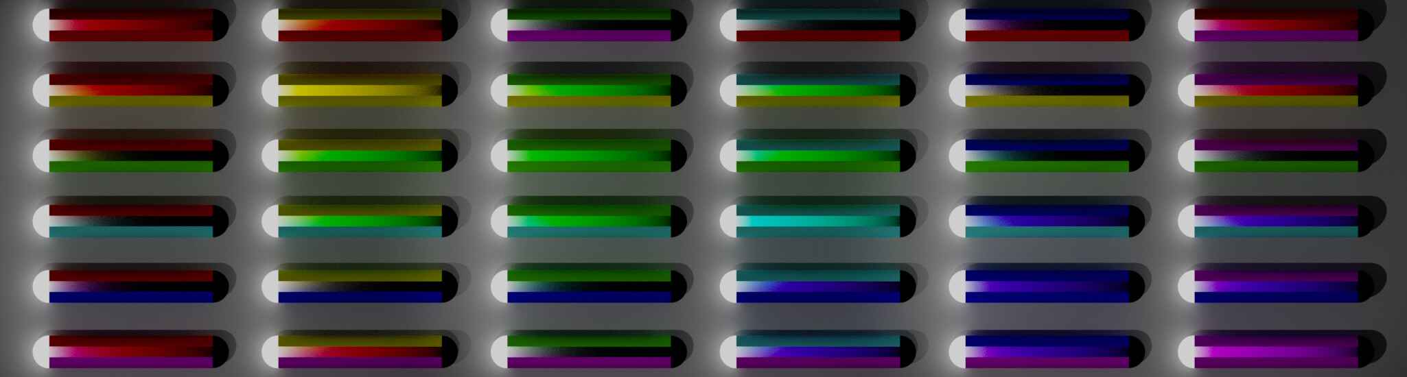
D) A thin 12-sided cylinder (dodecagon) with each side a different color (Red, G, B, C, M, Y, and gray scales) one-directional transparent BSDFs which are lit from the inside by a 2500K black-body point light. The floor is diffuse white and the roof is holdout see-through. The outer wall is (non-see-through) holdout. Thus, the colors you see are the single-scatter spectrum of the point-light in the center, surrounded by the spectra of each of the transparent transmission colors.
E) Same as D, but 6500K.
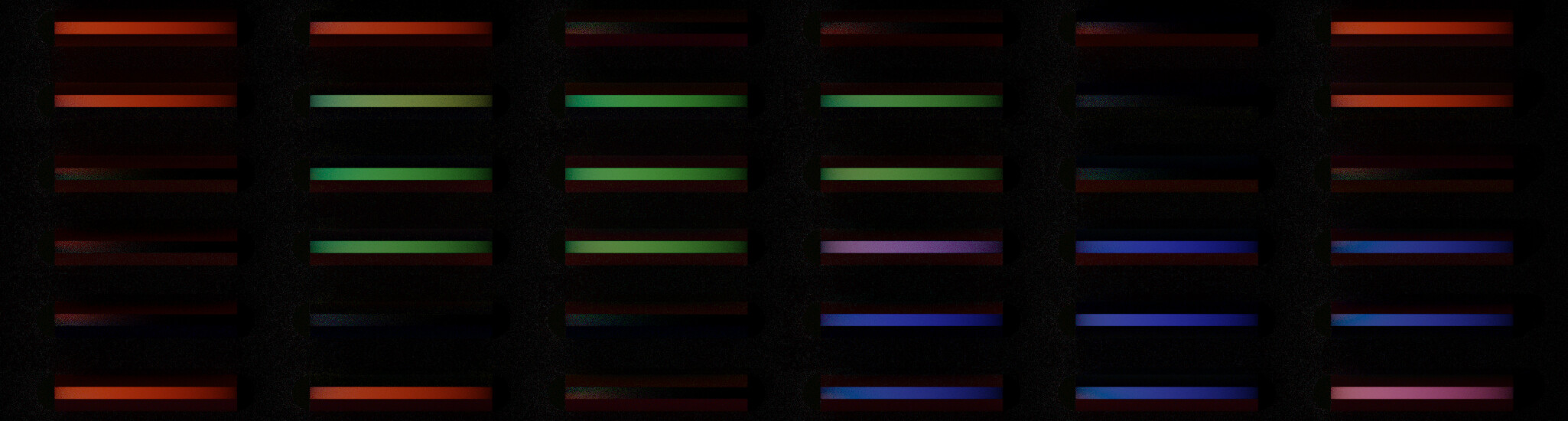
F) Mirror-surface tubes with white emitter at the north-end and holdout at the south-end. A see-through slit allows us to see its internals, but light cannot escape. The volume is a scattering-only white of density 5, 10, 20, 40, and 80 respectively. The mirror-surface extends each tube its sides to infinite west-east width and top-bottom height, such that we effectively render an infinite wide/high slab of finite thickness (north-south) where we observe the amount of light at each depth-step.
G) Same as F, but with constant density 10 and anisotropies -1, -0.5, 0.0, +0.5, and +1.0.
H) Same tubes as F, but no volumetric BSDF and just simple red (0.5, 0.0, 0.0), green, and blue diffuse surface instead of the mirror, hence not infinite slabs. Towards the right, these should merely show not only darker- but also higher saturated colors in Spectral-Cycles.
I) skipped for readability.
J) Integrating spheres with small see-through hold at the top and an equally sized diffuse white patch at the bottom. Inside, a white point-light is included behind a baffle. Rest of the surface is diffuse red, green, or blue like at H. (The holes should show homogeneous color, but don’t. There is something wrong here! The spheres just may be too small since those at O through U are fine)
K) Same tubes H, but with opposite colors in RGB-space - dunno, seemed logical to include.
L) Same spheres J, but with opposite colors in RGB-space - dunno, seemed logical to include.
M) Same spheres as with J, but its surface materials are achromatic diffuse BSDF stepping from 1/8 brightness at the north-end to 7/8 brightness at the south-end. The hole and white patch are a bit wider. The color from the central opening should be analytically calculable from the surface brightnesses. You can just see the very bright white dots at the edge of the openings which are the point-light sources (it is of no concern to the calculations, it is just annoying and the openings should be a little smaller to avoid this).
N) Same spheres as with M, but surface materials are achromatic glossy Beckmann BSDFs with 0.8 brightness and roughness from 0.0 at the north-end and 1.0 at the south-end. The color form the central opening should be the same for all due to the energy-conservation requirement on the surface BSDF.
O) From north-to-south: teardrop and integrating sphere having the same anisotropic Beckmann BSDF with roughness 0.3, then an integrating sphere and teardrop with same BSDF but isotropic instead. The teardrops are simple bulbous convex (?) shapes.
P) Same as O, but with GGX BSDF.
Q) Same as O, but with Ashikhmin-Shirley BSDF.
R) Same as O, but with MultiScatter-GGX BSDF.
S) Same as O, but with Glossy Toon BSDF.
T) Same as O, but with Diffuse Toon BSDF.
U) Same as O, but with Diffuse BSDF.

@smilebags: is this a useful progression?

6 Likes