Just submitted: UI: add text cursor theme color
2 Likes
I have a sort-of working patch for this but, since I doubt it would be approved for 2.81, I have submitted one that simply adds the dark shadows to the scale factor, that is more likely to get accepted in time imo.
https://developer.blender.org/D6025
1 Like
what makes this sort-of patch so complex that can not be accepted for blender 2.81 ??
P.S. perhaps it is better to add an image that makes the lack of the shadow more evident on a light theme …
On a dark theme they don’t see the shadow … risks that they don’t accept the patch
I think that the inconsistency is enough to justify it, but yes you are right, I’ll add a light background image tomorrow.
For the other patch, nothing too complex actually, but tomorrow is the last day before the bug fixing only phase for 2.81 and most likely devs have more important patches to review and include if possible.
Also, I guess that it would need some discussion, to see if adding a style category for that Infos is the right solution or not.
1 Like
I think that the things that concern the themes are so insignificant that it’s hard to break something that can’t be fixed in time and easily … but I understand your doubts.
and in any case consider that it takes one or two days to activate the branch 2.82 … so …
Hi @a.monti this is a nice patch! It would be great if at least the color could be changed from the editor, maybe under 3d-view -> Text Shadow Color?
I don’t know, I think it would be the only shadow option in the editors settings…
Anyway I’d rather not add temporary solutions that may be changed just the next release, so for now I think it’s better to leave it like this, and then discuss for 2.82 what’s the best way to implement it.
1 Like
Sounds good. And come to think of it, the node editor also has a Text Highlight, currently without any shadow. I personally prefer one shadow setting for all these kinds of overlay text. So @nokipaike’s idea to put it under Text Style makes more sense in that way. Maybe View Info or View Overlay?
2 Likes
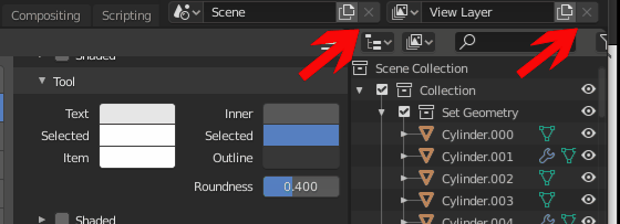
these two delete icons, strangely they are in “object disabled” mode and this makes it difficult to read them as well as having theming control over them
1 Like
This is a proposal that should first be made to the core developers before developing it, in order to prevent the patch from being accepted and therefore to waste time.
These settings highlighted in the screenshot are common to all areas.
The most boring thing in today’s theming is to arrange these colors for each space area 20 times.
It would be very useful if these were set up simultaneously once for all 20 areas.
At the same time we don’t want to lose the customization of colors of individual areas, so it would be useful if all these 20 areas have “an icon chain” next to the colors, so for the colors of the areas we don’t want to be linked to all the other areas , we simply disable the chain. (I think that just one chain icon is enough for each area, usually the colors of the whole area are customized.)

1 Like
Yes, if it’s more generic and shared between multiple editors it would make a lot more more sense.
Btw I got it mostly to work:
3 Likes
really nice … at this point before proposing it you should complete it with “extra info” that can be enabled in preference (and offer the possibility to set the vertex measurement colors and other measurement tools) … seem superfluous, but in terms of immediate readability they would benefit a lot, so it is not so immediate reading currently …
the purpose of extra info is to be able to hide the shortcut suggestions bar (once you know the shortcuts, it doesn’t make much sense to keep it open.)
1 Like
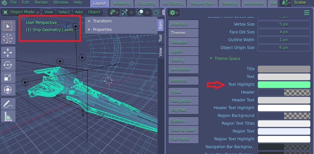
I discovered that the info text of 3d view is colorable … only it’s not so obvious …
3d view > Text space > Text Highlight
1 Like
You didn’t know? 
problem is that due to the dark shadow you can’t set it to anything below a certain darkness value.
2 Likes
I saw that your patches were accepted, good to know. 
working on transparancy backgrounds: Problems with theming bright themes
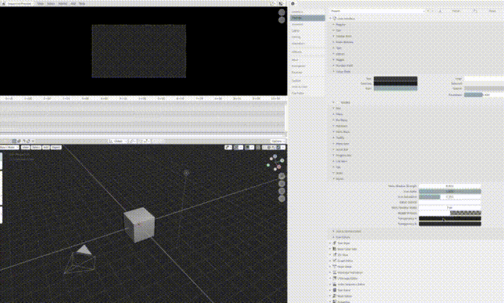
i now have Transparancy A and Transparancy B under User Interface > Styles
What would be a good name and place for these 2 settings?
1 Like
Wouldn’t be better to have only one colour and a grid multiplied over it?
1 Like
If you mean something like, checker tint and checker shade, then you can only make monotone checkerboards. It would be good for me, but maybe not for every theme out there.
1 Like
I meant a single exposed color, something like alpha background or alpha checkerboard .
And then the other one would automatically be a darker version of the chosen one (similar to the vse channels for example).
Another way that comes to my mind to expose a single value would be to use the theme’s 3dview background color for half the squares, and a alpha pattern one for the other half. This would also allow for different tints.
1 Like
I like the terms Alpha Checkerboard and Alpha Background
In the first scenario, by using only one property, you won’t have control over the contrast of the checkerboard.
The second scenario could work if basing the themes alpha checkerboard on the 3d-views background is what we want. But we have to keep in mind that the checkerboard is used in multiple areas. I’ve tested it with 3d-view, sequencer, and image-view. And as you can see in the gif, the ui-color-widget also has its own checkerboard that also needs to be hooked up to the theme settings.
It’s a tricky one 
1 Like