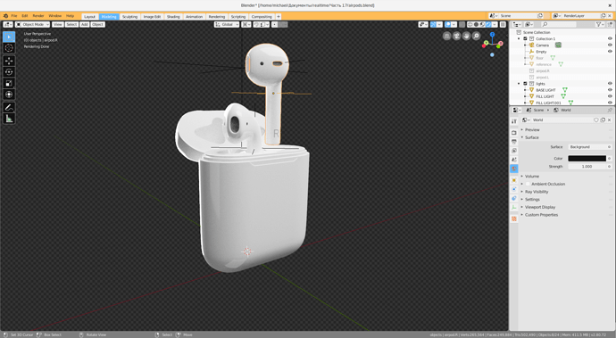
Missing ability to theming transparency grid
PROBLEM
It is annoying that you can’t theming how transparency looks like. Especially If you want to make bright theme:
In this image you see, that there is no practical benefits from using white theme
PROBLEM
No way to make selected item to “invert color”. For example, I can set color of selected tab here:

but not here:
![]()
It’s looks like I can set this style in for overlays button in “Regular” section, but this makes disabled icons in outliner invisible:
So i should make them black:
So as a result, i should make text in tab also black, because of consistency.

SOLUTION
Just add changes to theming engine


