Right, and using the editors background colour would result with different alpha checkboards per editor…
I don’t know, maybe it’s possible to write a function to find a good value shift depending on the chosen colour, but it’s probably not worth it.
1 Like
Yeah, I think just adding two global colors is the easiest to implement and most flexible for themers. What about this:
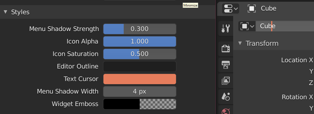
User Interface
Styles
Alpha BackgroundAlpha Checkerboard
1 Like
Hey guys, nice to see you again, I’m glad to see that this thread is still alive.
I have not added anything else because I have not found any other theming defects, I think they are all listed or almost …
all we have to do is solve the known.
That’s all folks!
1 Like
I think better to make like outliner background - main color, and semi-transparent overlay. In this case, you can change background with one value, and add contrast with second. Nice if you want to change background from time to time
In outliner it calls Window Background and Alternate Rows.
So, Alpha Checkerboard and Alpha Checkerboard Alternate maybe?
1 Like
The line numbers in the Text Editor should have their own color(not just the line-number background). In most modern editors the line numbers are themed less vibrant than the lines.
2 Likes
3 Likes
Thank you Harley! It was difficult to see with any sort of blue theme.
They do. As of a few days ago now anyway.
1 Like
Actually not quite. It turns out my patch is almost word-for-word identical to an earlier one by Paul (Thirio). Once it gets approved (a day or two maybe) I’ll commit his version (with him set as author) then commit my other related changes afterward.
5 Likes
another nice improvement is coming:
T64177 Toolbar icon theming support
The patch adds a theme option for “inverting” icon colors.
![]()
![]()
How the icons look at an exact middle gray background?
I have no idea, at the moment I have not tested it
but I would say that with the gray background it is better to use white icons
I hope that’s not some automatic thing that inverts the colors out of nowhere and too soon.
probably it is, but at least it works better with a lot of new light themes
We shall see…
I understand the need for something like this, but why a switch and not a swatch?
And why not add/connect the icon colors to Themes\User Interface\Icon Colors while we’re at it 
it was all decision of the developer who spontaneously proposed the patch, perhaps these questions, and any suggestions should be placed directly to him on the patch review (without making too much noise) or invite him to discuss it here
I made a patch about transparent checkerboard (edit colors and size):
3 Likes
Marker line always white: