Hi a.monti, I’m not. So yeah, please do 
1 Like
Grazie Ale
your help is welcome
1 Like
Hi HooglyBoogly, Did you get the text-cursor and n-panel roundness to work?
I’m super excited! We got our first revision!
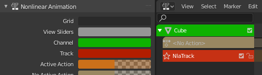
Theme: NLA Channel and Track
This revision is now accepted and ready to land.
3 Likes
After a while looking it looks like the radius for the tabs is set on line 1933 in interface_panel.c:
const float tab_curve_radius = ((px * 3) * dpi_fac) * zoom;
This needs to be multiplied by the roundness value for the “tabs” widget theme. I haven’t figured out how to get a reference to that uiWidgetColors struct yet though.
For the text cursor color, I haven’t changed it since the diff I posted earlier. It probably makes sense to have a global text cursor color like we were talking about though.
2 Likes
Thanks, I did see that. 
I was also trying to change a bit the way they look, I’m not a big fan of that highlight on the border. I still need to refine the patch though.
2 Likes
This toolbar, should it also contain the possibility of making it become transparent?
In case we have both toolbar on top or below, it is convenient that it is opaque, but if we have one at the top and one at the bottom, then I think it’s consistent that both can have transparency.
2 Likes
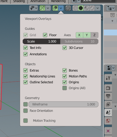
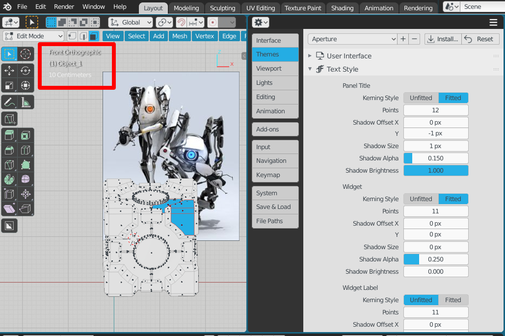
In addition to the color of the shadows of some informative texts of the 3D view that are not themable, there is also the text of the measures that has no shadow.
They should be themable evenly and should go to
Themes > Text Style > 3D view info (or something similar)
2 Likes
Ok cool. I’ll try to get the text cursor done this weekend.
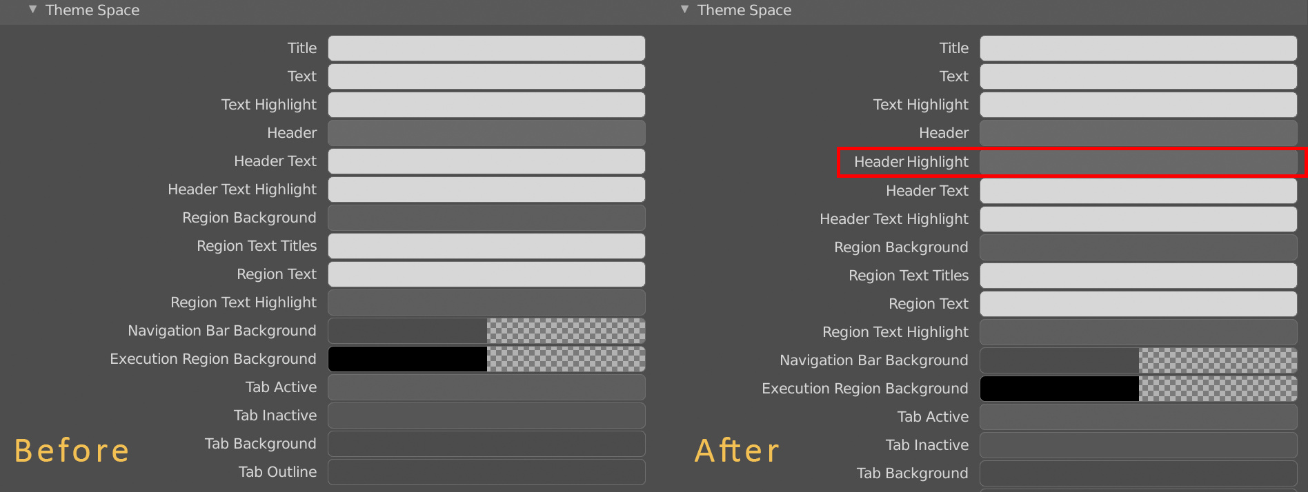
The mouseover highlight of the header isn’t themeable:
I would add this option in the Theme Space next to Header so you can easily adjust it:
3 Likes
To be honest, I don’t see the point of the header highlights in Blender. I even find them distracting.
If they don’t serve a purpose I would suggest removing the mouseover effect.
Does anyone know in what scenario the highlights are useful?
This is a function that has always existed, Blender 1.8 in 1999 already had this function, and its purpose is to indicate appropriate shortcuts in that area are active where the mouse cursor is overlayed.
Sorry, I don’t get it. I thought the status bar was used for keyboard shortcut indication.
How does the highlighting of a header help the user understand what shortcuts to use?
it has always been this way.
Blender areas are sensitive to the mouse cursor …
for example
try moving the cursor over the property area and press numpad + or - and you’ll see that you zoom in on the text
if you move the cursor in the 3d view and press numpad + or - it will zoom the 3d view … and so on you will have shortcut functions that change in other areas
if you open preferences and go over the keymap, you will see that they are listed and depend on the areas
So, nostalgia then
I don’t know if it’s nostalgia or something else, I was 18 - 19 old when I met blender, now I’m 40 and I’m still here, time has flown away and I’m still here. I think it’s just habit.
Personally i don’t use/like it, too. But maybe some people want to use the highlight (for some strange reason). So giving the people the choice to choose it would be great. If people dont want to use it they can just give it the same color from the header and it is disabled.
3 Likes
Wow, thanks for sharing nokipaike! This is awesome! Let’s keep 'em coming
3 Likes