There are not much of them to save enough space. Such system will also have a limit.
There are not much of them to save enough space. Such system will also have a limit.
I don’t like tab scrolling anywhere and do my best to avoid it. But that is not the point. The point is I like tab name truncation less than having to scroll through a row or column of tabs. Its like choosing the lesser of two evils.
An acceptable alternative to tab name truncation when space is limited would be an automatic conversion to tab name acronyms.
Though ideally a user would have the option to declare their own tab category names and designate where each add-on goes accordingly, when necessary. Some add-ons are complex and feature rich to deserve their own tab category, others not so much. As previously stated in my first reply to this topic, there is existing code for this option, and some add-ons already utilize it. Though sadly not enough.
It would be nice if the existing code for custom tab categorization was part of the standard add-on template.
As for panels, well, you got me there. Its not a T-panel any more. Its a Toolbar. But regardless we each knew exactly what was being discussed. And I still think an additional panel left of the Toolbar would be a nice addition for users in need of more space for their active add-on collection.
An optional customizable panel on the left, and an optional customizable panel on the right equals more space for Blender, add-on, and user designated category tabs.
On the additional topic of icons. I am not confident about the use of icons in place of names for tab categories. Typically I am all about icons over text, but in this particular use case I feel they would complicate development and not aid usability.
Scrolling is still a viable solution; considering users can make their own workspaces with filtered addons appropriate for each.
At this point it’s insane to load every possible plugin in one workspace.
I also think limiting text to acronyms is a non-starter. This is in direct opposition to the flexibility of the UI in almost all other cases. It’s not really a solution; more a mandate that will still be confusing to users. Also, it doesn’t address the vertical tabs eventually truncating; which is what this proposal sought to solve.
I have not used the Clean Tabs Addon; but will look into it when I get a chance. (I’m busy this entire weekend.)
Threre is one example I will give later of horizontal tabs with pop-over menus; which could be a viable solution as well. Though I still think all these ideas are veering away from the original intent of this proposal, which was; make a simple change that will have an immediate benefit to the users. Not start an endless brainstorming exercise on all the potential ways it could be completely different. None of which I am strictly opposed to; just trying to keep this on track.
With that said: if any of the developers who would be specifically prepared to take this on, would like to make suggestions based on what they could easily accomplish; I’m all ears.
Sure. Scrolling at least requires scrollbar. So there will be two scrollbars for panel and panel’s tabs.
automatic conversion to tab name acronyms.
Not a panacea but for sure a better behavior
Though ideally a user would have the option to declare their own tab category names and designate where each add-on goes accordingly, when necessary.
Well, special tab for management tabs can solve this. So are you in?
And I still think an additional panel left of the Toolbar would be a nice addition for users in need of more space for their active add-on collection.
Or mode switch. That was expected, but didn’t happened at some point. So, we have to work with what we have.
I feel icons would complicate development and not aid usability.
There are a lot of software examples, that has got their interface uglified, because programmers tried to draw instead of coding.
Not sure for double scrollbars.
considering users can make their own workspaces with filtered addons appropriate for each.
So that mean, that you will need some single place to observe all that you have enabled.
And this should not be Addons section from properties.
Also, user have not to be forced to use workspaces like that.
Threre is one example I will give later of horizontal tabs with pop-over menus
All horizontals are currently occupied, will be interesting to look.
I never mentioned ‘scroll bars’; and that would be inconsistent with the same behavior in the workspace tabs. If they go beyond the screen space, they do not have a scroll bar; they just scroll. Or the user can click and drag them.
This is what I was expecting with what I proposed.
This is a separate issue. I also made another paper cut that addresses that here:
Though it seems no one has seen or addressed it.
Workspace tabs works in a different way - there is no reason to make 50-100 of them.
Addons have such issue, so scrolling through tabs contents helps a lot.
Ditto. When I mentioned scrolling tabs in my brainstorming, I too am taking into consideration how Blender currently manages the work-space tabs. It seems like that would be a natural fit for the tabs in other locations within the Blender UI.
Not sure what you mean by “so are you in”, but as it is, when an add-on doesn’t already provided an easy way in the user preferences to change its tab category name I adjust the code myself. In the process I’ve cut down the number of N-panel tab categories from twenty to nine; Tool, View, Create, Utilities, Misc Boxcutter, HardOps, Bevel after Boolean, and Precision Drawing Tools. Obviously, due to the complexity of the tools within I left the last four tabs mentioned alone.
I am an artist not a code-wrangler but little by little I am learning how to hack Blender into doing what I want. The thing is, I rather be using that time to make art.
Yes, in static way, with current realization of tabs management you have to decide what is important in order to prioritize. It’s about sorting your workflow and life. This is a brave solution.
With special managing tab (store tab) you will have access to any amount of addons, prioritizing their location in interface, deciding if
This can be smart solution, that keeps tabs section clean, and hundreds of addons available.
I am an artist not a code-wrangler but little by little I am learning how to hack Blender into doing what I want. The thing is, I rather be using that time to make art.
I am Workflow Designer, so I making funds as an artist, and hire developers for making concepts.
If you have some programming skills, you already have base for conversation with local developers.
By the way, that’s why my addon’s list is so long.
It works.
little pigs … I know what you do with the vertical tabs ![]()
So these are the promised screenshots of Horizontal Tabs. (They are from Autodesk Alias; and they are referred to as ‘shelves’ both in Alias and Maya.) I’m really not trying to impose any of the exact UI elements as suggestions for blender; but the way that his setup gives the user flexibility to setup groups of tools to their own liking & logic; is pretty stellar.
So the ‘shelves’ are sort of little groups of tools that the user can put together. This is done by dragging a tool from the toolbar into a ‘shelf’. The user can setup the desired options for that tool by double-clicking on it and using the options tab; much like the new interactive tool windows we’ve recently seen added into blender for many of the tools. The neat thing is that I can make several preset versions of the same tool; with distinctly different presets, and name them however I decide is appropriate.
In the screenshots; you will see I chose the ‘Align’ tool as a good example of this. In NURBS modeling, you can align to several different degrees of alignment: G0 = Positional, (Think and edge of a cube where two surfaces meet to a sharp edge), G1 = Tangent (The typical Parametric CAD type blend that usually leaves much to be desired in its highlights, G2 = Curvature (good transitional flow): ther are also even G3 & G4 as well; but that’s not really needed for this discussion. The point is; I may already know which of those options is will create the desired result, before i even choose the tool. These multiple version of the same tool speed-up the workflow more than you could imagine.
So if we are going to talk about completely changing the entire fundamentals of Add-ons and their use of tabs; I would suggest that we consider something like this. Where users have the freedom to create toolsets that could include add-ons, as well as native tools; with retained presets of tool options.
You can see in the screenshots as well; that when I right-click over the ‘Shelves’, it reveals a menu of all the preset tools in that specific shelf that my mouse is currently over. The little square box is a place to click and open the option dialog for that tool; same as I described as a result of ‘double-clicking’ the tool icon. It just makes it so you don’t have to open the shelf to do that.
How that sub-menu pops up could vary; and could be integrated to adhere to the standards already developed by the updated blender UI guidelines. The general functionality and freedom it gives the user is what I am focusing on here.
Yes, we know about Alignment types in NURBS modeling)
G3 & G4 are ultraprecise, and used in space industry.
So are you referring to popups and flying menus?
This is literally sketchup way.
We are using it, and at the end of the working day there are a lot of… stuff flying around the screen.
Can’t say it’s good.
Having scrolling tabs is a terrible idea frankly but something needs to be done about the add on tabs as they are.
I think it might be an idea to consider to have your addons be listed in one of your main tabs on the lower left (like render, particles, material,etc…) and then when you select that addon from that tab, at that point it is added to the tabs which open on the side of the screen with the n key. And then it will remain saved there with your scene. At least then, you only have the tabs showing that you’re using with any given project.
The Pictures you show are a bit over the top as far as too much info & icons per panel. what I was trying to convey, is that there is a pretty easy method built into Alias; where the user can configure their own 'Menu’s. Perhaps what Alias calls the ‘Shelf’; could be implemented as ‘Presets’; which are another Tab in the Properties panel. I would suggest it go directly under ‘Active Tool’ near the top.
When a user right click’s on a horizontal tab where the desired tools are stored; it can pop-out (marginally over the 3D view), or over the list of user grouped tools. The actual tool options window would still be the same as they are now in 2.80 forward. The little black translucent window that shows options for the current tool in the lower left corner of the 3D View . . .
The little box in the sub-menu for each tool; is simply a nice touch, that allows the user the option to show or hide that options panel. In many cases the options are not needed; because the user has already preset them to exactly what they know they want.
**Let me know if you would like me to do a mach-up. I’m more than willing, if its truly under serious consideration.
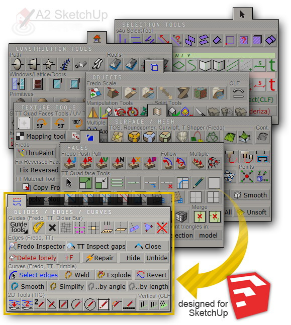
Your description of a solution still does not really help with managing 200+ plugins. I realize that not every file uses every plugin; but at the same time; many larger projects use many of them at different stages of the process. Whether you are talking film, Animation, or Arch Design, etc.
And "Standard Categories’ only get us so far. The user really needs to be able to put together what works best for their own desired workflow.
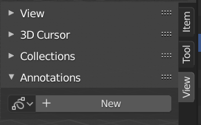
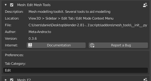
I personally like the idea of scrolling through tabs. I think it makes sense and is not unlike other parts of the blender interface. Another possible fix is for the preference panel for every addon that uses the N-Panel to always have a “Tab Category” setting that can be edited to combine like tools in the same tab. This would override the default tab (stored in the bl_category variable in the class definition). Here’s an example from the Edit Mesh Tools addon that ships with Blender. I could change the Tab Category to Graswald and have the tools show up in my Graswald tab. This should be pretty easy to accomplish code wise, probably easier than scrolling tabs.
Or in mangement tab