Well, the problem is that we are talking about massive toolsets with branding names
I would definitely like to see such mockup in order to understand it right.
It will be necessary in any way.
I’m not following you. What do you mean? I’ll say that I always go through and edit my addons so I can organize them into tabs and have never seen any major issues in doing so. Especially since I assign shortcuts to the features I use the most.
1 Like
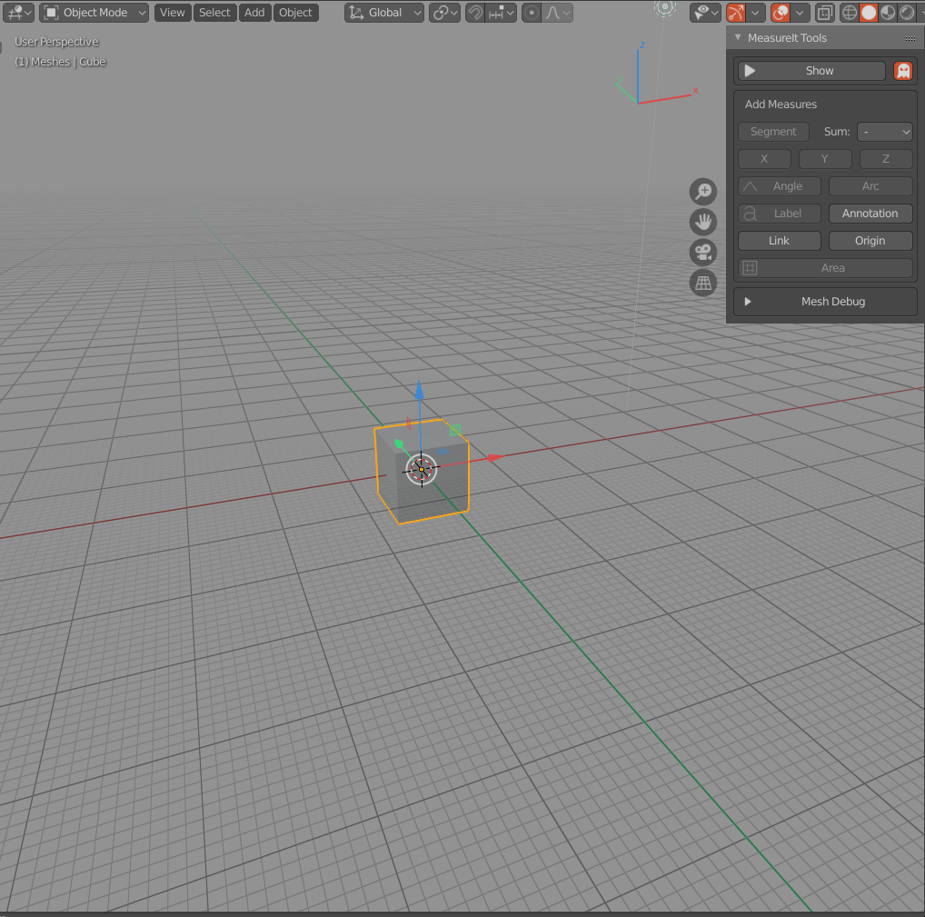
This is basically available in the tool tab under workspace. In your start up file have all of the addons disabled there and as you use them enable them. It will be saved with your file.
1 Like
I do the same. Though I still have spaces for certain purposes that should include certain tools; which still end up truncating the tabs. That’s the entire reason I reported this as a ‘paper-cut’.
1 Like
The thing about the add-on filtering; is that it is worse than the tabs to try and scroll through; and find exactly what you are looking for.
There needs to be categories, or user defined groups there; as well as a text search box to make it faster. It’s nauseating.
A nice example.
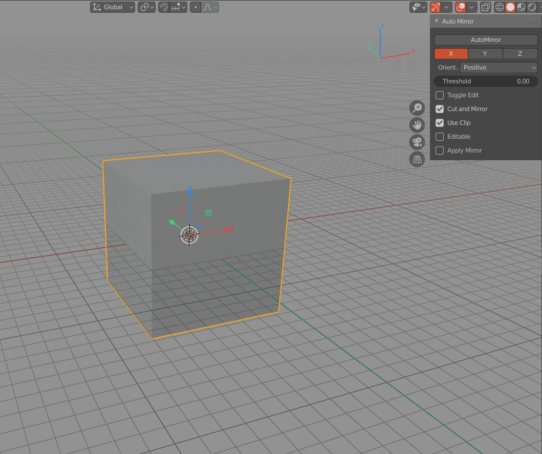
We made several large toolsets, collected in “1D” tab. So we can’t just move them to any other tab, or give another name, so ability to name a cathegory in addon’s section is kind a useless in that case.
Also, it will be tough to manage hundreds of addons this way.
Yes.
That will be complex way of management.
We can also imagine a customizable menu that can switch over the addons (and why not between transform;3D Cursor,etc…):
N key toggle the bar and Hold N Show the menu or,… Right click context menu
1 Like
Rather have something similar to what has been proposed for the modifiers, a list like the material one. Something to consider.
Lemme just summon @billrey
It is not possible to look through even 50 addons quickly with such system - the list wil be too long.
With the same success, it could be a drop-down list with add-ons somewhere in the UI, for example, on top of N panel. It will make access to every addon equally slow, regardless of relevance.
Also, do not forget about the need to switch from the addon to the properties of the object every time it is needed to be edited.
So, configurable tabs solution can be more universal.
1 Like
I should like to add my endorsement to what @1D_Inc has written above.
Please don’t mess up this panel for addon developers and please don’t make it too slow, or awkward to use!
Cheers, Clock.
Configurable tabs can be good however there is still the problem of vertical reading which is not good and the bar list that break the ui consistency…
Having 50 addons is extreme case but menu can have column/separator/label/icons and you can also group the addons by categories to show few at the same time.
I also have this mockup in a corner:
That’s just my 2 cents trying to find something else…
4 Likes
It looks interesting!
It’s like configurable management tab system, but with RMB instead of management tab.
Well, the tabs list that break the ui consistency, but it is still the fastest way of direct access.
This structure seems too deep for navigation and lacks transparency.
It will take too much time to find proper addon in proper group in proper set.
Cramming seems to be the only way to use such a system.
1 Like
Such addon management will make Blender extremely personalized
2 Likes
A lot of really good ideas here, I hope some get implemented. I think the bare minimum should be that users can decide where to put each addon without having to code.
2 Likes
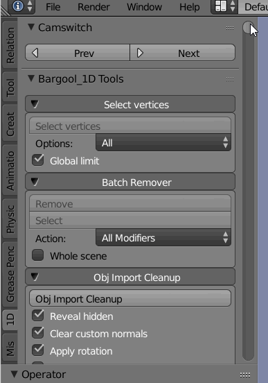
Can we at least just get something in? Just make that tab list scroll vertically. The worst improvement would be better than this:
I don’t even have that many addons enabled and it already turns to shit. We can always look for a more elegant solution later, but basic usability really has to be addressed now instead of continually debating the perfect interface and getting nowhere. Can’t tell you how many examples of perfect being the enemy of good I’ve seen around here. ![]()
3 Likes
This has unfortunately gotten out of hand. One of my users tells me he just starts “clicking away until he finds the addon he wants.” What a terrible User Interface Blender has provided for this feature.
I would suggest allowing icons to be displayed and if an addon has no icon, use the first character of the addon, so Hard Ops would be H and then, do as Google does and add a predefined color to the background with a circle or a square: Colors are VERY easy to find-- esp if there’s a tooltip involved to double check.
Icons should be trans white PNG or SVG (whichever is easiest for devs to work with) and will also be superimposed over the same circle or square.
2 Likes
The problem is multiple addons share the same tabs, adding various initials if there are various addons would be a good compromise imo.
Or custom tab name override.
I have for every addon in the code to change category tab and after my tabs are clean. I don’t want everytime to turn off some addons to clean tab space. I want all necessary addons to be turned on and have clean tabs with fully visible name.
1 Like