I am not a Blender expert but it is my impression that the T-Panel still exists. It is just dedicated to quickly accessing “essential” tools, both Blender native and those from add-ons.
Still, it would be a nice option to have an addition panel left of the T-Panel (T for tool?). Maybe an A-Panel, ‘A’ for add-on.
This along with granting users the ability to custom name add-on categories, as well as select which panel ‘A’ or ‘N’ where they can be placed would help a lot with organizing a user’s main Blender work-space.
And while I do not love the idea of tab scrolling, I would welcome it over the current truncating of tab names as an additional option should a user just happen to collect and activate that many add-ons.
Just brainstorming here.
Ultimately I just want options. Clickable options in the user preferences for us all to be able to customize Blender to meet each of our respective needs / wants.
Those extrude and spin buttons in Maya style?
No, it cannot be named “panel” anymore, it is “buttons”.
“A” is a bad name, because it is selection shortcut, and addons do not have a clear border with software - for example, in professional production Blender is used mostly for addons, not for spinning)
There is no perfect software, every developer knows that, that’s why any kind of software is used mostly as framework for running addons in high-level production.
It’s kind a “use it like that or loose to those, who uses it like that”
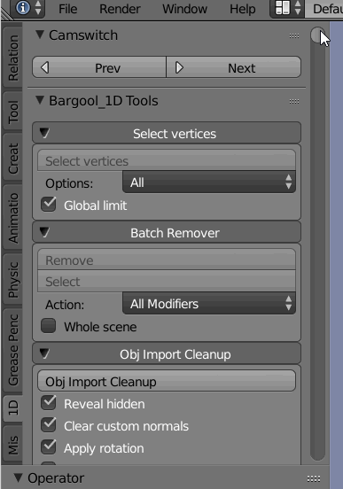
For instance, here is GIF with our addons list, that makes Blender useful for complex production:
This is just single tab.
Now it is replaced with… spinning and extrude?)
Not sure they are more essential to us than any from our tools.
What kind of scrolling is meant?
This row is already responds to scrolling - it switches tabs.
Do you mean that kind of solutions, that requires scrollbar near the row to display where are you exactly in the list?
Well, that GIF just gave me a visually induced seizure.
Its not quite what I think of when I say scrolling “tabs” it is not the info in the tabs that I am refereeing to but the vertical list of tabs themselves. Still not ideal but better than truncating the names into something unreadable.
As for whether the T-Panel can or should be called a panel is a mater of personal semantics. I would argue that it still is a panel, but I rather not as it diverts from the primary point. Which is, a panel to the left of the tools would be a welcome option to me as a user. As for what to name it, I was just brainstorming, and went for the obvious as a starting point.
Still not ideal but better than truncating the names into something unreadable.
There are a lot of examples of tabs behavior to that day - browsers, sites, other 3d software…
Where do you like it more?
As for whether the T-Panel can or should be called a panel is a mater of personal semantics.
The “panel” is the name of program solution.
So, if person says, that he want “panel”, “button”, “slider” or “scrollbar” - it is clean what is meant.
If we call a “panel” everything that is not considered a “panel”, but someone has presented it as a “panel”, we will get a mess all over the world.
Just like previously with “instances”, that are suddenly called “duplicate linked”, or “layers”, that are not related to any kind of layer systems at all, and was designed to be used in other way.
The panel could switch the mode instead of being removed.
I don’t quite understand the denial to both icons and the acronyms of an addon.
And more when your addon uses 1D as its name and you can recognize it even better than the rest of the addons. If the text were horizontal it would be better.
I’m not entirely sure, is it a proposal to reduce addon’s names in tabs to 2 characters?
I don’t think icons will be allowed, because it was made too much UI design work.
And we don’t want to make an icons to all our addons - we want just to name it.
If you don’t want to make an icon select two letters, with case sensitive, and an icon is painted with both letters. I don’t see the problem.
Other option is that somebody doesn’t want to use icon or letters uses a complete word and the tabs going to the down of the tabs and will be hide if the screen doesn’t have enough space.
What do you mean?))
I thought, scrolling is the worst solution, because it’s even disallows to see all your entries in one place))
What if you will have 50 of them?)
100?)
There were another addon, can’t find it, that allow to manage tabs visibility.
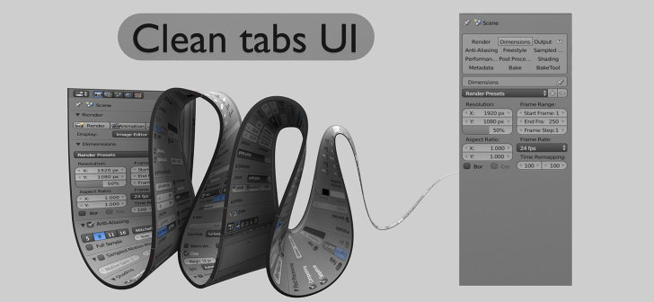
I think it would be nice to have a separate tab, that works like Clean Tabs UI where you can place all rarely used tabs, leaving to regular bookmark tabs everything important.
Can’t find where it was proposed
Unofficial icons will be ugly.
Also, system tabs are just tabs.
I think separate tab for managing tabs can solve an issue.