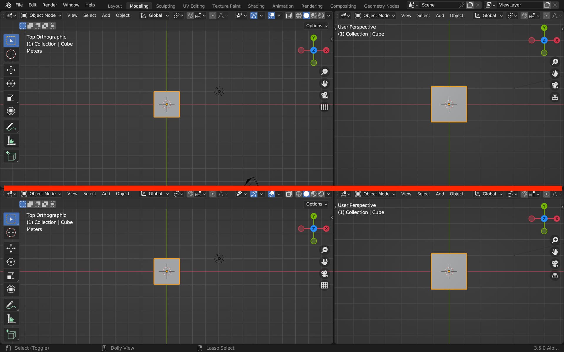
Just tried the Linux build and I really like the changes. Being able to split/merge any anywhere once you’ve started the action feels much more fluid and spontaneous and it’s easier to course-correct an unintended action, unlike the current behaviour.
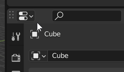
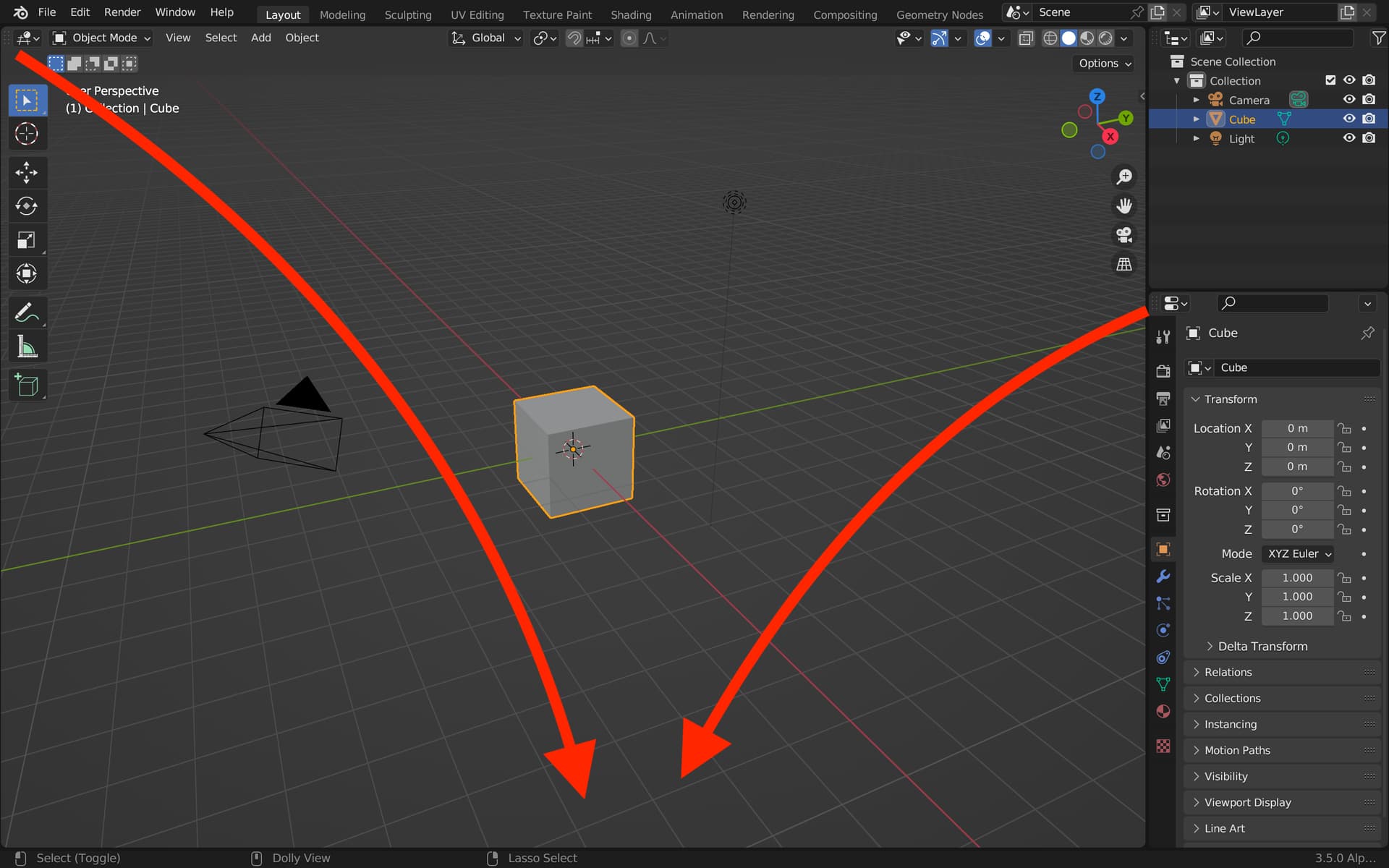
The existing corner-drag gesture has a metaphor that’s like pulling a curtain or a window shade along the splitting direction which goes beyond muscle memory. So I think having the grab handle on the header is crucial for getting away from that. I found that saying aloud “I am placing the area here” every time I moved the preview around reinforced the intention. It’s just a case of getting over that metaphorical hurdle.
If you did compromise and keep the existing corner behaviour, I’d hope that at least the header drag handle would use this new behaviour, including splitting.
I did a few things to try to break the old mental model. I made the top-left action zone larger and moved it a bit away from the corner. Then added a “gripper”. Maybe a bit much but made it so that the cursor turns into a “hand” to imply dragging. And I also added a “document” to the dragging mouse to indicate that something is moving, which of course could be changed and improved.
So dialed it up to 11 with a few gimmicks to see if anything helps. I updated the build links in the top comment.
I find it funny that common UI/UX conventions developed and somewhat standardized over the past 20 years are called things like “Maybe a bit much” or “dialed it up to 11”. Things considered absolute bare minimum in terms of usability are always referred to as audacious in Blender land
This is great. Once this is in, then we could finally deprecate the clumsy and poorly discoverable system of splitting the panels from all 4 corners. But then again, since this patch falls into the “This would be a great benefit to user experience” category, it will likely end up forgotten and never make it into the master
The rectangle under the cursor is unnecessary. That’s one too many gimmicks indeed. I’d simply keep the cursor set to the hand until the mouse button is released. That’s how the grab action accompanied with the hand cursor works in most other software. The indicator of something being dragged is supposed to be the hand cursor itself, so it should stay on for the entire duration of the dragging.
For sure. Providing builds is a bit of a pain, so I don’t want to make tiny iterations. This had a lot of changes so I could test out a bunch of ideas at once: good, bad, and ugly. I do like the visible gripper area though.
…this patch…will likely end up forgotten and never make it into the master
My dream is that we can have enough changes for 4.0 that it can allow for this type of change. But I’m still worried that the difference in splitting behavior will be the spoiler.
…keep the cursor set to the hand until the mouse button is released.
I’m having trouble with the “hand” cursor. It just feels too “goofy” to me, coming from Windows where we don’t use anything similar. I realize the open and closed hand cursors are used on Mac for this kind of interaction but it just feels funny.
This splitting behavior is not different, it’s just straight up better. But yes, that’s why I made that snarky comment. Unfortunately, when it comes to Blender, there’s always someone who will point out some obscure underused reason why the old way is better, and in Blender land, that’s always enough of a reason to put full stop on everything and abandon any changes.
developer.blender.org is just a giant graveyard of amazing UX improvement patches, slowly decomposing, being forgotten. If you look at most of them, they are almost always killed by some comment from someone along the lines of “The old way had this one thing, and the new doesn’t so we need DESIGN!”
I am really worried that this patch will end up the same way because it has all the signs. It’s immensely useful, and it doesn’t improve something by just a tiny, incremental step in a better direction, but fully. So it’s been marked for termination.
I’m happy with the visible gripper area, it’s an established convention and thus intuitive and friendly. If that’s the necessary price for this wonderful docking behaviour and future advancement, I think we could lose the 4-corners option. I like its flexibility, but I also know that whenever I teach someone Blender, they really struggle with it.
I still find the splitting behaviour too finicky though—when you swipe at a roughly 45° angle, it flips flops between the two orientations too much. If that’s easy enough to alleviate with subtle changes that gives more weight to the initial mouse movement, for ex, then all is peachy as far as I’m concerned. I had proposed “locking” the splitting orientation, but as I’ve used it more, I changed my mind—I don’t think that’d be necessary.
Have to agree. We could use the default 4-way “move” cursor of Windows perhaps? Would neatly emphasize the “you could go whichever direction” nature of it. Is it that it has to be platform-agnostic and this one is not used on Linux and Mac?
This patch still allows all operations from all corners. It is just treating the top-left one a bit special by making it larger and adding the visible gripper.
Well that is exactly the boundary between the targets, so understandable. Use your mouse to indicate where to place the new area, at the top, bottom, left or right. You are not indicating the cut but the destination. It is this change to splitting that makes all three operations work identically.
Yeah that’s good. I’d keep the cursor icons the same as they are now though, they convey splitting and joining pretty well imo. I think the light overlay is enough to tell the user they’re editing the screen layout -if that was your concern when adding it.
As a relatively new-ish blender user who does not yet have ‘muscle memory’ for the old splitting behaviour: this new way just feels completely intuitive to me. If I had the power to force a decision I’d just apply this to master today.
The current splitting behaviour is just too undiscoverable. I still never know what’s going to happen when I drag from a corner (in master) and I never know which corner to pick. With this patch anything works from everywhere. I really like it.
The added ‘document’ in the latest versions feel superfluous to me. The shaded area already clearly shows what is going to happen. It might be nice if the editor type that is being created in the shaded area would be somehow shown.
I don’t care much for the gripper area. But I really don’t mind it either.
As for a changed cursor: the grabbing mac-hand seems slightly better to me than the 4-directions arrow, as that last one signifies moving something and that’s not the (only) thing happening here. But even just no mouse change would be ok.
I hope this patch goes in, as to me it is way easier to predict what’s going to happen than the current system.
That is so much better. The handle/gripper was definitely the missing piece. Even if it’s essentially still the corner behaviour, it feels different. I almost want grippers on every corner now
Regarding the hand cursor, I think it helps convey the grabby nature of the gripper, but you’re right that it’s not really used anywhere else. I also like that the ‘document’ box helps convey that you’re holding something that’s being moved around. Not sure what the ideal visual representation would be for it though. Clearly the full preview was too much. Some simplified representation of an area with a header? More like an application icon? Or as has been suggested, the icon of the area type maybe.
Would you consider exploring animation at all? Like highlighted area expanding out from the cursor on the initial drag? Or it resizing to the new location?
I wrote a whole thing before realizing you made every editor’s corner draggable, which solved all the comments I had. To me this seems like an improvement accross the board, functionality wise.
There’s still some work to do on the UX part, such as visual feedback. Maybe a concave bevel? Maybe only show a simple widget on cursor hover? Needs some experimenting.
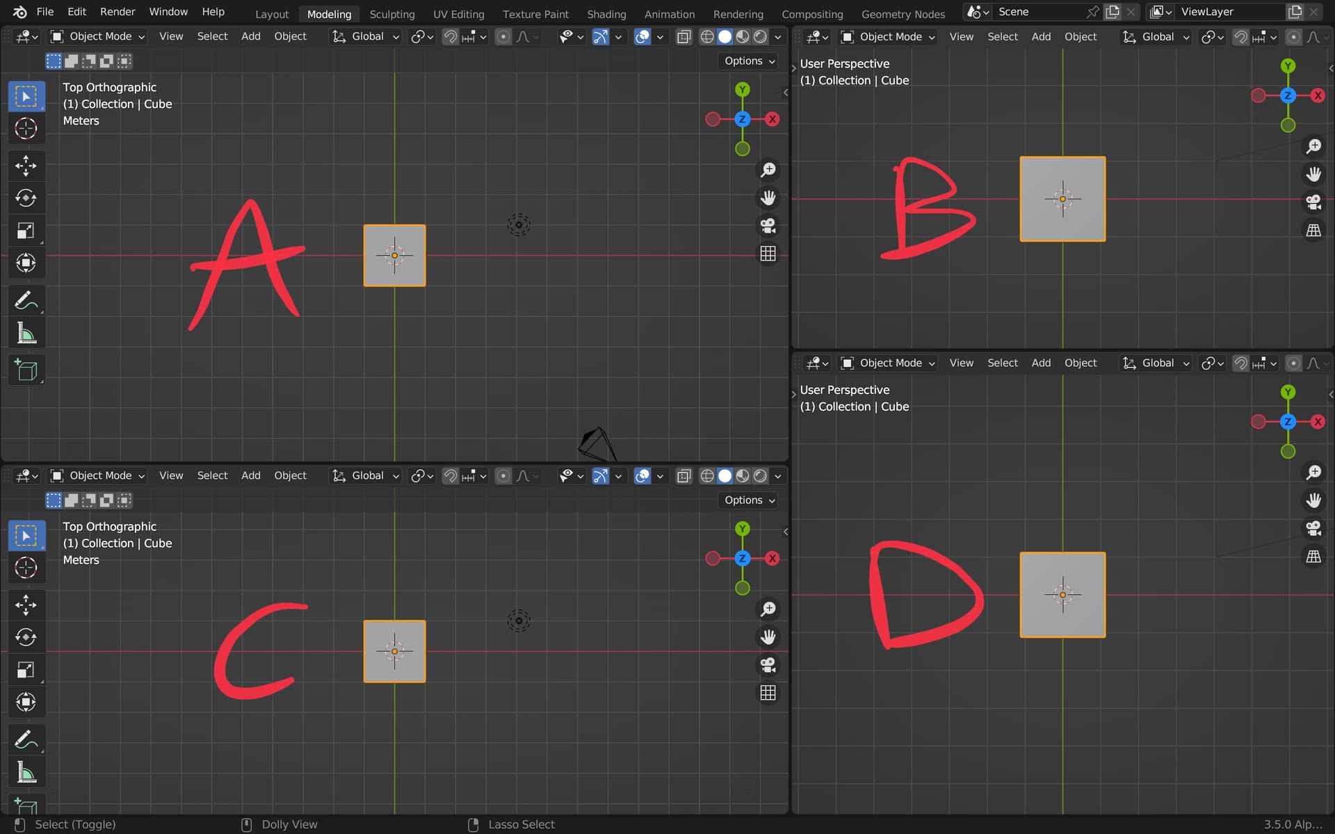
I found a peculiar behaviour. When I move the division between B and D to align it horizontally (pixel perfectly), Blender seems to recognize this and now I can only move the single long horizontal division line; A and B’s heights get resized together, and so do C and D. There is no way to resize them separately again to the previous state without closing an editor. This was already the case in 3.3, but your patch could include improving this.
Currently you can’t tear off a window if you’re in fullscreen, since you can’t move the cursor off the window. It would be helpful to keep a modifier key for this behaviour.
I’m unsure about the grippers in the header. They have the same function (?), but different interface, which can lead to confusion. I would lean towards improving the interface of all corners and keeping them the same.
IF keeping the grippers, they should be consistent across Blender.
Yes, if there’s supposed to be some icon to indicate something being dragged, instead of the hand cursor indication, then it should be the icon of the area being dragged. Good thing is that all the icons are already there so no new ones have to be added.
Yes, still struggling with the right balance for the feedback. It now gives quicker feedback (before minimum cursor movement occurs) . Only in the patch; the build is not yet updated.
align it… there is no way to resize them separately again to the previous state
Yes, that has been the case for years now. Once areas become aligned they share edge vertexes and move together. I once made an “align” areas operator that does so for areas that are close. But my problem is lack of a good algorithm for “breaking” that alignment. It is simple in a simple case but neighboring areas can make it complex. But not related to this patch.
The current behavior of Shift-drag from the corner zone still works with my patch.
For sure. the current ones are done with a shader that I couldn’t figure out how to rotate to the orientation I needed.
Thanks, fixed in the patch. But the build does not yet reflect that change.
I did some more work with this to just get a feel for it. And I like it more and more.
Only I start to dislike the ‘gripper’ look more and more as well. In all other software a gripper means ‘move this object’ or ‘tear off this object’ and that’s not really what happens here. I think some other symbol would be better though I must admit I’m kinda clueless as to what that would need to be. The gripper at least has the advantage that a new use will expect something to happen when dragging it…
I like the grippers in terms of UX. It provides discoverability and clean affordance about functionality. The problem is that not all corners can have a gripper like that. And splitting an interface element - as in: some corners have it, some corners don’t - seemingly arbitrarily can confuse users. I took the liberty to make some very quick mockups of universal corner handles. My favourite being the medium dots, but I’m scared things will start looking busy very quick. There’s still way more experimenting to do.
Images
Harley, is it undesired to fade in and out a UI element base on cursor proximity?
Blender doesn’t suffer from not enough visual clutter. It suffers from too much of it. Solution to overcomplication (in this case too wonky layout management system) is not even more complication.
I really don’t think there’s much to invent here. Just:
Remove the corner splitting feature
Add a small gripper to the top left of each area
Make sure the gripper is visually unified with all the other grippers in the Blender UI, so there’s consistent visual language of telling users “This UI element is for dragging of panels”
And the problem is solved. The only reason we can currently drag from all 4 corners is a legacy limitation of the current panel system, where splitting is unintuitive and unnecessarily constrained. This new proposed system doesn’t have any of these limitations, so retaining split interaction area in all 4 corners is absolutely pointless.
Fading them at the cursor proximity would be even worse, because now you have to have much more code for something which should be absolutely trivial. It’s not just about adding it in, but also about maintaining it. The best commits are the red lines of code - those improve software by removing the code. Not the green ones, which add even more code.
Let’s just have a nice, simple and clean area splitting system, that’s easy to use from both UI/UX standpoint and from the code maintenance standpoint.
Yes they are, but here we’re talking of UI layout adjustment, a task that is usually not frequent nor repetitive.
I second what @LudvikKoutny suggests (especially the “remove red lines” part)
I like the improvements in this file, but for me blender’s layout management system is (even without this patch) actually better than that of most other apps. I know it’s no good trying to convince you, I just want it to be said that there are also lots of people who actually like blenders ‘wonky’ UI.
That said, I agree with you on the rest of your post. To me the grippers only add clutter and (slight) confusion, because their function would be slightly different from what a gripper normally signifies. That said: I understand that a small gripper might be better for discoverability.
I would like to keep splitting from all corners though. Hence my preference for no gripper I think.