I get it, yes, it feels pretty natural. Would you consider adding back a tiny visual indicator where the corner hitzone is ? I always miss it it’s rather infuriating. A triangle that pops when the cursor is near or something.
2 Likes
With this patch yes, because it allows all operations from any corner zone. So I would actually add something visible all the time. Or perhaps visible when the editor is active - hovering anywhere in the area.
It seems to invite “dragging”, which is what I’m hoping for.
5 Likes
Ok I didn’t realize it
I’m only not doing it right now in this patch because I haven’t found where to change the header content left margin. It is somewhere obvious that I’ve seen a million times, but of course not when I’m looking for it. LOL.
A blank area sounds interesting. One might pull out last area out of the main window without closing it.
A blank area also could be interesting in another way. Imagine, a window which contains blank areas, and populate it …
I don’t ever actually want the window I drag out of the main window to close the original area. I typically only do this to get a temporary copy of an editor that I can fullscreen to make it easier to do something and then close it and go back to what I was originally doing. That’s typically what I do when working only on the laptop screen. With a 2nd monitor I tend to have 2 main windows open.
Edit: this won’t be an issue if shift+click can continue to behave the same as before.
The icon of the editor type being moved should be displayed in the overlay. Makes it easier to understand that the editor being moved will completely replace the editor it is totally covering. Perhaps also a color change to indicate that the entire editor will be replaced with the one that is being dragged.
Is it possible to hijack the mouse position and always display it at the edge of the overlay that is being moved?
What if instead of adding a drag indicator to the upper left corner, we just allow dragging the editor icon itself? I take that back. I enjoy click+drag+release to change editors too much. What if we split the difference. Put the editor icon further to the left and not in a box then make the down arrow in the box bigger so they are equally large click targets. Icon to move the current editor, Arrow to change the editor type?
off topic
The ^ symbol shown when merging to editors really needs a text label that says at least “Merge Editors” or preferably “Expand editor being expanded over this area.”
I intended to say that Blank Areas might be interesting in different ways.
It does not only solve the “pull last area out of window” case, but it could complement docking.
Blank areas do not need to behave like regular areas.
pull into Area:
If Area is Blank → do overwrite Area
otherwise → do docking/splitting
But I think too, the visual feedback could be better than in the video.
I like how current built keeps use of modifier-keys slim.
Current way is to press ‘Shift’ or ‘Ctrl’ to trigger pulling-out or swap. pulling a window out is already covered.
Would it be an idea to have Docking react to modifiers? (When press Ctrl, change from Docking to Switch.)
Would it be an idea to trigger swap during docking movement?
Our icons are pretty small. Where do you want this? A mockup would be best, from a capture made while using this build.
I’m not quite understanding what you are asking. Do you want something displayed at the mouse position that moves while you drag?
Sounds interesting. Will play with that.
Yes, blank areas would come in handy for a number of uses, many that came up while talking to people at the Conference. Its on my “to do” list to talk to others about that
A spoiler there will probably be that I’ll be forced to add snapping to the docking operations at some point, even though I think that dumb, which would use Ctrl. Some people see value in having areas that are exactly a half or quarter or whatever, while I see no value in arbitrary locations.
Think of a sensation that is a mix of moving the area (your new behaviour) and splitting the area (traditional behaviour)
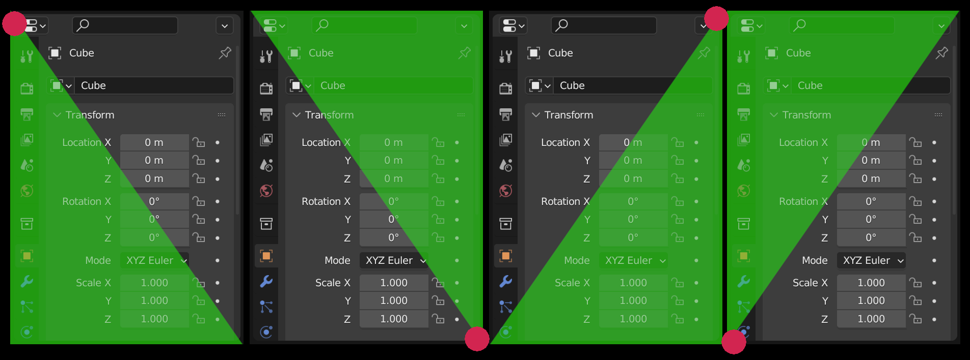
You can’t see my mouse in this image but it’s in the middle of the overlay area that indicates where the new editor location will be. As I move my mouse side to side, the right edge of the overlay area moves side to side. I’d like it if the actual mouse position was at the edge of the overlay area so I could see a 1 to 1 relationship of my mouse movement to that moving edge. It would make the new behaviour feel more like the old splitting behaviour at the same time.
Maybe it’s a side effect, but I find it strange that the cursor is centered and not in a corner of the new panel. In any case, with the new method it is more versatile and once you get used to it is predictable.
You lose something important if the mouse is indicating the edge of the area instead of the middle of it.
In this patch it is possible to create a new area that is any size from any edge. So you can create one that is 80% of the target space, anchored at the top. Or you can create one that is 80% of the target space anchored at the bottom.
When you are moving the division line instead the theoretical maximum is 50% from an edge. The practical maximum is less than that because you have to allow for the middle to indicate replacing the entire thing.
The point of this patch is that joining, docking, and splitting all operate identically. And for all these operations you are pointing at the location of where you want the new area to be.
This part would be the most difficult thing for people to get use to. But we get many advantages if people can break their mental model from “i’m cutting with my mouse” to “place an area where I am pointing”
After three full days of use my impression is that I would be very happy with this change if it limited the direction to a single axis according to the initial mouse movement if you’re splitting the original region (like it is currently, just updated visually I guess), but keep it free flowing for everywhere else. I tried to get used to it, but I find the new method too fiddly, too sensitive and slow for splitting, I can’t do it without having to stop and think—but it’s equally flexible and intuitive when docking the window elsewhere, it enabled me to work in new ways in that regard, which is wonderful. Do you think it’d be possible or desirable to find a best-of-both-worlds kinda compromise like that?
Still, it’s been only three days so maybe I’ll get used to it, or maybe just tweaking the numbers a bit, reversing the initial splitting direction etc will be enough for me to get on board fully, but this is my current feedback. I have come across some little weird corner cases in the implementation as well but those are less important atm I think. I’ll keep using it. Thanks!
It is almost certain that would have to be the case. So many of us have trained our brains to expect a particular thing when splitting that it would be terrible (for me) having to weather the complaints.
However, such an inevitable compromise would not be without cost. Had it been possible for users to make this change then we would no longer be required to have an action zone at each corner. We could move to a future where we could drag from any empty spot in a header, for example. Or a future where we have tabs (multiple editors in a single area).
This current design we are living with, and can’t move away from, is limiting us for future improvements. We might be stuck with a system where the direction of the action depends on whether you have dragged greater or lesser than a 45 degree angle from the corner.
I can understand your frustration with conservative or pedantic feedback, but may I ask, if you wanna shake off the shackles of past design decisions, why bother with piecemeal changes like this then? Why not a patch where corner action zones are no more and you can only drag from headers, for instance? You can really only understand a thing in its context, so when I still have to use corner zones and there are no tabs or header dragging, my impression of a combined splitting-docking-joining action will inevitably be shaped by whatever’s available. Maybe if those were available, what seems to me as the main pain point now would fade into irrelevancy because of what I gain in comparison?
You speak of “having to have corner action zones” as a limiting thing, for example, but I can’t immediately see why. Isn’t it a freeing, more flexible method than always having to go to a designated zone, even if it’s a wide header? What happens when my header is hidden? What does a “tab” look like? The panels in Photoshop, or something hidden you reach with Ctrl+Tab?
I hope these don’t come across as aggressive questions or anything like that. I’m trying to understand what your vision is, and how you want us to look at these patches (for which I’m grateful, as I said before, we don’t have that many people beside you who tries to—or can—do sth about UI topics like this).
Because it is very difficult to move existing users very far at a time.
There are many problems, but greatest is that we require four of them because they behave in different ways. New users complain that we have these hidden zones, but we can’t really make all of them visible in each corner, nor just make one visible.
We get so used to having four zones that all act differently that we forget they do so. For example you can only join areas using the zones that neighbor their shared edge. So you can’t use the top-left zone to merge to an area to the right, for example, since you will get a split instead.
The weirdness about splitting is hard to notice too, because we all generally use just one zone for that. But consider where you must move your mouse to add a horizontal cut. It depends on where you start:
We are just used to it. But this kind of behavior can’t happen if you are allowed to drag down from the middle of the header, for example. What should happen then?
Dragging the header, or dragging a visible thing, or from a visible thing, is what new naïve users would expect. Not hidden areas with hidden rules, no matter that we are used to them.
3 Likes
I spent some time in 2.79 recently. You cannot drag from all 4 corners there. Being able to split or merge from all 4 corners is essential to the joy of life. Having a drag indicator in the corners is nice but having it permanently visible in all 4 corners of every area would be overkill.
What if the indicator only appeared gradually as your mouse got closer and closer to the sweet spot:
As a new user mouses around the UI for the first time they will have at least a 25% chance of indicating the hover effect within a few seconds and then be tempted to click and drag.
If the cursor had a tool tip saying “merge or split editor areas” then they should have an easy time with it. And I mean a REAL tool tip.
[Moderation note: Removed screenshot from other software]
What if we split the action into 2 steps.
Step 1: Drag from the corner.
A preview overlay shape that is never more than 25% of hovered editor area appears in either the upper, lower, left, or right of the hovered area.
Step 2: Release left mouse button.
The mouse cursor position jumps to the center of the edge that can be moved.
Step 3: Move mouse to set the desired size of the new editor area, then click left mouse button.
Right click or ESC key can be used at any of the steps to cancel.
I think clicking a corner and moving inside the existing editor should just do a regular split, like it works currently in master. When I click a corner and move horizontally, I want a vertical split. As you have it now I have to think too many thoughts and observe too many things instead of using muscle memory.
Clicking the corner and then moving outside of the editor should trigger your new feature.
I’ll try to make a video tomorrow demonstrating what annoys me the most. Making a new area from a current area and resizing it at the same time in one motion is something I do a lot.
Moving an existing area to a new location is definitely something I want but not at the expense of the first thing.
In the following situation I want to move the outliner to be to the right of the shader editor and let the properties take the full window height. Your build is great for that. But to get into this situation in the first place with your build is annoying compared to the standard splitting behavior.
I thought they were vector files and infinitely resizeable.
“Muscle memory” is merely the habit of being used to how things are, and indicates it would be difficult to change your mental model about what is happening. That has always been my general worry about trying to change this. But it was worth the attempt because of the all the advantages of doing so. It is always sad for me to think that we must forgo improvements just because we get too used to the current situation. New users get a worse experience because we can’t change.
Not at all. The source documents for them are vectors, but they are exported and used as small bitmaps in Blender.
1 Like
A valid point. On the other hand, sticking to the expectations of the existing user base for eternity will limit Blenders growth as well. I think it is totally underestimated in general as of how many users finally transitioned to Blender when the default behavior was set to left click select. It is simply what the unaccustomed user would expect from it. I myself only got into Blender on the third attempt, because in the initial two I failed to get how to select things. I just installed it, tried it, and uninstalled it after two minutes. I though “if something SO basic isn’t working, what else might be hidden in there that is flawed…”. The teams which I lead only adapted to it when I provided them with modified Blender settings that would set left-click as default at all times.
Not intend to start a debate about which button to use here. My point is, I immediately liked the proposed behavior of docking because it is what I as a user - even long-term Blender now - would expect from it. It was easy to understand and use. The current implementation needs to be explained to every single new user that starts with Blender. It is just SO confusing. Yes, I get it, veterans like it and would have trouble accepting a change in this field. But is this really so critical in this case? I personally change the docking configuration once or twice a day. I can live with a different UX just fine, especially when it’s not so alien to literally every other application (or OS) I use.
Would this docking behavior be the default as is tomorrow, I’d be just fine with it.
Just my two cents.
1 Like
I’m just saying there are advantages and disadvantages and proposing a way to keep the advantages of both.
Moving an area is great with the new feature. Splitting is not. I don’t know the actually code but conceptually I think it can work great to keep the old split when dragging inward and use the new feature when dragging outward. I understand if it’s impossible in the current code base and impossible to refactor the whole code base to make it possible.
It is certainly possible to code either way.
But what I’d prefer is that dragging into an area act the same way, regardless of where you drag from. That results in a constancy that we don’t have now. We might not get docking if it has to act in a way that feels reversed from splitting.
1 Like