I agree one corner grip should be enough. Changing the screen layout is not frequent enough to warrant four actionable corners, this patch simplifies the whole thing and I think we should embrace simplification.
Re: animation, here’s a mock-up to illustrate what I was thinking:
Not sure if this is feasible, given that you’d probably need a deadzone around the boundary where it transitions between vertical and horizontal to prevent it jumping back and forth continuously. Maybe the initial expansion from the gripper could work though?
mock-up animation
2 Likes
With the patch all operations can be done with any single corner, so we could eventually move to having just one place with a gripper (or some other) visualization.
We do that now (and for ages) with the scroll bars, but I’m not really a fan. It is sort of a cheap and easy alternative to proper animation which is difficult in our system right now.
Yes, when I merely think about it, having just the one zone makes sense. But in practice when I’ve actually removed the other three I kept trying to use them anyway out of habit. Having invisible zones you don’t actually use is pretty harmless as long as they don’t get in the way. They are currently slightly in the way in that we have to move the ends of scrollbars inward and out of their way.
Is the different orientation of this one a problem, or just the overall look (dot size, spacing ,etc)? I’d actually rather the others were vertical because it fits the layout better and intrudes less on the content.
Oh… gripper on the top-right instead. Interesting. It is certainly possible, where I have it is just easier for me right now as I don’t have to worry about other content there.
My own brain seems okay with the “drag this thing” idea because of how it feels like I am dragging the area. Would any changes help this for you? I wouldn’t mind of eventually just dragging the area header instead, but it would be cruel to users to from from one hidden zone to a different hidden zone. LOL. But could be an eventual direction…
I’ve got another patch that allows you to cycle between different editors in the same area. As in you dock one area onto an area, then just hotkey between it and the previous editor. https://developer.blender.org/D16731
Its unclear to me exactly what is being animated, in that as you move the mouse down it already gets a changing target area. As in it already varies as you show along that path.
1 Like
It’s not really a big point for me, I don’t really care for the gripper, but I can live with it. Though I do dislike auto-hiding them based on mouse proximity. Not a fan with the scrollbars either. If I look through all those mockups by Claus I think I like the default blender gripper look better than his other suggestions.
The idea was about transitioning between states/zones, as it’s currently instantaneous. So the image was trying to convey:
- When you initially start the grab, the highlight area would expand out from the gripper
- When you transition from horizontal to vertical, there’d be a short animation of the highlight moving/morphing between zones
When dragging an area, if the cursor is placed exactly on the division line between two other editors, this is seen as tearing it off. It causes flickering of the dragged editor when moving the cursor from one place to another.
Why are people not a fan of fading scrollbars? Imo there is no better alternative. These times, they mostly only provide a visual feedback for position and should only appear when needed. I think we can use the same paradigm for the corner handles.
I’ll restate (and then shut up about it forever) that having both a gripper in the header and 3 invisible interactive zones causes confusion. It hints at different functionality where there is none. I’d opt for either a single gripper in the header, or provide all corners of the same handle (be it invisible or not). I lean towards the latter.
1 Like
It is generally easy to animate between a starting and ending state. But here the current state is constantly changing, so an animation here would be felt as a delay between where you have just moved your mouse and what you see as feedback.
That is a behavior found in current code too (when joining and your mouse is exactly in the middle of the shared border). I submitted a patch to fix that last night. https://developer.blender.org/D16879
3 Likes
- Because the scrollbar often provides information on where you are in a larger space.
- Because it doesn’t actually give you more usable screen space.
- Because disappearing gui elements in general make the ui a game of hide & seek. Especially for elements that are sometimes needed. As long as I have a mouse with a middle button I hardly ever use the scrollbars and I’d prefer them to be just not there to gain the extra space. But when I’m on my laptop trackpad, I actually need the scrollbars to be able to scroll and I’d much prefer them to just stay visible so I can swipe to the needed position in one motion instead of first moving in the general direction and then looking for where I need to be.
- Because (subjective, I admit) the popping in & out of gui elements in my brain makes the ui feel more cluttered instead of less.
I think disabling the use of 3 of the for corners would be a shame. I think one gripper for ‘noob friendlyness’/ discoverability is probably useful, but having it work in the areas without gripper doesn’t really hurt. And if the consequence of having a gripper would mean disabling 3 of the 4 corners I would much rather have no gripper at all. The corners themselves are already easy to find. To me it would feel rather unnatural (with this patch) to create a new editor in the bottom-right by dragging on the top-left of the nearest editor.
I like that it’s small/subtle so you could put them in all 4 corners. But I don’t think it would tell someone new to blender much more than just the corner being there. Also it would make the corners look rather busy. This single dot feels more like a ‘pin’ action to me. I think if we put anything there the default gripper is probably the best (I’m getting used to it) because at least it invites people to drag.
1 Like
Exactly, it gives me a landmark : is there information beyond the borders of this editor? one look at the scrollbar and I can tell. I don’t actually use them! Instead I use middle click+drag to pan/scroll (tablet has no scroll wheel).
Also agree, there is hardly any gain to it. It’s less busy on a screenshot, but as soon as you move your cursor around they keep appearing and disappearing and it’s actually busier than without the fading effect.
Just dug up this beauty. Notice the corner handles (yes, also the scrollbars), interestingly only in 2 opposing corners. Can’t believe I almost forgot about them, it was only pre 2.8.
–
There’s actually many, many ways to do scrollbars well, but that’s getting too off-topic and I’m sure there’s been tons of discussion on it both here and on phabricator. As you’ve hinted, maybe there should also be an element of preference. I’d love to dive deeper into this in another thread, maybe next year.
Have a happy New Year everyone!
1 Like
Second that. Consider grippers in my previous mockup all vertical, from now on!
Also: I love the idea to have some back and forth navigation for editors, like in a web browser
You cannot split from all 4 corners in 2.79 and it’s a miserable experience whenever I need to use 2.79.
If splitting from all four corners was a problem and inferior to only being able to split from 2 corners, an angry mob of long time 2.79 users would have been complaining about the 4 corners feature non-stop.
I have proposed a way to make it easier to discover in all corners: Testers Wanted for Area Docking - #36 by thinsoldier
Many years ago, I think it was on an old layout of amazon-dot-com, their web designers put out an article explaining in detail the logic behind how they choose which sub-menu to open and how long to hold it open for depending on the angle of mouse movement just before and just after the triggering of the sub menu. That same logic can be applied to this problem and also to the similar problem with the Editor type menu. I just can’t find that old article for the life of me.

Would also like to suggest a nice way to open editors in new windows:
I have also proposed a way to make it easier to discover in all corners: Testers Wanted for Area Docking - #36 by thinsoldier
I feel that your concave bevel does not make it clear enough which editor will be affected when you click and drag, but my corner highlight does.
What is your opinion of a colored border in the corner instead?
I don’t think it’s bad at all since the primary way people have been teaching about UI splitting and merging the last few years is to right click on the divider line. I think fading something in is far more discoverable that right clicking the divider line. That standard behavior will always be there and will always be the better known approach until youtubers decide to teach another way, unless I am correct in thinking fading something is in more discoverable.
You cannot drag from all 4 corners in 2.79 - Why do you say “legacy”?
There are far more important icons we might want to add to headers someday. I don’t want to waste the space. If insisting on only being able to drag from one corner, my vote is to make the existing editor icon drag-able.
Speak for yourself. On my slowest laptop it is faster to transform the current workspace into the Shading workspace if I’m currently using Cycles and don’t want to use EEVEE. Waiting for eevee to activate so the Shading tab can appear is slooooowwww. Some blender users on youtube and twitch change their layout at least a little bit every 15 minutes or less, especially when only using one screen. The only time I don’t frequently rearrange is when I’m using eevee from the beginning and using a 2nd monitor and using multiple main windows. And I’m nothing but a hobbyist. I have downloaded blend files from blendswap and elsewhere and sometimes every workspace tab is clearly no longer anything close to the workspace tab it originally was. Shader looks more like UV. Layout looks more like animation. Texture Paint looks more like Geometry Nodes.
I would prefer if every editor had the TAB key setup to switch to 1 particular editor.
I would have tab in Outliner setup to switch to Properties and tab in Properties setup to switch to outliner.
Of course that is not compatible with TAB in 3d Viewport so it’s too complicated to figure out something consistent ![]()
Yes, I remember it every time I try to switch editors and the menu closes down on me: Ben Kamens, Breaking down Amazon's mega dropdown I always wondered if an action zone in the shape of a convex hull drawn between the popup menu and the switch button with a certain padding added (kinda like how the new simulation i/o nodes do it) would help, but I don’t know enough about it to talk.
In my experience of teaching new users, what they struggle with the most about splitting is that once they pull on a corner, a new thing is created immediately, they don’t understand what it is, or why it’s shaped the way it is. They usually pull conservatively so a thin, kinda useless slice of a new window appears. They can’t undo with Ctrl+Z or cancel with Esc, and when they try to get rid of it by swiping, they create a second one because the corner is so busy with icons and borders they miss the target, so on and so forth… This patch doesn’t create a new window immediately, it indicates what’s gonna happen with an overlay and you can cancel it with Esc so I think it’s a big improvement in those regards. A better discoverability for corners would be nice theoretically, I guess, but that was never the real stumbling block for the people I’ve taught so I’m less worried about it personally. I would rather be able to Ctrl-Z splitting/docking actions, though I’ve no idea if that’s feasible.
Happy new year!
The editor type menu should contain a “close this editor” command which I think is totally possible now thanks to this patch.
I wouldn’t want UI changes on Ctrl+Z but I would like a separate UI Undo stack in the Edit menu.
I should mention one thing about that “area cycling” patch in case it isn’t obvious, or just not to some readers.
There can quite often be a long delay when switching from one type of editor to another and then you quite often will make changes to it to suit your work. Unknown to many users is that areas remember all the details about the previous editors in the same area. We just don’t do much with that data.
So with that patch you can just hit the “back” and “forth” hotkeys to switch between editors in the same area and it will happen instantly and be exactly as before. Were you in the middle of painting on an image? Doing something in 3DView Edit mode? You’ll be back there exactly as you left it. So the end result is exactly the same as if we had a tabbed interface, just without the visual indication of tabs per area.
4 Likes
I’m not sure what the problem is here. Why not just use Cycles in the shading workspace? change it once and you’re done.
Something subtle that I only noticed now: you separated the action zones in the corners. This indicates that you can’t use the area between two zones to perform the new editor action, which is great for clarity.
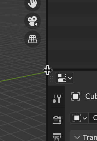
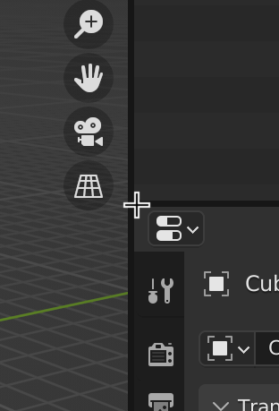
Currently:
In the case of four identical interactive corners, some kind of dynamic indication like @thinsoldier’s mockup makes this even clearer: If the gripper would only appear for the editor the cursor is hovering (and not just solely dumb cursor proximity)
@thinsoldier
I think the coloured border is definitely one of the options, it’s very similar to one of the mockups I posted above. I like it cause it’s not obscured by the cursor itself. The excercise of the exact graphical representation is great to get an idea of the possibilities (such as keeping visual noise to a minimum), but there’s no real point in detailing that out right now.
–
Putting a single gripper on the right makes sense. It’s consistent and allows for some UI perfectionism.
- Should be vertical everywhere, I think. To save space.
- Should it be fixed on the header or should it scroll along and get hidden? There’s arguments for both.
- If it’s fixed it needs better visibility over the rest of the header icons that scroll underneath. (like an opaque background)
- This then could also allow for an overflow indication when a header is scrolled. Something like a shadow, maybe. We’ve come full circle to the scrollbar discussion.
- If the other corners have no interaction, I assume the editor icons in the headers can be pushed left into the corner? This would minimize the loss of horizontal pixels.
1 Like
This.
Yes, please and thank you.
+∞
![]() This in combo with the vertical grippers.
This in combo with the vertical grippers.
![]() Finally a use for the page up and page down keys? Blender can haz use all the keyboard keys!
Finally a use for the page up and page down keys? Blender can haz use all the keyboard keys! ![]()
Is there still a way to test this? The links in the first post return a 404.