Since the previous version (2.7), the status bar does not fit into the full HD screen (1920) with a scale of 1.6.

Is it possible to introduce the ability to disable the part of the toolbar where the hints are located?
Since the previous version (2.7), the status bar does not fit into the full HD screen (1920) with a scale of 1.6.
Your request makes sense.
Currently, user can scroll horizontally to see info about scene.
But at each operation, new hints will push scene info out of sight.
Scene info should go to the viewport. No idea why it’s not there already. 
In general, I use my add-ons for comfortable work. And I have to “read” the necessary information from the request … statistics (…) and output to the interface. This is not very optimal, a poor crutch.
In most cases that would be nicer, but I think one of the reasons why it is not in the viewport, is that this info is often more general and may be referenced when using other editors too.
However, we could also just add those stats to those other editor types.
Personally I would be in favor of moving this to the viewport, in which case we can also make this info less truncated and more readable, and add more stuff without running out of space.
Alternatively, we could also simply add a panel, say in the Scene Properties, with all the statistics related to the current scene. Then you can keep this visible when you need this info, and when not you can keep it closed, out of the way.
it seems like a good idea
It has been asked literally thousands of times to put the information on the viewport. I don’t see why we should have it on a panel.
There have already been complaints because it was placed in the far corner of the work area, if it is hidden behind a panel, which may seem comfortable but the need to consult it is random, it will not improve the situation.
It is better to put it together with the info in the viewport and that it disappears at the request of the user.
First of all, I made several proposals about moving this to the viewport back in 2003. Yes, 2003. So I do think it should be moved.
However, the memory and version number are not specifically related to the 3D View, so those things would be out of place in the viewport at least, but:
The main downside of moving it, is that then you would not be able to see all this information always at a glance, since it would be turned off by default inside the viewport. To me this is perfectly acceptable - similar to how other apps do it, and also makes the UI cleaner overall - but there is a tradeoff.
Yeah, that data are not relevant, could be deleted without problems, or left in the statusbar.
The tradeoff is not a problem, from my point of view.
Do you have an idea for the memory item? I think some users refer to this also in the Sequencer. It’s also useful while rendering, because you can check if you are running out of memory.
I can think of a few solution:
I think we should probably just do #1, because then the bottom right of the status bar is completely free, and we can put the progress bar and info messages there, instead of in the middle.
Today I don’t see much sense in that item. It doesn’t really indicate anything, because it doesn’t tell you what the free memory is, nor the percentage used. And the data it gives is not real, just start blender puts me “22 megabytes” when according to the taskmanager Blender use 150 megabytes. So if you really want to know, you go to the taskmanager of your OS.
In the case of renders, now with eevee and cycles with cuda, it is not useful either because both use the memory of the GPU, and there is not indicated. Neither used nor free. I don’t know if it has value in more specialized rendering tasks.
In any case, the best idea I think that is left in the statusbar that info, and put in the right the progress.
I have another idea of an old proposal for the statusbar. Maybe could help now. Its similar to your proposal but keeping rightmiddle space for messages or errors instead weird popups
Blender Normal
Blender Rendering
Blender when an error happens
I think it’s probably fine to just hide the memory used by default - other apps don’t display this information usually. For users who truly care, as you say you can open Activity Monitor or equivalents.
i honestly disagree, blender eats up a lot of ram especially now with eevee, having a memory stats makes it easy to not go overboard but could be enabled or put somehwere else if the statusbar is not the place .
But Eevee relies on video memory, which we don’t display anyway.
when u switch from solid to rendered mode the shaders compilation takes RAM not VRAM and the stats goes up, it’s stays there until next garbage collection.
“Users don’t need memory.” Yes, in the ass users! Users need a button “make everything beautiful, quickly render, and post to instagramm for everyone to see what a cool student I am.” So the blender is more like a Christmas tree with toys. The industry is not made by users, but by professionals!
Why is this such a problem?
Why not remove tips from this zone? Add a button to “hide the tips for idiots”, and immediately a lot of space is released.
Information about the scene, it must be located either in the “scene” panel, or in the outliner. And nothing prevents from embedding this information into the context panel, and then it will be available in the toolbar.
What if there are 100 objects on the stage, and I want to know how many polygons in the three selected?
And how to find out the length of the curve? Why 10 years ago it was just by pressing a key, and now, in this new, beautiful blender, this is impossible?
Blender too much praise all kinds of assholes, and the developers think: “Well, if everyone is happy, then everything is fine, then we are doing what we need.”
I remember when I installed my first blender, it was a few megabytes in size. A few megabytes! And everything worked! And now this thing is filled with Python code, it is 10 times slower and weighs hundreds of megabytes.
It looks like a golden polished coffin that is beautiful on the outside, and inside it is a rotten, stinking corpse.
Sorry. I don’t want to hurt anyone. Cry from the heart. ))
If we had the technology to do that, why not?
Pros are users too.
Yes, those are valid options, and would allow for displaying a lot more useful information than we can fit in the status bar. Currently we are constrained in how much info we can show. That’s exactly the point.
The “do well” button is a metaphor. Why cling to words? )))
I contrast users and professionals. A good professional understands how what he uses works.
There are two fundamental principles:
No knowledge, no power (Exactly).
Minimum input, maximum output.
The first principle educates engineers, promoting intellectual development.
The second, brings up idiots, lazy and brainless, accustomed to have everything ready.
Of course, I’m not saying that you need to give up benefits. But I just want to point out that one should not appease the desires of lazy people, users, crowds. As Freud wrote: “The crowd is lazy and not farsighted.”
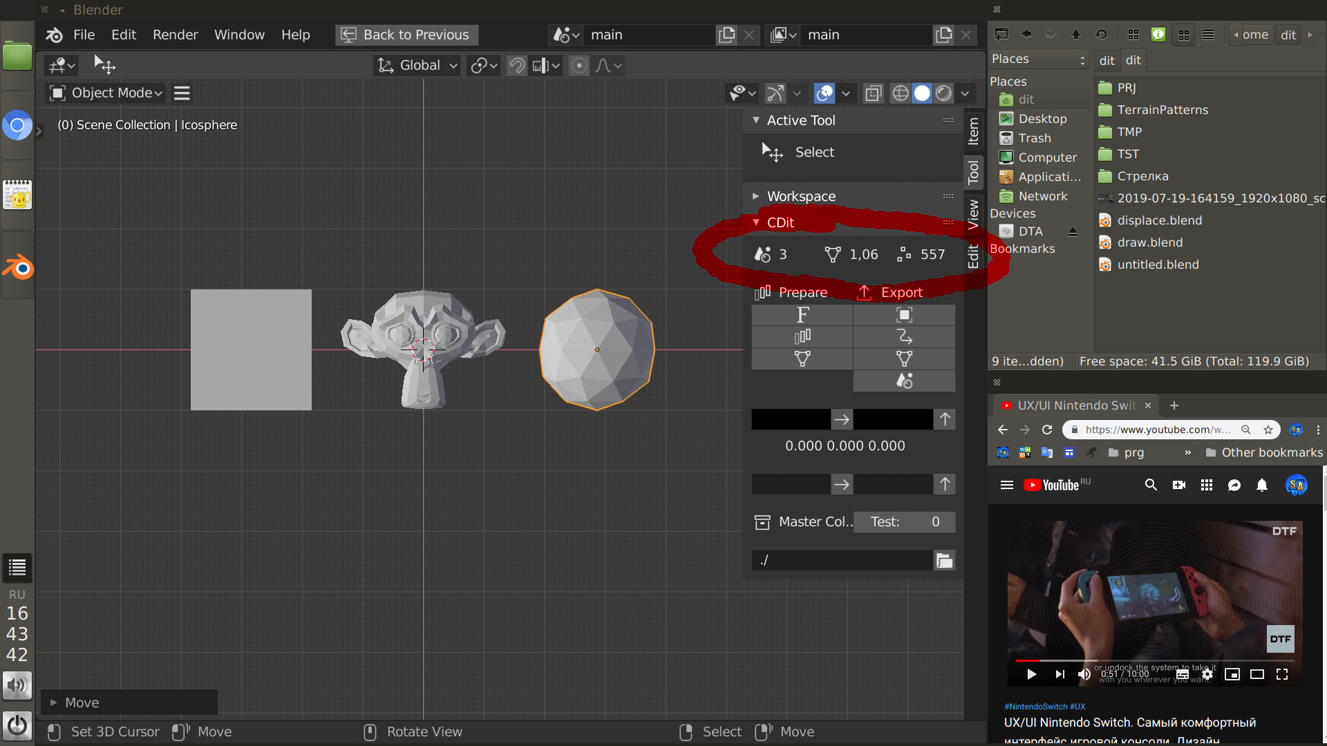
I think a great place for statistics will be the context panel (the one in which the workspace scroll is located). This thing is visible in the properties and in the sidebar.
If you look at computing over the past 30 years or so, it has generally become orders of magnitude easier to use and also orders of magnitude more powerful. The two aren’t mutually exclusive.
We should aspire to make Blender as powerful and easy to use as possible.
What is the ‘context panel’?