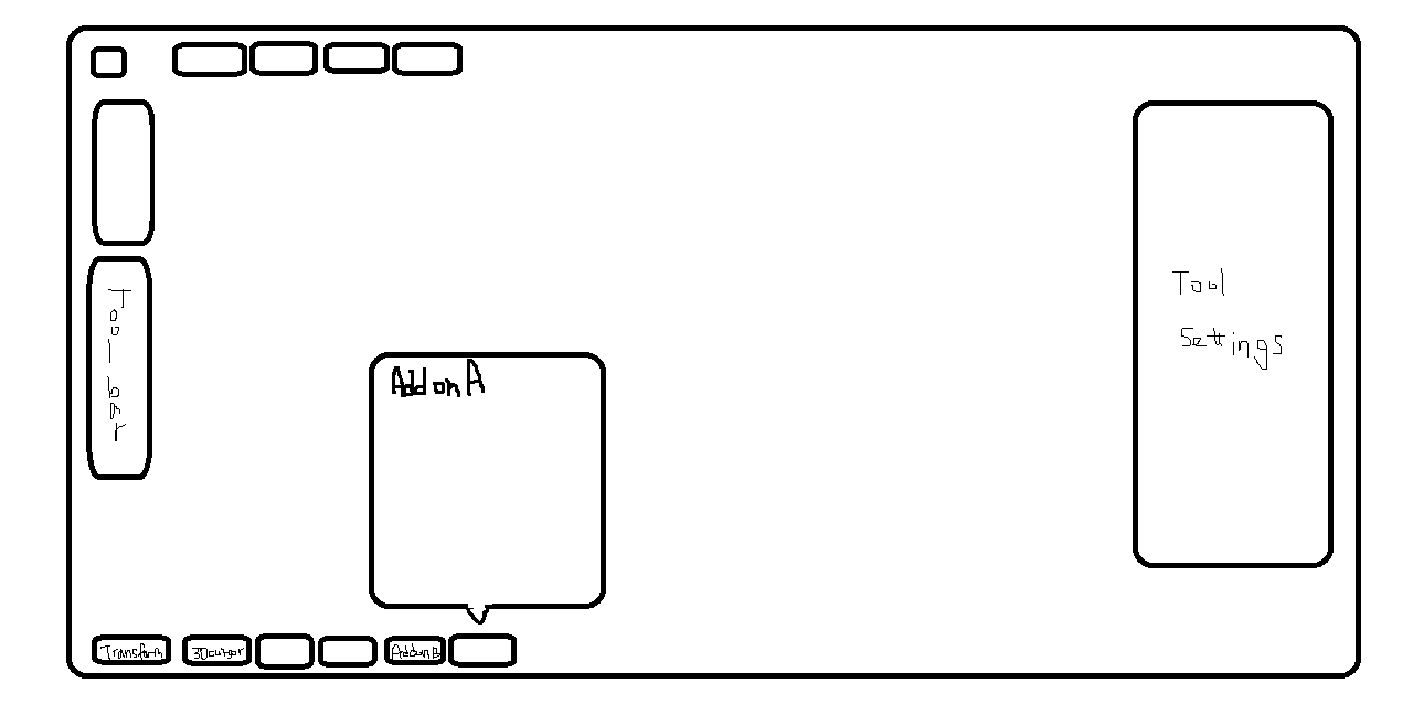
How about moving tabs into buttons with popovers? They might go to the bottom of the editor(3d viewport). sidebar might simply be replaced with tool settings
(Sorry for the quality, but this was the best I could do because I’m currently outdoor. Yet you’ll get the idea…)
As a result, the 4 sides of the 3d viewport might look like this.
Top: Header menus and popover buttons(such as pivot, overlays, shading, etc)
Left: Toolbar(T)
Right: Just the tool settings(N)
Bottom: Extra popover buttons(which was the sidebar tabs)
This organization might be really simple and easy to use.
In Blender Today, it was stated that the popover is actually internally treated as a panel in terms of coding. It shouldn’t be too difficult. This solution might also get rid of the horizontal text completely. Consistency between editors might also be recovered(since most of the editors don’t have tool settings at the header).
