I want immediate access to an addon tab, while this looks nice from a UI perspective, it forces me to make additional clicks. A lower click count should always be preferred imo.
I also diagree with those who want to have the addons in the properties panel. That makes it so that I can’t have an addon panel open alongside the objects properties or, let’s say, grease pencil layers in the properties and a colour picker in the N-panel. It’s not that easy.
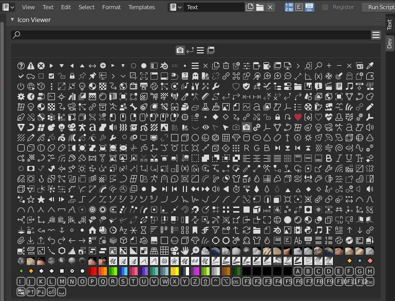
I quite like this approach, unfortunately, the default Blender font (Bfont) is quite limited with the icons that are available. Ideally, the font should be expanded to include custom made icons, like the ones in the iconviewer.
I could see a submission procedure for custom icons that could be added for every Blender release (or even point releases like 3.1.X).
This would then enable a consistent icon set. For every icon there could be a set of 8 or 16 colours or so from a default palette that could be chosen. That way, we can have both text and icons and this also propagates to the Workspaces tabs (e.g. a camera icon for the Render workspace), see: Right-Click Select — Blender Community
If we could rename tabs and re-arrange subwindows (also on a per addon basis), that would be best I think. Especially with text & icons.
Just like you can reorder collections in the outliner, you should be able to drag a panel (e.g. 3d Cursor) to a different tab (e.g. from View to Item) and then save the new configuration as a workspace. Blender should use the Photoshop UI approach for the N-panel to achieve this.