Really wish the dev team would take a serious look at this. Vertical tabs in the properties panel are a total UX nightmare. Surely implementing an option to have horizontally flowing tabs like this https://github.com/atom/tabs/issues/76#issuecomment-63383282 wouldn’t be a big ask? There are 21 readable tabs in that image! Blender’s vertical tab UI breaks with as little as 5. Alternatively, could the code for a drop-down menu, like we have for scene and view layer selection, be refactored to sit in a header at the top of the panel? In the long run being able to dock panels / tabs wherever you want them would be the best idea, but until that’s figure out we at least need a fix for workable UI.
2 Likes
The attribution of these tabs is different.
1 Like
How so? The UX requires random access to a range of independent dialogues within the same context (the properties panel). What is it about the attribution that means either of those UI implementations aren’t possible?
1 Like
During coding tabs are primary, so they can occupy that much space.
During making CG tabs are secondary.
No that makes absolutely no sense at all. The type of work being carried out is irrespective to the issue. It has everything to do with a poorly executed UI design and nothing to do with the work being carried out being “CG related”.
During coding you work only with text.
It occupies the entire space, an you care about tabs count and content, since they influence your work quite directly.
During making cg you work in 3d viewport, which has a higher space priority, and sometimes access tabs which are just shortcuts to additional functionality and occupies limited space.
Thats why lots of cg software use tabs concept.
Sorry but it doesn’t sound like you’re really making any particular point other than being contradictory. From a UX perspective usability is far more important than “space priority”. If you can’t even read the labels on the tabs, as the design is right now, then they’re basically useless. Which is why this thread exists. Having them horizontal and able to flow over multiple lines, based on the width of the properties panel would negate this issue entirely. Agreed, that would incur a negligible cost in vertical space but this would very be minimal based on an average user having perhaps 10 or so tabs listed. Not to mention both this and the other option of a drop-down menu (which would be compacted in the header) would actually save screen space by removing the not fit for purpose vertical tabs.
Looking at some of the proposals above. For the corner case users needing a large number of tabs, the horizontal tab idea would be nearly as bad as vertical tabs though to be fair. So the logical alternative to both would be the drop-down menu and/or icons on the tabs instead of text, with tool tips.
You can read the labels, they are rotated to the left.
In modo they are rotated to the both sides - so you have troubles reading them, since such a solution does not fit readability convention.
Yes you can read the labels if there’s enough space in the UI to display them i.e. if you have just the default tabs visible and the area is large enough. However, if you have more than just the default tabs (i.e. add-ons installed) or even if you scale the area down, you can’t read the labels at all because the text is clipped. To the point that if you have enough tabs or shrink the area enough, the text disappears entirely. I don’t have a huge issue reading rotated text personally, but I do have an issue if I can’t see it to begin with.
There was tabs management tab proposed for such kind of purposes.
Actually there is a task written at the developer site. This seems quite reasonable that I wonder why they didn’t implemented it yet. I guess we missed the bus again since 3.0 is already released…sadly.
It was made in 2.8 wild west time.
2 Likes
Here is another add-on that might interest some of you: CEB Addon Management by @carlosedubarreto :
6 Likes
I wonder why you refer to this time as wild west times? Back then the UI team actually had a leader with a vision, the ability to make decisions on UI questions, and engaged with the community. Since he left his position, no one has taken his place and no one has a grand vision of the UI, and UI questions are left to linger forever. The situation has been so bad, that a central person has been suggesting that no UI changes should be made whatsoever until a new UI lead is hired. So, actually, it’s after William left, the UI work has gone “wild west” if you really want to label it.
4 Likes
I get your sentiment but I think @1D_Inc meant ‘wild west’ as in the land of opportunity: anything could happen as opposed to now. Things can still happen but very slowly.
1 Like
Wild west was a place without laws, a land of opportunities gained without rules.
AFAIK the design of such a set of rules is in progress.
I want immediate access to an addon tab, while this looks nice from a UI perspective, it forces me to make additional clicks. A lower click count should always be preferred imo.
I also diagree with those who want to have the addons in the properties panel. That makes it so that I can’t have an addon panel open alongside the objects properties or, let’s say, grease pencil layers in the properties and a colour picker in the N-panel. It’s not that easy.
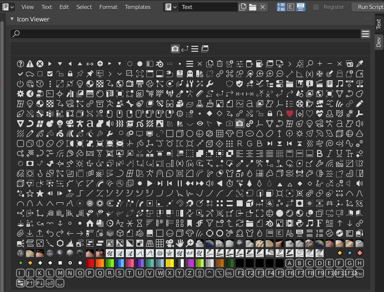
I quite like this approach, unfortunately, the default Blender font (Bfont) is quite limited with the icons that are available. Ideally, the font should be expanded to include custom made icons, like the ones in the iconviewer.
I could see a submission procedure for custom icons that could be added for every Blender release (or even point releases like 3.1.X).
This would then enable a consistent icon set. For every icon there could be a set of 8 or 16 colours or so from a default palette that could be chosen. That way, we can have both text and icons and this also propagates to the Workspaces tabs (e.g. a camera icon for the Render workspace), see: Right-Click Select — Blender Community
If we could rename tabs and re-arrange subwindows (also on a per addon basis), that would be best I think. Especially with text & icons.
Just like you can reorder collections in the outliner, you should be able to drag a panel (e.g. 3d Cursor) to a different tab (e.g. from View to Item) and then save the new configuration as a workspace. Blender should use the Photoshop UI approach for the N-panel to achieve this.
yess I loved the old toolbar that and many creation addons were working on left , now property and creation is too much mixed on same place, tools can still stay but more tabs on the tool area can be added but in a more iniutivie way with icons that can extend into text for more info.
So I fully agree left area will be great for addons that create or import objects, then objects can be edited on the right for properties, as for addons that only change properties of things, it can be only placed on N panel. At least some addons like tree or model libraries should use the T panel to add objects and then editing objects on the right side related to addons. It would be awesome. Such as archimesh should be on the left like before, now everything is at right side,…
4 Likes
