This exactly what this topic is about.
Making blender a bit more consistent throughout it’s UI by having text align to the left since most people read from left to right and removing as much negative space as possible. It helps readability and for a more pleasant UI.
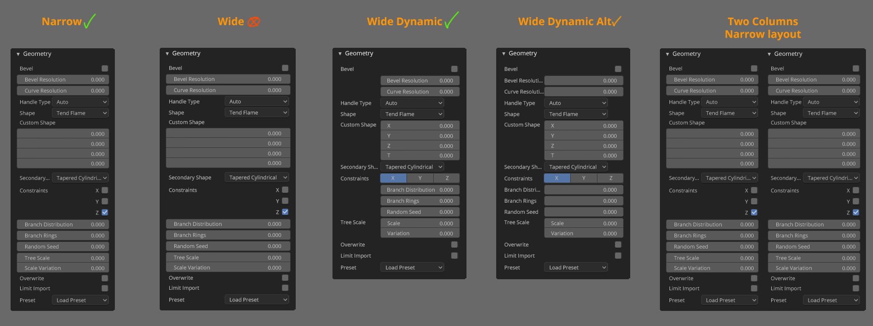
As mentioned above there’s probably an adjustment to be made in the cutoff point to switch from single collum to two or three collum layout. Would it be possible to have it as an option, a slider maybe? in the UI settings?
Talking about UI. Any development in the vertical menus?
Love that last proposal by brita, looks much easier to read than current one and wastes less space. Also seems like it can compress horizontally much better without cutting off labels.
@FreeMind thanks for the link! It’s helpful to connect the two discussions.
@billrey & all :)
I find that both designs to have its drawbacks.
Problems with the current layout in 2.8:
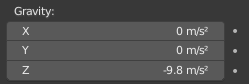
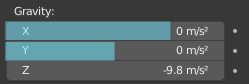
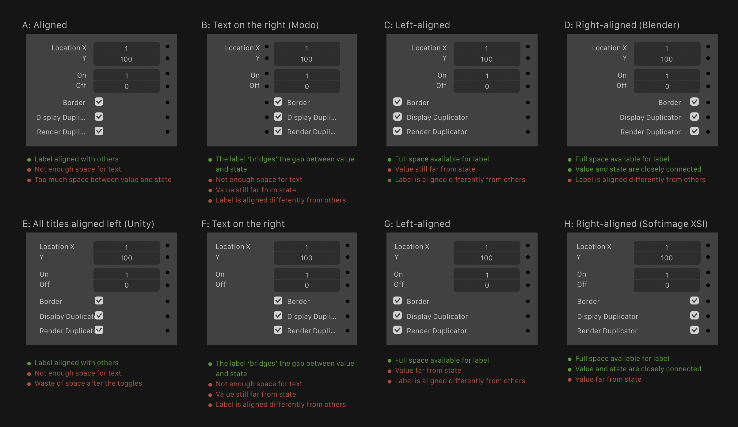
The labels are not left aligned, this makes it harder to read and search for left-to-right languages as one can not scan down a clear line.
There is no distinction between labels and sub-labels. In addition to having to “find things horizontally”, a label may be a continuation of another label, without any clear indication.
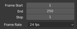
^Example: ‘Step’ and ‘End’ are a continuation of “Frame” in “Frame Start”. (I personally find that a lot of strain comes from this, as not only I have to search left and right, I have to go back up)
Checkbox labels are not aligned with other labels.
Suggestion: remove the exception for checkboxes.
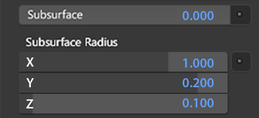
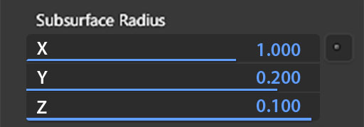
Values are not aligned:
Suggestion: I personally think that values should be right aligned and have a bit of space between a number and a unit. The reasoning is that numbers usually align to the right for easy comparison (potentially with a fixed number of decimal cases), and that the values would start from a fixed line, further from the label. I don’t think that in this case the right alignment would interfere with readability, since people usually search for the labels, not the values. —>
The layout occupies a lot of horizontal space in a way that isn’t useful.
Suggestion: change the split between the label and property from 50% to around 35-40%?
Problems with this proposal:
The labels inside the values don’t provide a good visual queue for “here is a property”, compared to other properties (colors, properties, enums, checkboxes) where the label is not embedded.
Here, there is also not a good distinction between a regular property and a sub property. Example:
Suggestion: for consistency, labels for number properties would also be on top of the value, unless they’re a sub-property. This would considerably increase the vertical space that this layout would occupy :
(
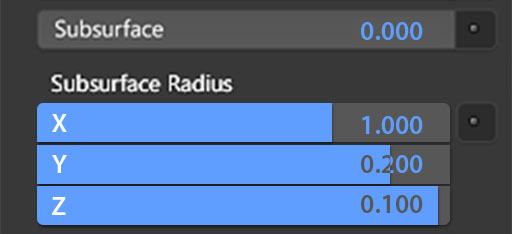
Not all values are right-aligned (yet).
Given that we are now back to discussing the proposal itself, I will not polish the patch further until (if) it’s agreed on, since it’s very time consuming.
Numbers used to be center-aligned in 2.5 and 2.6 series. Starting with 2.70 it was a design decision to switch to right-aligned numbers. I feel like reverting to center alignment is a regression. This brings back all the issues and shortcomings in usabiliity that were presented and acknowledged in this task #37761 - Number field alignment - blender - Blender Projects
The decision of the UI team was to stick to the currently single column layout in Blender 2.8.
This other layout system can not automatically give good results for two column layouts, and for a single column it takes up more space vertically, leading to even more vertical scrolling than we have now. While it looks good on more narrow properties editors, in general the properties editor in its current state must be wider to accommodate lists, node trees, modifiers, context path, …, and the outliner above it in the default workspaces.
So taken as a whole we do not think it improves the layout, even if it looks better in specific cases.
Putting the value boxes and the editable objects on the left, (Or any side) reduces the mouse movement distance to actual operation. Should have an option to toggle left or right, people may put the properties editor on the left side of their screen
@brita did you abandon your variant in the end?
I would have also liked to have the option of making my panels more compact (I’m a guy who likes to create their own comfortable environment, not imposing their vision on everyone, so I just wanted to tell you I’m one of those who liked your changes, your job wouldn’t have been wasted in my opinion)
(image from a guy on comments right-click-select- column layout with left-alligned text)
@nokipaike I still stand by my list of pros and cons, but ultimately the decision belongs to the UI team.
I am no longer working on the patch. When I get a bit of free time to work on Blender again, I’d rather work on something less political.
 —>
—>