Will this ever come to life?
The version with the labels on top seems perfect.
1 Like
Having the labels inside the sliders looks fantastic. It solves all the space issues of the current design. This is how it needs to be.
It’ll likely require some unpleasant rewrites of the UI code, but wouldn’t it be worth the trouble? Get this into the beta, please.
1 Like
Yes, Left Aligned looks better being that we normally read left to right.
After reading the feedback, I am cleaning up the patch in order to submit the following:
- (left) labels → value → decorator (right), so as to follow the logic order of having the “what” first.
- labels are on top of the value, with the sub-property name inside, if there is any.
This makes all text left-aligned and easy to match horizontally with the value.
- when expanding the area, the resizable layout will make more columns, with the labels still on top.
- the checkboxes and their labels will be on one horizontal line, with the checkbox aligned to the right, next to the decorator.
Note: this is all subject to change, even after committed it is not written in stone.
Problems with the above choices:
- the decorators (as well as the render toggle in the outliner) are thrown under the scrollbar, with no obvious solution.
- I preferred the 2.7X checkboxes where the checkbox was on the left of the label, but that would now put it far from the decorator.
- the locks for the transform channels are quite a pain, as they are a property separate from the channel and they can be keyed as well. Might need some custom solution and code here.
These changes are non trivial in terms of code and it will take a while to have it committed.
This is because the patch is hacky, just for preview purposes, and the result is not up to Blender’s quality standard.
To have it done proper, there are a few major problems to discuss with other Blender developers. For example, many properties are actually independent, such as clip_start and clip_end, when it is expected that _start and _end would be a sub-property of ‘clip’. This makes it difficult to decide which labels should be inline with the value, but on the other hand, merging the properties would break compatibility with existing python scripts. 
Curiously, removing the ‘:’ from the labels is also super hard (:
5 Likes
It is really amazing! But with many attributes it needs also some separators or some group of parameters to boxes, so list is not so long.
with background color
right now I’m wondering why this proposal has not already been adopted by the developers 
2 Likes
I continue to propose material design … maybe some developers could take inspiration: P
in my mind I imagine blender with a modern UI with all the animations and automatic style and resize of the pannels  always well optimized according to the size and position of window screen
who knows … maybe blender 3.0 … or even earlier: P

Did this patch ever get submitted/proposed? Just curious as alignment is still inconsistent across the app. Sometimes it’s left, sometimes it’s right.
1 Like
Hi there!
I’m sorry for the delay, I haven’t had much free time to work on this.
After a few weekends, my changes are starting to look good. I hope to be able to iron out the last corner cases next weekend to submit a patch for review.
Specifically regarding the checkboxes, I think they look better and more consistent always on the left, even if that means they won’t be close to the animation decorator. Because the columns width is shorter, I don’t find much difficulty understanding which decorator goes with each checkbox. (also, animating checkboxes shouldn’t be a very common case).
What do you think?
4 Likes
It’s not clear to me how these latest button layouts are intended to work in our default workspaces.
What this patch seems to be doing is effectively automatic layout of what we were doing manually in 2.7, but in a single column. However the properties editors in our default workspaces usually have an outliner on top, so it’s a lot wider than the screenshots shown here. There are also a lot panels right now that require a wider properties editor: anything containing lists, the tree of nodes in the material editor and the context path at the top for example. Long file paths or long object names can’t find in a narrow properties editor at all.
So what would be the proposed way in which these are used?
- Change the default workspaces to have narrow properties editors. Rearrange all the panels that require a wider properties editor, find a solution for or abandon the material node tree, … and just generally gear Blender towards this kind of narrow layout.
- Keep a wider properties editor, and use this layout in a single column. This would look quite different than the screenshots posted, and require more vertical scrolling than the current single column properties layout.
- Keep a wider properties editor, and use multiple columns. This would approximately give us back the 2.7 button layouts.
- Keep a wider properties editor, and make it auto switch to a layout where the labels on top move to the side. This probably will look strange, and again is not what is being shown in the screenshots.
1 Like
Thanks for the feedback Brecht, that’s all super valid!
I was playing with different ways to express that properties should be under a label (eg. X,Y and % should show under “Resolution”) and ended up with something that indeed is very close to what was in 2.7.
My code is now at the point where I am tweaking individual panels and things that look odd are not just bugs, but things to think about.
-
The panels get longer and less wide. The same width now fits 2 and sometimes 3 columns of properties.
In all, it takes less area than before and I think it is more readable and searchable.This was expected, however:
- Things don’t look automatically good when flowing more than one colum.
There are a lot of gaps and it’s harder to search for a property name with more than 1 column.
- For the gaps, a possible solution would be to manually specify the layout for 2 different widths, but that could be quite a bit of work.
- The searchability could be improved with the theme.
- I don’t think this is worse than before.
- When reducing the width of the properties window so that it shows a single column:
- The tabs become practically unusable. There were already plans for vertical tabs, I think?
- The breadcrumbing (context path at the top) is also near unusable. However, what’s the usability here? I can still pin things, and path is just not clickable? In this case I think I can make it visually fit.
- Lists actually look fine until the scrollbar comes in, which should be fixable by making its width match that of the other scrollbars.
- The panel can get very narrow and still be readable, but honestly it feels claustrophobic. I feel the urge to make it wider
 Also, narrow doesn’t work for properties that display long paths.
With only 1 column, I can make it ~70% as wide as before and I like it much more. It doesn’t need to be as narrow as possible.
- Things don’t look automatically good when flowing more than one colum.
-
In all, I am very happy with how it looks when there is only a single column, but it’s hard to make a workspace layout including the outliner.
-
I am not that impressed with how it looks with 2+ columns, but I still consider it an improvement on what it was before. @brecht do you think it’s feasible to manually supply a layout below a certain width and other for above?
-
I’m having a hard time deciding between having enums on a row or column:
Here are experimental builds that can be downloaded for testing (no compiling! :):
Linux 64bit
MacOS
Windows 64bit
There’s a temporary option in the user settings to change the enums in “Interface > Development”.
I didn’t work on the material tab yet.
4 Likes
I had hoped to find the texts of the properties of the materials included in the parameter scroll but evidently it is still early hehehe
that said …
you’re a boss, I like your job
It’s of course technically possible, but requires code duplication and manual puzzling to get logical and gapless layouts. The automatic 2-column layout is not good enough for most cases in my opinion, I’m not sure if that can be solved.
2 Likes
ive seen many failed attempts at this, we should just keep the single non dynamc layout
Hi Ines,
Great that you are experimenting and playing around.
However, the current design approach for the Properties is not an accident, but something that was carefully thought through. Here I’ll give you an overview of the why and how.
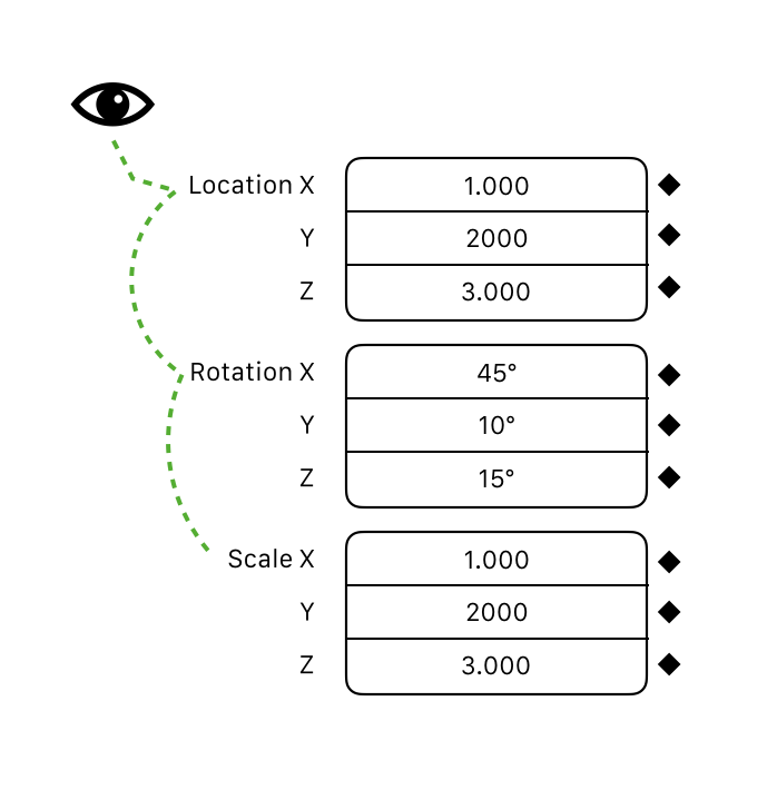
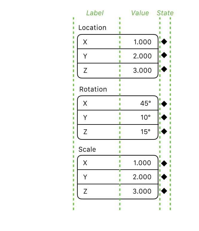
The main principle with this design is about eye scanning and stacking.
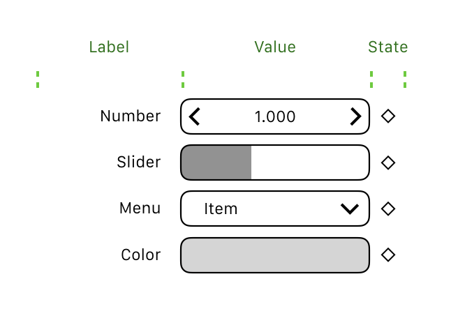
Mostly, the Properties Editor is a list of settings. For a given setting, there’s a label, a value and a state indicator (decorator).
In order to visually scan through these items, we stack them on top of each other, so you can scan down the list of values, the labels and the decorators.
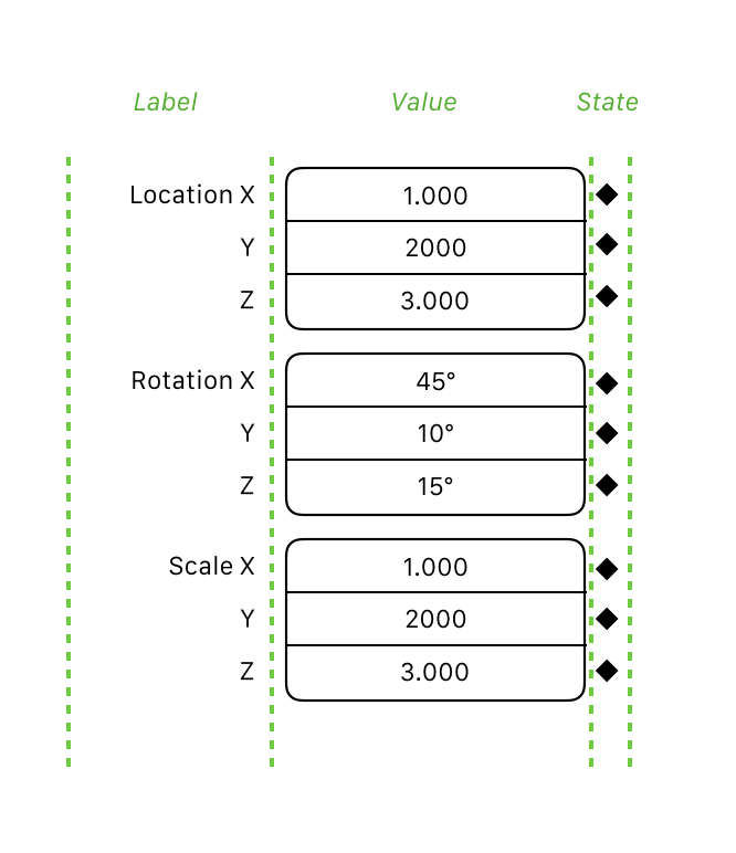
The order, going from label to value to state makes sense. Think of a spreadsheet, where the label precedes the value. The state has to be last for better eye tracking, and to visually connect it to the value.
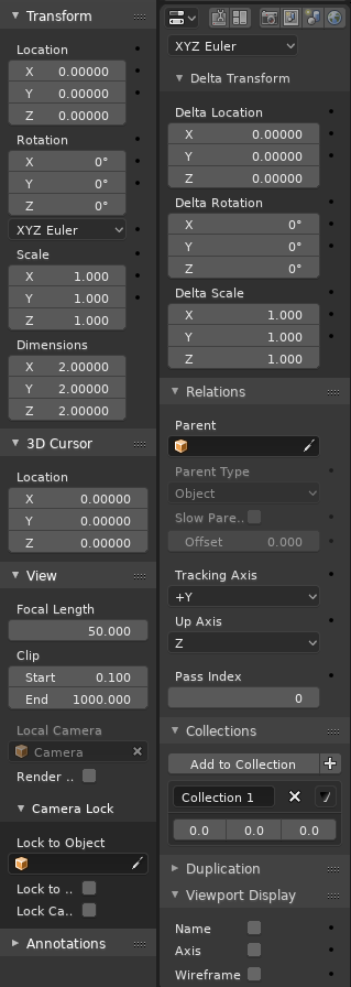
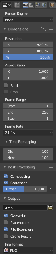
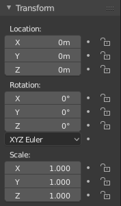
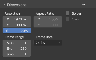
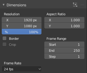
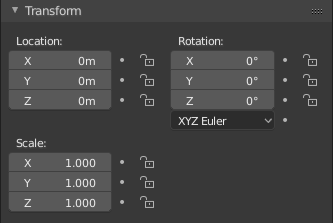
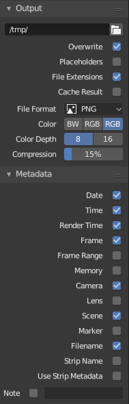
As you can see in this image, the labels, values and states are all ordered and stacked. This works also for menus, color values and sliders, where the label essentially has to be outside the value anyway:
The values are separated, which gives them more breathing room. This goes well with our system for increasing and decreasing values using the arrows or by dragging, which changes the value but not the label. Putting both label and value inside the value field muddies this principle.
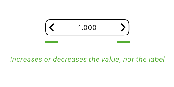
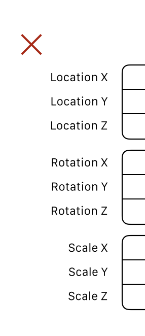
The negative space around the labels serve as visual anchors, so the eye can more easily find the correct label.
This is why it says ‘Location X, Y, Z’ and not ‘Location X, Location Y, Location Z’.
There are a few other side-benefits of the single column layout approach: When you have two or more columns, not only is eye scanning harder, but it means we often had to add compromises to make a given layout fit well with two columns. Often, the data in a given category doesn’t lend itself well to be split in two evenly sized columns. We often had to rejigger the data in order to try and make this happen, which could introduce illogical or suboptimal configurations.
All that said, could there be optional alternative layouts? Sure, there could be, but I think we should be careful with that. If it auto-switches based on the width, I expect the result will be very jumpy and finicky. We already do column flowing based on width, and if we add yet another layout type when it’s more narrow, it means there’s actually a very small Goldilocks zone width where we get the proper single column layout.
If the alternative layouts require separate UI files and corrections, I think it’s untenable. This will make maintaining the layouts a major hassle, for very limited benefit.
I think the only way this could work, is if an alternative layout would not require modification of the UI files, and that it would be a separate toggle (say in the right-click menu). Only then would it not interfere with the current Properties design.
2 Likes
Hi William!
In answer to your points:
-
I agree that the reading order for an item should be Label → Value → State, my original proposal didn’t consider it, but it was mentioned by many people here, and the current proposal has this logical order.
-
I take your point that having the label inside the value controller muddies the concept of using the arrows to change what’s inside, and this is a nice thing to consider, but I believe that it’s acceptable. There are examples of other well-designed software doing this, such as Apple Photos, and it looks great
-
1 column Layout
While I understand the reasoning behind having the labels on the left of the value, I don’t think it works well in practice. I find it very hard to search for properties, because they are right-aligned. My eyes constantly have to jump to the next label instead of going on a line straight down.
There were several possibilities discussed as an alternative to have the labels right-aligned, and I’ve done a patch that allowed trying these options in combination. The labels on top of the value were preferred for the space it saves while having about the same or more readability.
Note that the values get right aligned, which is a good way to display numbers and makes the values easier to find and read than with center-alignment.
Some comparison screenshots:
 ---------------------->
--------------------------> ----------------------> ---------------------------> -------------------->
 -
2+ column Layout
I did not change anything in the multi-column responsive layout. The problems that it has with my code are the same as before: scanning is harder, it may not look good automatically and, if done manually, there needs to be re-jiggling of properties that could lead to grouping them by looks instead of by topic, besides the additional work.
In the 2.8 branch there is already auto-switch of the number of columns according to the width. I am not proposing to add an additional narrow layout type. I was merely thinking of what to do when the column-flow doesn’t result well:- disable it? (lock it to one column)
- leave it be.

- explicitly make a layout for under a certain width (with 1 column), and another above a certain value. For instance, the Object > Transform panel could flow from being in 1 column directly to 3.
-
Consistency with the rest of Blender’s UI:
My proposal displays properties consistently not only in the properties editor, but also in other places such as popovers and nodes. -
Alternative Layout
To be clear, I am not proposing an “alternative layout” in the sense that it could be optionally enabled in the user settings. I think that, in this case, the least options the better, otherwise it’s too much to maintain without a clear benefit.
The code I’ve done implements only my proposal with the labels on top and the original 2.7 layout. I kept only the option between these two as a way to control the transitioning to the new layout (and the temporary toggle for enums). I have cleaned up all other conditionals from the code which is now ready for review.
Unfortunately, the UI code is already quite spaghetti and my original patch with lots of options got unmaintanable super fast. With the cleaned up version, I wanted to be careful with adding more technical debt.

tl;dr
I think that my proposal makes things more readable in a single column. Additionally, it takes less space and it’s more consistent with other parts of Blender.
The code is ready for review.
It needs a few more tweaks (material tab, specific panels, the enum values are taking too much and other spacing problems here and there). These can be done in separate commits.
13 Likes
Well, that is essentially going back to something like 2.7x. We made the change for specific reasons, as outlined above. Adding decorators doesn’t really work with 2.7x style multi-column layouts, because then it’s not clear which column the decorator pertains to.
With this proposed change, the labels and values are not consistently stacked and ordered anymore. Menus and number fields now have different alignment. Color values too.
Another problem that gets worse here is the connection between the value and the decorator. For checkboxes, it’s less clear here which one the state indicator belongs to.
The negative space afforded by right-aligning the text is intentional. It means that the label is connected to the value, and we dont need lines or ellipses (….) to connect them. It also means that we get ragged-left negative space which is a big help for eye scanning - just like paragraphs of text are proven to be easier to read with ragged alignment.
Putting the descriptor label above the values for number fields and menus both violates the stacking principle and also make the Properties list longer.
In short, this new design approach in 2.8 is intentional, and optimised for adding decorators and scanning through large lists of settings.
However, there are some panels that have not been consistently converted, resulting in an inconsistent impression, and others where the text alignment is not perfect yet. We also want to add things like a vertical header and a search field at the top to quickly find a given property.
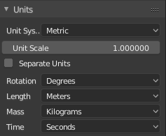
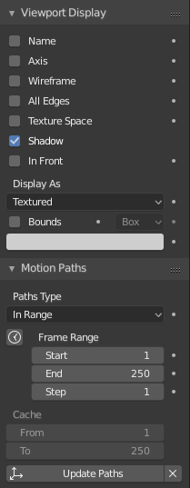
Here’s an example of the kind of panel that is not well aligned currently. The ideal version is on the right, but our current code makes this kind of alignment difficult to do - we should improve that.
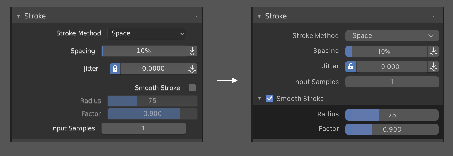
These issues we should fix, rather than changing the overall design approach.
Cheers
4 Likes
“We also want to add things like a vertical header and a search field at the top to quickly find a given property”
+1
Having property search in the top is going to be fundamental to be able to find roperty things easily! 
I would be very happy if this would get added. Currently, it’s tiring to search for properties because your eyes keep jumping horizontally. Brita’s proposal looks very clean to me.
1 Like
I love when the moment of research and development starts to get serious…
I enclose this video made by one of our friend user @HEAVYPOLY
that has been customized this compartment for mere practicality …
just to inspire you insiders

Good job everyone 
2 Likes