Trying some adjustments
3 Likes
I think that the label of the checkbox, it’s more like the text inside the button than a separate label, therefore I against options like A or H. It looks like checkboxes without a label.
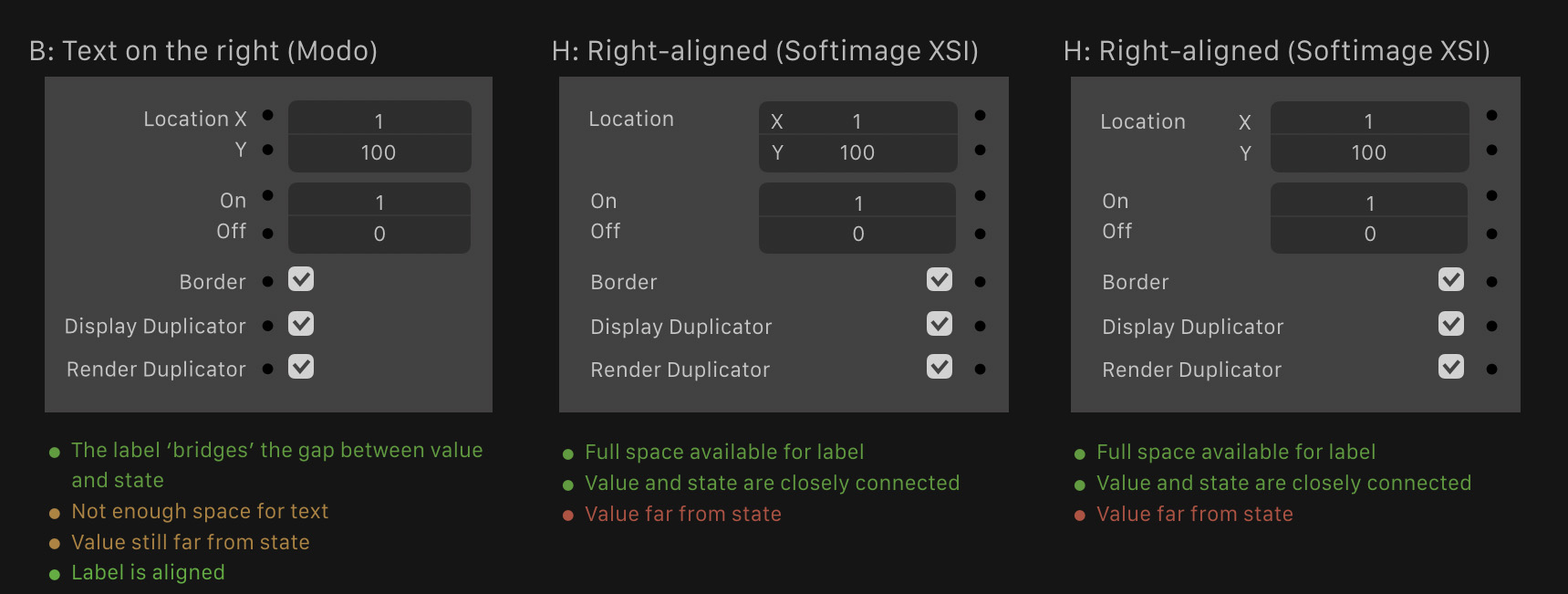
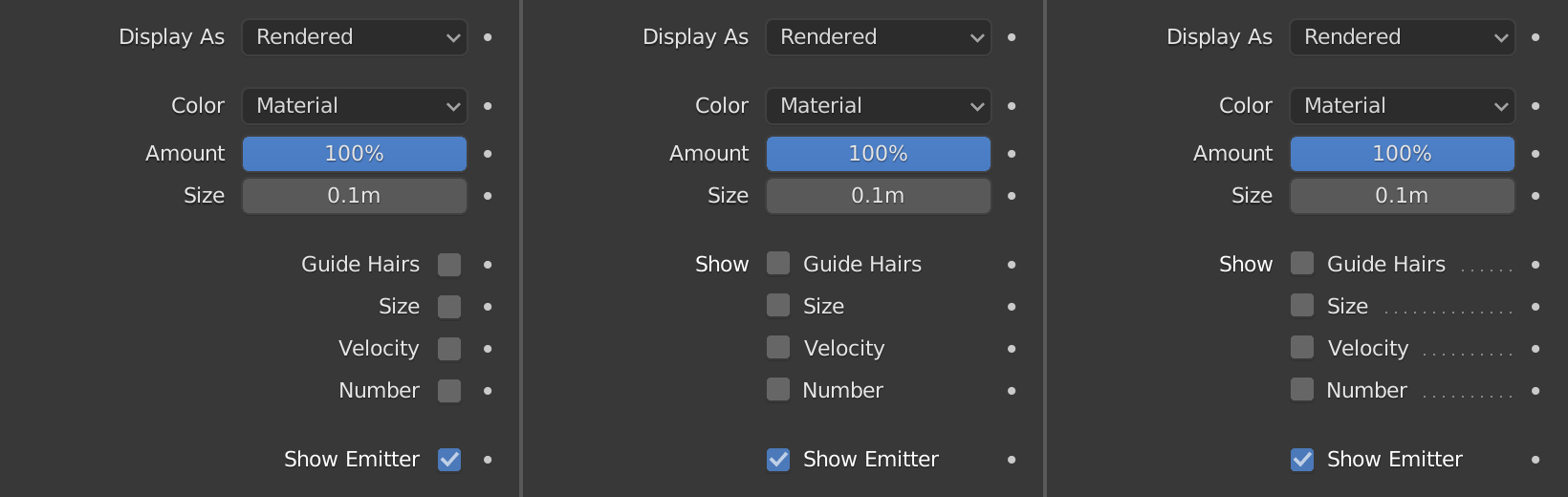
“Value far from state” - this is solved by adding a leaders, like in the table of contents (on mouse hover or permanent).
Option C is acceptable, especially if there is a some visual separator, between a group of checkboxes and a group of buttons/field, such as a sub-panel.
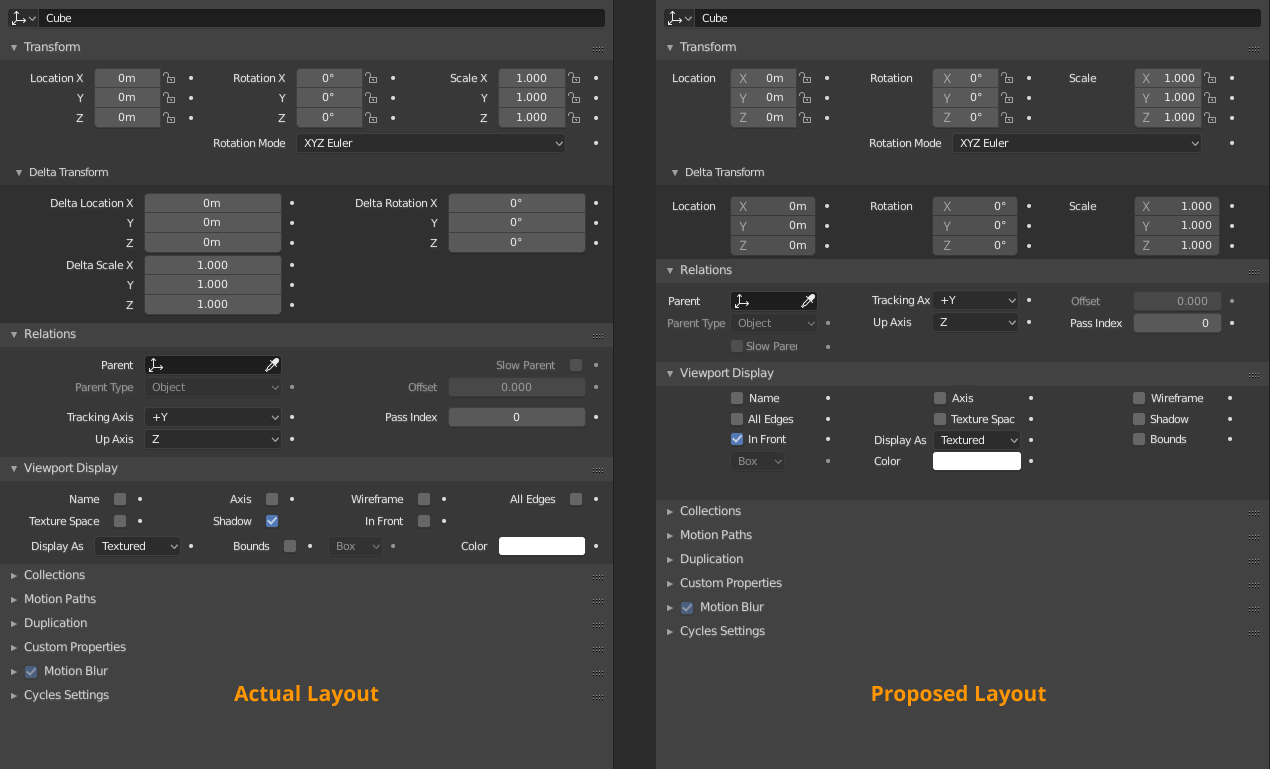
Checkboxes inside the panel headers are located to the left of the text. It looks strange when there are near two checkboxes but aligned differently.
1 Like
The main petition of people is make left aligned column. If that is not solved touch the actual columns is wasted time.
I want to remember the proposal that I made in Right Click Select with a lot of support from community
7 Likes
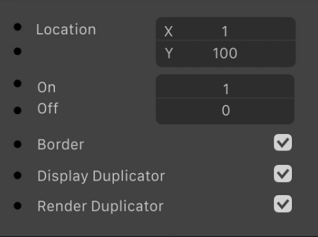
it doesn’t show the state dots
Yeah, the problem was that I pick the layout from a redo panel and it doesn’t show the state dots. But I used for the basic layout. ANyway I have a version with it.
But state dots could be moved without problems.
4 Likes
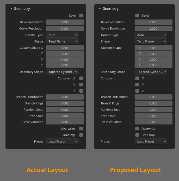
Those mockups are not solving anything. If I enlarge the panel and the controls still stays on the right, there’s not point.
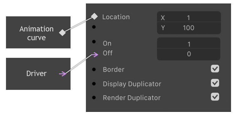
Unlike Maya, Blender does not use nodes for the animation curve. I think if everything will be nodes, the editor of nodes and attributes should be likened. For this reason I think the first option of zebus3d is the most successful.
4 Likes
I keep being baffled about this design decision. I like we are reading like some contries do, from right to left. Readability is relly bad!
2 Likes