Hi, in the second message you have a proposal similar to your idea.
I updated the patch with feedback from this thread and also from Blender 2.8 UI design – hierarchy issue
It now has options for:
- labels of sub-properties inside of numeric values.
- property name on top of the value.
I upgrade my original proposal to:
However, I do think that the argument for labels coming logically first is very valid.
In that case, I still suggest left-aligned labels in a responsive layout like so:
Click for Video → Developer Portal - developer.blender.org
Stills:
Labels on the side:
Labels on Top:
Note: The purpose of this patch is to help visualizing and reaching a decision. It’s getting complicated to maintain so many options in such hasty code. I don’t think I can keep iterating much more.
Also Note: The decorator bullets are misaligned in the version with the labels on top and I did not actually implement the transition from one to the other.
15 Likes
I like the labels on top version. I just think perhaps the main labels could remain on top even when enlarging the area.
5 Likes
The labels on top with few changes is perfect.
4 Likes
label on top i it’s the best, especially because I’m not forced every time to enlarge the properties view to read the texts
1 Like
Labels on top looks great. It’s more compact. It bothers me that the panel has to be extended so wide to make it expand to two columns as it is now. I’m wondering if the labels on top makes that change to two columns happen sooner.
I also agree that lables on the top is the best option
1 Like
Having labels on top looks perfect. Would be good to keep the main labels always on top as suggested by TheRedWaxPolice. That way we would save horizontal space. I really hope this gets in 2.8!
Please, guys ! Keep calm and think a little bit to what a principled shader will look like with labels on top.
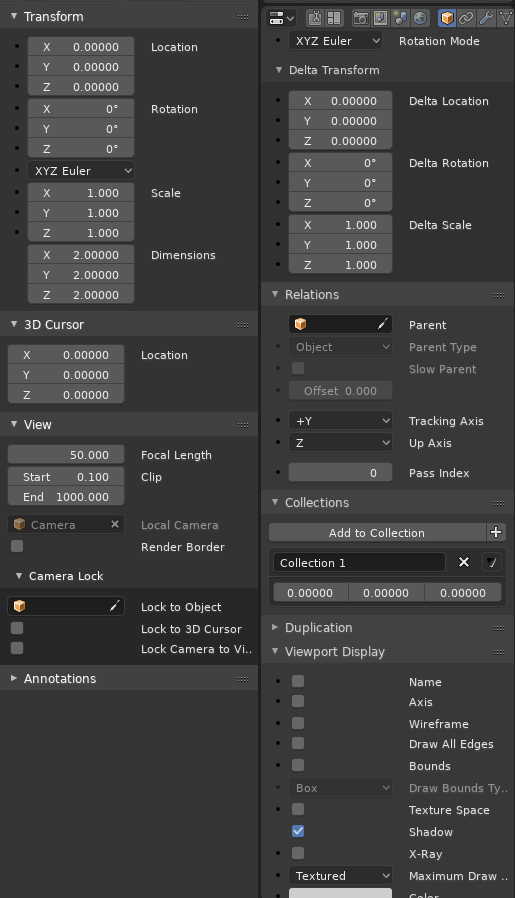
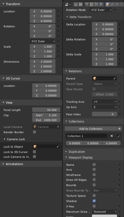
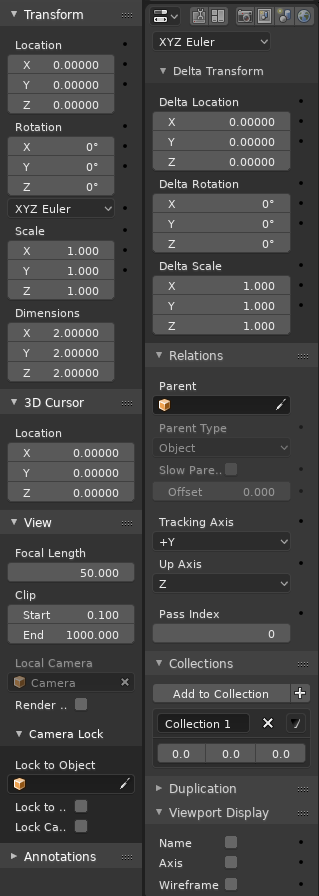
Of course, it looks good for Transform panel with little labels to add above a massive 3 or 4 values array.
Any disposition looks fine with this panel. It is a bad choîce to use it to demonstrate any UI choice.
To make a decision, it is better to choose something that always looks ugly.
Is it possible to see what it looks like with Motion Paths panel ?
I also like the idea of narrow columns. But label on top will double length of most of panels.
It is already difficult to display more than 2 panels with default UI. And sometimes, it is often only possible to display one at a time.
If you are not able to set-up 2 settings without doing an extra scrolling or an extra click, we can qualify the UI as a hell of slowness.
I would like to see if narrow columns with labels on top is readable with grid flow lay-out.
If grid flow layout is not able to use narrower columns, I think that another solution have to be tested.
Can subpanels correspond to one column inside a panel instead of being stretched like the header of panel ?
That is false. The situations where it’s necessary are few, not all the values. Second, the alternative to add a few lines to the panel is to double the wide of the panel…
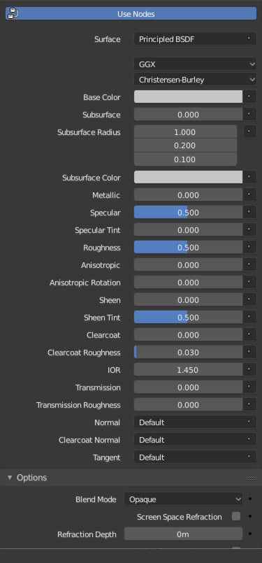
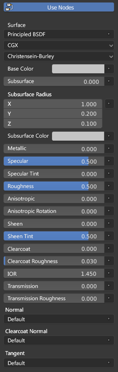
And, the actual layout for principled is the worst (if we don’t want to see that the menu is a mess anyway when you add something more than plane color)
Actual Layout
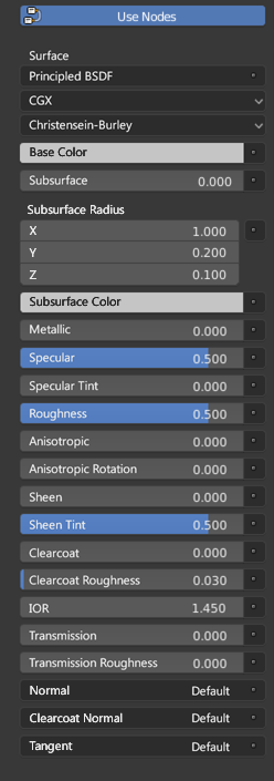
Proposal
Proposal with a few improvements
18 Likes
OK. Mea Culpa.
I read Brita proposal too quickly and I missed labels inside numeric values part.
But I continue to do not like grid layout behaviour.
If it works to create narrower columns why abandoning these choices while expanding properties editor.
For same width, we could have one more column of settings.
in my opinion a mix between “label top” and “principled shader node” style is the best solution for the property panels I need to optimize the space. I’m tired of having to expand the property window every time to be able to read the text better or have a slider a bit wider to have a little margin of precision … the mix is the best solution for all 3 problems, better reading text, better slider management, and better space optimization.
I really like the way it looks in the third image. Is compact, clean, much better to read and has said before eliminates the need to push the panel around. Great stuff!! Hope it gets implemented.
Keep in mind that labels inside the color field is a no-go, cuz the text would disappear eventually, once both colors matches… 
How hard would be to make it change once the luminosity of the colour passes a certain value? or for those fields put in outside align to the left.
1 Like
No idea…So I’d go with the second image.
1 Like
I have tried before having text switch from black or white depending on the luminosity of the background, but for values of 50% luminosity the contrast ends up not being great. Additionally, it’s quite dependent on the monitor calibration and the surrounding environment.
Blender already defines colors for all types of text, so I wouldn’t try something automatic here.
1 Like
I am adding my vote for labels on top option. It will finally make it possible for the double column layout to not waste space.
I also vote against having labels on the right of the UI control. Reading goes from left to right, not the other way around. It just doesn’t feel right.
2 Likes
Must be black for 0-80% and white/grey for 80-100% or similar, not chane in the middle
I’m just going to post in support of this proposal, as I honestly think having the label and value inside the slider is better for a few reasons:
- The slider uses the entire width of the column, so the user has more precise control when setting the value via the slider.
- There is more horizontal space, so we can have narrower columns or just more space for the label and the value. The current design seems to waste a lot of space on the numerical value, which is given ~50% of the layout.
- Less vertical space is required, so less scrolling up and down or folding panels out of the way. This is a huge benefit for things like nodes.
- Label and value are very clearly connected.
7 Likes