All arguments written down in the mockup. ![]()
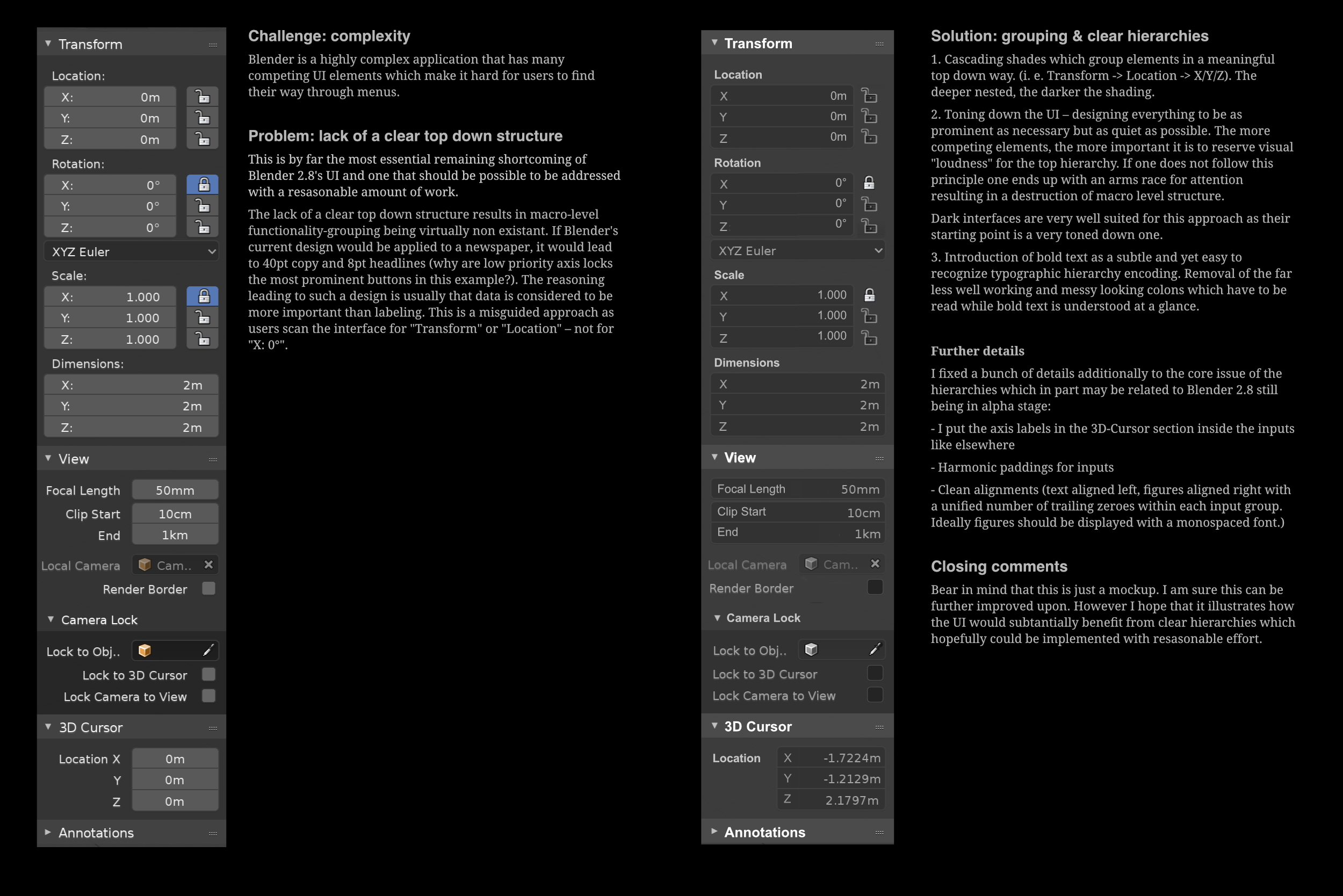
I just noticed, the 3D Cursor now has 3d-view rotation, but we have no sliders to control it’s rotation like we have with it’s location on the N-panel. I wonder why… ![]()
Anyway, there are some questions regarding the readability of the side panels that I like when we are talking about peripheral vision. Since the N-panel is usually to the right of the focus-point of our vision which is in the middle of the screen, I like how it uses some contrast and color to provide peripheral information.
For example, look at this example of how both looks outside of our focal point:
According to this emulation I can assess some pros and cons to both.
The original panel gives me the following peripheral information:
Positives:
-Light areas are clearly areas that I can interact with.
-There is clear separation for a special area (the lock panels) to the right of the larger light areas
-There is a distinct Blue Color on some options that I have changed (that are now NOT on default state)
–There are some orange hints that indicate object interaction (which is consistent with the rest of the interface, since orange is used only on the object icon, the object outlines and the outliner icons)
Negatives:
-There are some apparently random darker areas mixed in the panel (which are the axis drop-down menu and Camera Lock options)
When I look at your version blurred, here’s what I feel:
Positives:
-Highlighted names give a clear indication of separate areas within the panel (the hierarchy that you mention)
-Darker areas are apparently less random, since they mean interact-able areas… except again for the Camera Lock region which is entirely dark for no specific reason (the same as on the original version). But on yours it’s less dark, which is a plus.
Negatives:
-Slightly less peripheral visibility on what are interact-able regions (compared to the light areas of the original) because of decreased contrast to surrounding area.
-Much less visibility on Locked icons, due to desaturation and decreased contrast to surrounding area. Also the Lock/Unlock button is not inside a dark region (indicative of interact-ableness) therefore it’s inconsistent with the rest of the theme.
-Desaturating the Object Icon (from orange to grey) makes it inconsistent with the rest of the program’s interface. So either blender should desaturate the icons everywhere, or nowhere, to maintain a standard. (I prefer colored icons to pop them up from the interface, specially because Blender uses different colors to different buttons, which is good for quick identification)
Final Considerations:
-I really liked the Bold White Names of the panels, which serves to clearly separate them even on peripheral vision.
-I dislike the lost contrast that was useful to get a subconscious sense of the separate interact-able areas from the neutral backdrop region. Also I’m pretty sure you can edit the back color of those panels on the User Preferences if you really prefer a darker input area color.
-I really liked that you added the XYZ axes to the inside of the 3D Cursor Location inputs which makes it consistent, but I don’t understand why on the Transform panel the Location text is above the inputs, while on the 3D Cursor panel it’s Left-Aligned, which is inconsistent even on the original layout. Any reason to keep that aspect from the original? Also I question the developers again the missing 3D Cursor Rotation inputs, since it is now a 3D object.
-I dislike the desaturation of the selected Lock buttons, which used to give a good sense of a toggle option that was selected, while on your version it is faded away, hardly different from the unlocked ones. Also the fact that the Lock icon regions are not darkened which is inconsistent with the rest of the buttons and input areas on your proposal.
This is my feedback ![]()
This is a nice fair point!
From the original picture:
- Indeed the 3D cursor labels were not consistent with the rest.
This happens because the transform was not converted to single layout yet, and the 3D cursor was.
I made a patch which fixes this inconsistency, but I had to temporarily remove the locks. ✎ P768 Patch with different alignment options for the 2.8 single-column layout - In the mockup there are other things such as “Focal Length” that were also placed inline with the value. I’m not entirely sure about this, on one hand it makes all numeric inputs look more consistent, on another, that is the property name, “X/Y/Z” is not the property name, “Location” is, to it gets a bit inconsistent here.
- “Harmonic Paddings” - I tried moving the inner value labels to the left, but I quickly realized that conflicts with the stepping arrows.
- “Clean Alignments” - see Single Column Layout - Suggestion to have text left-aligned
“Cascading Shades and Toning down the UI” - @okapi can you make a theme with these changes?
“Bold Text” eh… not sure how technically easy this is. @pablovazquez?
- Please paste your feedback for the 3D cursor in a related thread, where it can be taken into account. It’s quite a new thing, the more feedback the better

- Super interesting point about peripheral vision with the blurred picture!
- The blue color simply means that the property is active, which may or may not be the default.