I updated the patch with feedback from this thread and also from Blender 2.8 UI design – hierarchy issue
It now has options for:
- labels of sub-properties inside of numeric values.
- property name on top of the value.
I upgrade my original proposal to:
However, I do think that the argument for labels coming logically first is very valid.
In that case, I still suggest left-aligned labels in a responsive layout like so:
Click for Video → Developer Portal - developer.blender.org
Stills:
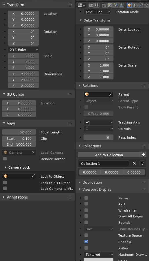
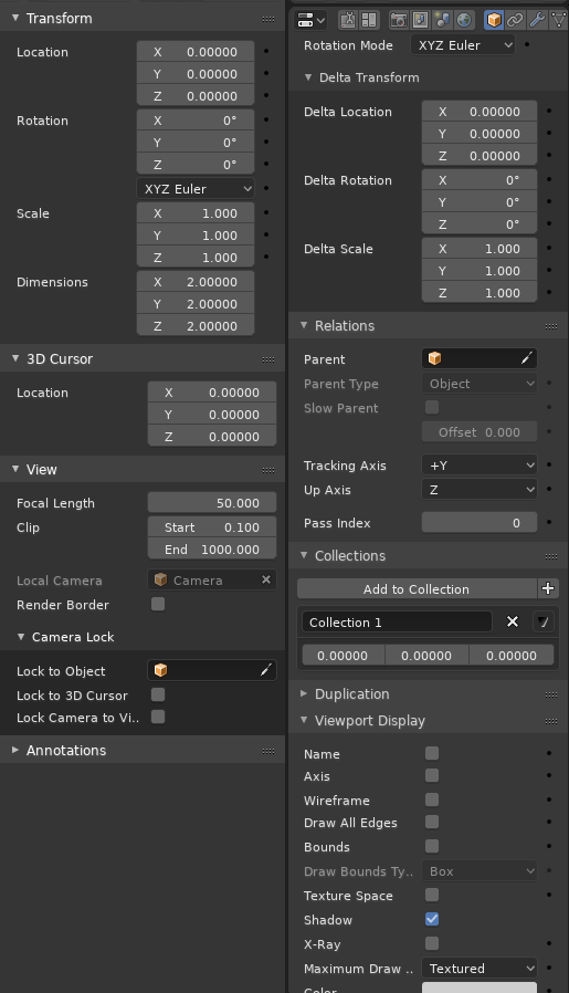
Labels on the side:
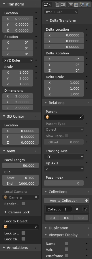
Labels on Top:
Note: The purpose of this patch is to help visualizing and reaching a decision. It’s getting complicated to maintain so many options in such hasty code. I don’t think I can keep iterating much more.
Also Note: The decorator bullets are misaligned in the version with the labels on top and I did not actually implement the transition from one to the other.