Loop face select always selects the vertical loop. But what about the horizontal face loops?
It depends on where you click.
The UI doesn’t give any hints in where to click, though. It doesn’t even reveal what alt and control clicking does to a selection.
Read the manual for details, there are too many subtleties.
Why, when 2.8 added a new shortcut hint bar at the bottom? They just need to populate it with modifier keys as well!
1 Like
I agree that tips in the status bar can be significantly improved, but it is impossible to describe everything (like where to click) in a small line, there is a manual for this.
It actually does respond to modifier keys. Try it - hold down a modifier and you’ll see the status bar update.
Yes, but that is “after the fact”. It would be nice if it would always say [Ctrl] - Does this [Alt] - Does that.
1 Like
The problem with this is you end up having to expand a lot more of the key-map than fits in the status bar.
Maybe Ctrl-Shift ones one thing, Ctrl-Alt another, when each may do something different for left/right mouse buttons… etc.
Sure, but how is the user supposed to discover that otherwise? And how is the user supposed to remember all that?
(Especially when some shortcuts are backwards compared to the rest of the industry, like I’ve mentioned earlier in the thread.)
perhaps ctrl, shift, and alt should be added to the status bar like a nested menu when there are options available beyond the modifiers. with a ‘more’ or ‘+’ label.
Just as you hover your mouse over a button to to see it’s tool-tip, you can press modifiers to see what they do.
If we want to show current available keys we could - but we would need to use a lot more space.
I had not seen this thread, so I had written about this topic on papercut
Well, the problem is that user need to learn something in order to use program.
Program should not to give such simple advices every time user launches it.
There is a lot of things (like drivers) that cannot be described that way.
If you are modeller - you know about loops selection from manual or timelapses.
And yes - there will always be features, like layers, including addons functionality, you never heard about, because they need knowing “concept” instead of buttons pressing.
This is a common situation.
How peoples supposed to survive CG if they need constantly to see such basics on a screen?)
If you’re seriously asking, then I can say that there are many new users, or maybe the user has never used a particular tool before, or uses a lot of programs and forgets/confuses the most basic hotkeys.
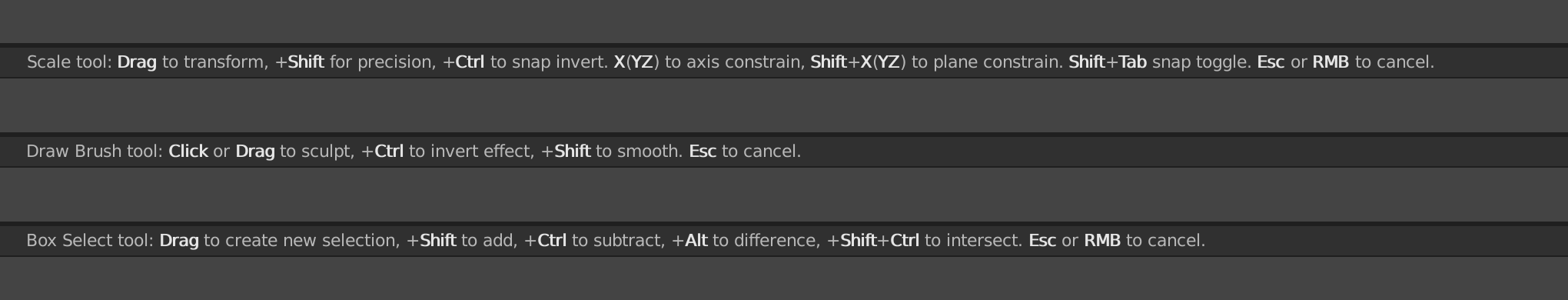
I propose to show hints for the currently selected tool or operator, rather than some random or obvious (like that the RMB shows menu). And do not use icons, they are very noticeable and distracting, and also look like buttons that you can click.
3 Likes
There are many users that don’t know how to properly use layers, snaps or NLA editor, they will always be the majority.
Is it a problem of software?
Also, for example, professional users turns RMB mouse menu off, replacing with pan, it’s a sign of growing up.
What should happen with hints?
Normally that users don’t know to use that parts of the software because they don’t use it.
Yes! Yes, that is absolutely a problem of the software UI design.
1 Like