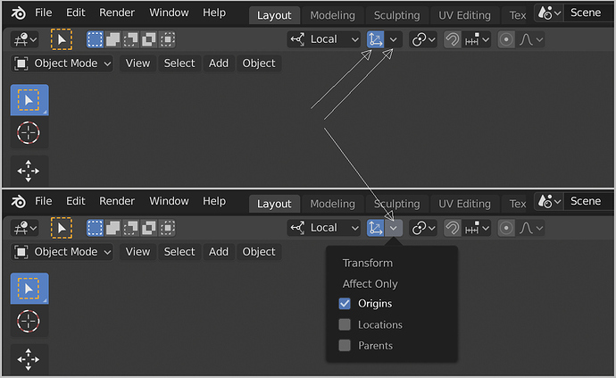
What you mean exactly?
My main concern with this is the usability. Right there on the right it’s hard to reach.
I would prefer to have it in the middle section of the header, kinda like this:
Better place/easier to reach.
With this type of popover+button we would be able to activate more than one option with just one click/hotkey.
We can see at a glance if it’s enabled or not.
