@Antaioz
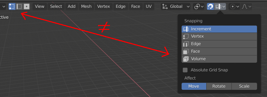
The bottom ones are too similar to Snap Target icons, which are compeletly different concept. Having both of them similar and in one header is konda confusing.
Well, if you are interested in my 2 cents: I get the feeling that you try to find globally unique icons. This is, IMHO, an impossible task. In software development, where I am coming from, many fall into the trap of trying to find globally true models to represent stuff in code.
The big fallacy here is: Meaning always needs context and the icon/model can mean totally different things depending on the context. There is no universal truth. Having proper contexts and boundaries between different contexts is the important thing. (For example, an account at a bank is something completely different to an account on Blender’s devtalk. Still people have no trouble keeping both apart.)
So coming back to icons, is the Channel Alpha icon ever used in the same context/editor as the Face Select icon or are they never even close? If it’s the latter, I don’t think similarity is a problem then since they are used in completely different areas of Blender and should not interfere with one another.
I don’t see how that’s an issue, they’re still different, the snap icon has the link to the magnet icon as essentially a ‘header’ to the dropdown, and it being a dropdown, which distinguishes it greatly from the selection mode picker. They’re displaying similar concepts and similar types of information - whether to operate on faces, vertices or edges - they’re going to be similar, context has to, and more than enough does make up the difference. The ‘conflicting’ icons are INSIDE a snapping menu.
As for the UV editor, so… You completely ignored me when I wrote this then?
For some reason looking at this icons feels super pleasant. I really like them.
They are totally consistent and it is very easy to read them fast.
Why don’t you want to stick with that design?
I’m good with it too. My first plan was to use those for UV Editor and 3D View Editor, but then I was suggested to make them (UV and 3D) different to emphasize the difference between the two selection modes in UV Editor - UV Vert./Edge/Face and UV selection synced with 3D View.
I’m pretty convinced, that the latter differentiation isn’t crucial, but still try to find out a way to make it possible - visually functional and pleasant at the same time.
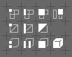
I like those too, but I find they are just a bit too fussy and complicated when used in practice. When in the Component Selection buttons they are cramped together and have a rule between them.
They don’t look too bad if simplified though. Here showing how they are used in those buttons:
I like the reduced versions. Hard to decide between the two, but I think I like the first reduced one more (since there are no triangles in the wireframe I think a quad is better in this case). On the other hand, consistency with the edit mode select mode would be good, too.
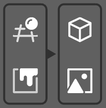
I just used the editor menu in 2.8 and looked at the icons and felt that most of them make sense but two of them is sticking out as not so obvious. So I made a quick mockup suggestion.
the 3D view icon is very busy and hard to read. I understand the concept of a grid and a ball, but to use a sphere to illustrate a 3d shape or perspective is not very good, as it looks the same from all angles. The grid uses too few lines to make a grid so it only looks like a hash sign. I think the cube is a much better representation of a 3d view as it shows both perspective and a sense of 3d in a simple shape.
The image editor icon looks like a square with slime on it? I understand the concept with paint, but it doesn’t remind much of an image. If the painting aspect of the editor is important, I would show that with a paintbrush instead of slime(paint).
The Movie clip editor (not an icon). Why not rename it to Motion Tracking or Tracking instead? You may do other things in this editor as well, I heard something about rotoscoping (manual or tracked?). The icon suggest motion tracking as the icon is a tracker gizmo. Just a thought.
I suggest to replace the icon for the image editor with D21 and the 3D viewport with C23. It would make it more clear and consistent.
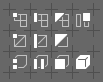
The triangles are a bad idea.
When sorting out topology, the goal is to eliminate triangles, so most models are quads. Quads are the quintessential representation of wireframes and faces. The triangles look like they belong to some other editor.
This is such a pointless change, @jendrzych I think you’ve reached if not are reaching that point where you tweak into infinity chasing perfection. In every project, at some point you need to say “that’s good enough”, because it’ll never be ‘perfect’, and in chasing that beyond that point, you just make things worse.
It is not true. Topology depends on your goals.
Triangle is representation of simplest face form.
Quads might be more pleasant to eyes, but I don’t see anything against triangles rather than that.


 !
!