Search would be a great addition, but there is some technical work required still to make it work.
I think it’s something that should be added, but it might be more of a 2.81 feature.
Search would be a great addition, but there is some technical work required still to make it work.
I think it’s something that should be added, but it might be more of a 2.81 feature.
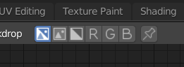
@jendrzych Great job on recent icons update! Really like how Pivot Point and Transform Orientation popovers look right now ![]()
But, one icon is very out of scope…
![]()
This Face Select icon looks like was accidentally placed here and don’t have any relation with two others.
And this choice obviously relates to changing icons style from 3d to 2d.
So, as an example, that’s how 3ds max 2d icons looks like:
![]()
They are a bit ugly, but pretty simple and descriptive in relation to each over.
The simplest solution to current icon set would be something like this:
![]()
But I’m still not sure that 2d shape is a good choice.
Can anyone explain to me why there are three different sets of icons that represent Vertex/Edge/Face Selection Mode, where is the case where the functions they represent can be confused?
Hey @jendrzych,
I see that some updated icons landed in the latest version of Blender 2.80 but a couple of them don’t make any sense yet …
The new icon for viewport visibility is now a link icon, which will make sense if the planned changes of the Outliner Visibility Update will get added but for now the icon is totally out of place. I think it makes sense to wait adding them until the changes to the visibility system are actually done.
Doesn’t @billrey responsible for ‘landing’ and reviewing icons made by @jendrzych?
This is feature I don’t use and I’m not familiar with - I changed the design, based on the discuss You’ve linked. Perhaps a bit I rushed
Yes! Much more clear and concise. I dig!
Actually we don’t need three different sets, but two are a must - one for Vert./Edge/Face selection and one for Snap Target.
My original intention was to use the selection icons from UV Editor. Ultimately, both 3D View Editor and UV Editor use the same Vertices / Edges / Faces selection concept. But first I wanted to try a set of visually distinctive icons for: [1] 3D View Editor Sel./Disp. modes; [2] UV Selection modes; [3] 3D View Editor Snap Target. That’s because it was suggested to me that No. 1 and No. 2 should be distinguishable due to the option of synchronization of selection between UV Editor and 3D View Editor. In my opinion, it does not matter much and I think that numbers [1] and [2] can share icon sets without a confusion. So my goal is to: [a] design better set of I1, I2, I3 pictograms or [b] just replace I1, I2, I3 icons with G13, G14, G15. Personally I opt for the latter.
Thanks, I missed the Snap Target option. And I agree with your opinion.
It may not directly cause confusion, but having those icons change, and be the same as the 3d view when using that selection link aids in recognising and understanding that selection mode in a useful, unobtrusive and intuitive way - it represents the mode far better than any icon can, that double arrow doesn’t mean much. It also increases the chance you’ll notice you’re in that mode if you don’t want to be or vice versa.
Why remove it?, it’s helpful and there’s no benefit to doing so.
BTW - @billrey, Local and Gimbal Transform Orientation icons are switched.
Odd, I didn’t change it in the code. Are you sure it isn’t you who switched them? 
Gosh… looks like I screwed it up.
What about something like this?
I think the 3rd row might be good.
Second or third row is very good.
When that thin square disappears in the last icon, all family resemblance between the three is lost.
My five cents:
![]()
adding or subtracting a penny…
![]()
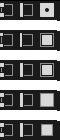
Why does it have to be two? Like two vertices, two edges and two faces?
I find @Harleya’s version with on face clearer. Same goes for vertice and edge, why not highlight a single one? After all, it’s “edge select”, not “edges select” 
It was my firts shot, but then I realised that it’s way too similar to Channel Alpha icon:
Thus two selected faces was an obvious choice.
Or maybe I just overthink it? Do I?
Again, serious question,
What on earth was wrong with these
