The design process usually ends when: [a] there is no time left and no further development of the concept/project is possible, [b] resources are over and further work is unprofitable, [c] all possible solutions to the problem have been exhausted.
None of the above options apply to our situation, so there is no “perfect” point to achieve. We’re free to doodle.
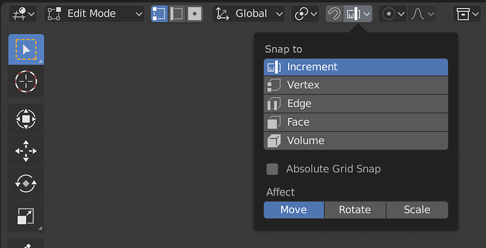
The 3:rd looks good, but I still don’t like the inconsistency with two selected vertices but only one edge and one face. I suggest to only highlight one vertex. It also gets easier to distinguish the selection mode from the snapping mode.
Im a bit late to the party!
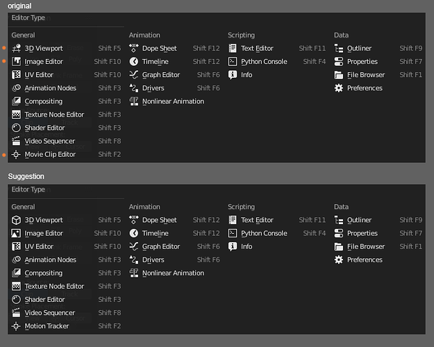
I really like the changes, except for the output icon. ![]()
The old printer screams “output” and is easily distinguishable from the rest of the column.
The new one screams “image” and looks similar to the icon beneath it. …and the one below that.
I think “output” is way more fitting then “image”.
Its subjective ofc, so just my 2cents.
Definitely a good proposal, otherwise!
At anyone willing to answer:
Is there a plan to just deliver the icon sheet inside any folder of blender and not hardcode it, so it can be changed easily ?
And: What was the conclusion on the idea to make the icon sheet multilayered, to apply some basic colors to it ?
Was not practical ?
2 words
dev time.
BTolputt was working on making it possible to switch icon sheets back in december, no word on it. Other than that, nothing.
As much as the printer screams output it also screams print and is used as such in all other softwares, so I think it’s a very missleading icon to use. You usually don’t print from 3d softwares (besides 3d printing) and this is not related to printing, it has more similarity with saving files than printing. There must be a better symbol for this.
I completely agree, these icons were the best for Vert/Edge/Face mode:
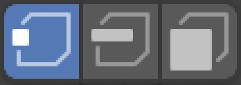
If anything I think the snapping icons should be the ones to change, but I don’t really see the problem with having them be the same.
I just noticed in the latest b2.8 build that the icon for showing a modifier in the viewport is now this:
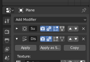
I am all for trying to improve things but ill be completely honest, the only reason I had for clicking that icon is because I KNEW it was there and what it was for.
I see no connection between viewport visibility for a modifier and that icon… It is very confusing.
I don’t remember what it used to be. A screen I think? That was better than this ![]()
The link… well, it’s a feature I don’t use and I’m not familiar with - I changed the design, based on this discuss: Outliner Visibility Update. I rushed a bit. I’ll bring the screen back.
I am confused… This is actually a good thing. If you want to depict same thing (vertex/edge/face) in the same software, then naturally, the same icon should be used, so that you can immediately identify it refers to same entity. It’s beyond obvious those in the popover switch snapping, as there is a clear snapping title above them. I don’t get why should they be different?
I think the same thing…
The icons used for component selection don’t actually have anything about them that says “component selection”. The icons themselves are only communicating the idea of vertices, edge, and face. Similarly, the snapping icons really do not communicate anything to do with snapping. They very simply only indicate increment, vertices, edges, face, and volume. The UV vertex selection mode icons are the same: the icons themselves communicate only vertices, edges, face, and Island.
They should all be using icons from the same set. A set that is used to indicate vertices, edges, faces, islands, and volumes.
Otherwise it is arguing that we need a multitude of slightly different generic checkmarks for different uses. It is one thing to have a custom on/off that communicates something specific, like a lock closed or open. But there is no need for variations of a generic thing, like having multiple checkmarks. Or slightly different “camera” icons because visibility is used in different areas. “We use the SLR camera icon for collection visibility but the portable camera icon for object visibility because we don’t want people to confuse them.” LOL
That’s why I’d use the same icons for selecting verts/edges/faces/islands in 3D View Editor and UV Editor.
In fact, in your earlier example I’d argue that you are adding confusion by having different icons for vertex, edge, etc. When faced with this the most natural reaction is a wasteful “why are these different?” There would be less confusion if the icons were the same.
I have changed the screenshot slightly though, so that the snapping options have a better label above them…
And now for something completely different… LOL
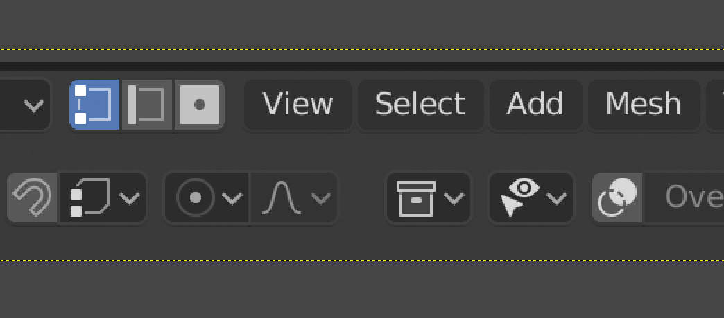
There is a different icon mystery that I’m curious about. What is it about the “collections” icon that makes it look so much brighter than the others? It really isn’t brighter. In the following image the white of that icon is the same as the white of the visibility icon to its right. But to me it just seems to glow much brighter than the others…
It’s because it’s composed with pure straight lines. Each line contain 100% opacity pixels. Most of other items has lines that are angled, curved or nor full opacity and thus not all pixels are full bright.
The arrowhead to the left of it has many more pixels bunched together of the exact same brightness, yet it looks less bright overall. I wonder if is the close multiple contrast changes of black-white-black or our brains giving more importance to lines that are vertical and horizontal. I’m always curious about. Looks almost glowing to me.
I bet it will be it!
To my eye I have to decrease the opacity to about 66% to make it look similar to the others. And here with a slight shadow under the box lid:
With the box interior given a very very slight opacity (4%), the border at 66%, and with small shadow under the lid:
To be honest, I haven’t experienced this, just because the space between the Proportional Editing icons and the Collections is way bigger on my screen. It’s purely personal IMHO.
